From critters to curse words, the designs on wine labels have evolved from Old World sensibilities to social media-worthy sassiness. But is it fair to judge a tipple by a winery’s twist on typeface or bent for bawdiness? Christine Sismondo traces the lineage of wine label design and explores why serifed fonts and dusty mansions have been replaced by hashtags and hippos (for better or for worse)
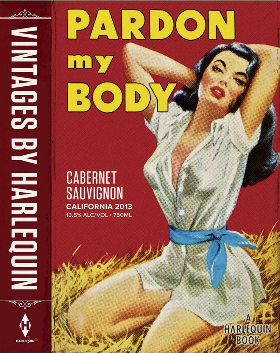
Pardon My Body has all the visual clichés we’ve come to expect from a mass-market romance – an under-dressed, Barbie-proportioned woman with full, ruby lips who is, for some reason, cooling off on a bale of hay.
“As she pressed her ruby lips to mine,” the blurb reads on the back, “I drank in ripe cherry, blackberry, boysenberry and a hint of cassis.”
If that seems oddly specific – or an instance of purple prose gone way too far, even for genre fiction – take heart. This isn’t jacket copy, it’s a wine label. In late September, Harlequin announced that it’s getting into the wine business, starting with the release of a cabernet (Pardon My Body), a red blend named Wild at Heart and Substitute For Love, a California chardonnay.
Whereas this brand extension might once have seemed cheeky and low-brow, these bodice rippers in a bottle will be in good company in today’s wine market. Positioned alongside other approachable brands – Two Buck Chuck, Sassy Bitch, Boom Boom, Big Ass Cab and The Ball Buster – labels today, in response to a saturated and hyper-competitive market, are in your face and full of humour.
Welcome to the brave new world of wine branding. Labels have images of sexy ladies and Mexican wrestlers, allusions to brothels and bombs, funny sayings about wine being liquid therapy or mother’s little helper, and now even expletives, daring people to share provocative labels on social media in hopes of attracting attention on crowded shelves and catching the eye of a younger generation of drinkers who need to be convinced that wine can be just as fun and casual as craft beer and bourbon. Only one thing’s for sure: This ain’t your father’s Bordeaux.
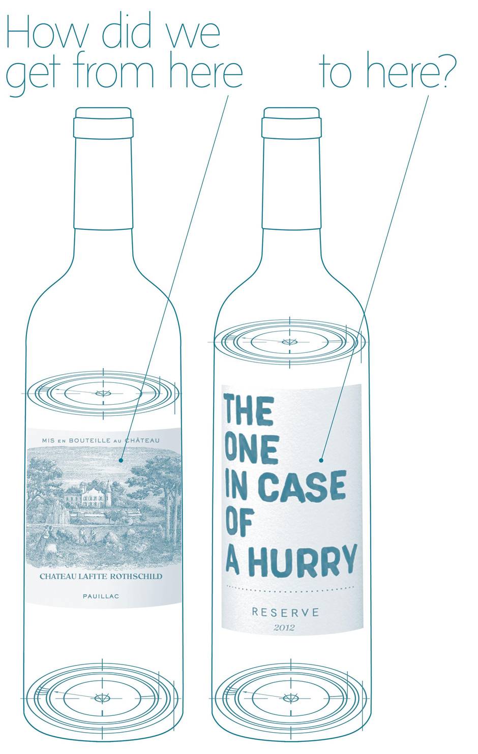
But how did we get from here:
To here?
It all started in 1976 with the Judgment of Paris, the historic blind taste test that pitted venerable French wines against upstart counterparts from California, most famously a cabernet sauvignon from Stag’s Leap and a chardonnay from Chateau Montalena, both out of the Napa Valley. The away team trumped France on its own soil, shocking anyone who had previously thought French wine was the pinnacle of craftsmanship and that everything from the New World was plonk.
The surprising results put Napa Valley, California, and eventually, virtually the entire New World on the wine map. But the biggest winner from the Judgement of Paris was the grape itself. Specifically, chardonnay, the varietal that swept the whites in the tasting and became a hot commodity after the upset. Chardonnay-mania elevated the grape varietal into a product and brand in and of itself. Prior to this, ordering a wine by the varietal was practically unheard of.
“In France and in Italy, you drink the land where the wines come from, but in North America and the rest of the New World, you drink the varietal,” explains Bernie Hadley-Beauregard, founder of Vancouver’s Brandever, an awardwinning branding agency with a specialization in wine. “You drink a malbec, you drink a chardonnay, and that made it easier for the consumer because they didn’t need to have an atlas with them to figure out what they wanted to drink.”
This creates a more streamlined form of wine buying, argues Hadley-Beauregard, who points out that Old World wine consumption assumes not only geographical knowledge, but also historical savvy. European wine aficionados want to know the history of key vintners as well as soil characteristics and preferred grapes of specific regions. After 1976, though, the grape became the star of the show. Wine marketing was, in a sense, freed from time and space. The pedigree and history of the winemaker, the location of the vineyard and the age of the chateau all became irrelevant. Or less relevant, at least.
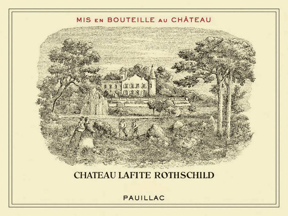
It took a while for some brands to understand this and, to date, there are still plenty of New World wines that employ very traditional, Old World-inspired advertising. There are many North American wineries, for example, that slavishly continue to use the word “Chateau” in their names, including, most obviously, Napa’s Chateau Montalena. Perhaps because they’re as far removed (both geographically and culturally) from French aristocracy as you can get, regions such as South Africa and Australia saw the light first and threw off the shackles of Old World wine-selling traditions. Circa 2000, labels such as Goats do Roam and Yellow Tail ditched the chateau, the white label and the Edwardian font and invented a new trope – the critter label.

“We’ve seen big brands like Yellow Tail and Fat Bastard make some pretty significant sales based on their branding and labelling,” says Dan Paszkowski, president of the Canadian Vintners Association. “That played an important part in the new, more approachable labels.”
The kangaroo, hippo and goats evolved into a menagerie that included wiener dogs, leaping lizards, dinosaur skeletons and, what some might consider a nadir in marketing, cats peeing on gooseberry bushes. Labels then looked for inspiration outside of the animal kingdom and came to include stiletto heels, bow ties, zeppelins, dancing ladies and red trucks, among other striking and friendly images. Cupcake wines, for example, launched about eight years back.
“The critter labels started it all,” says Toronto-based sommelier Anne Martin. “The funny wordplay labels are part of the same trend. They grab your attention and, if they make you laugh and you think your host will laugh, too, you take it to the dinner party, where it’s an immediate conversation piece.”
But Martin, who qualifies her statements with her firm belief that, like books, you should never judge a wine by the label, adds that the critter labels have also picked up a stigma amongst wine connoisseurs, who, at this point, would probably rather buy chardonnay than any bottle adorned by a koala bear, even if the contents were said to be first-rate. Cute labels have picked up a bad reputation that they’re having trouble shaking off – this is part of the backlash against the wildly popular Yellow Tail shiraz, which critics derided for being too jammy and heavy on the vanilla. The new tongue-in-cheek labels are memorable, attract attention and manage to sidestep the now infamous Yellow Tail negative associations. Plus, Martin points out, a lot of the wordplay wines are actually good, and her clients enjoy both the labels and the contents.
“To be honest, the label doesn’t matter as much to people in a restaurant, since we’re hand-selling the wine,” she explains. “But, if a great label has a great story behind it, which it often does, then that gives me something to talk about with the guests. And the guests love that.”

That’s precisely what the best of these new branding exercises do. Okanagan’s Dirty Laundry, for example, takes inspiration from an early 20th-century laundry turned brothel close to its vineyard. Formerly Sherzinger Vineyards, the re-brand doubled Dirty Laundry’s sales. The Speck Brothers (Paul, Matt and Daniel) grew up working in the family’s Niagara vineyard, Henry of Pelham, and decided to celebrate the next somgeneration’s stewardship with a fresh label. Hence Sibling Rivalry. And Megalomaniac is a reference to people who take wine too seriously, a character trait owner John Howard narrowly avoided when he decided not to name his southern Ontario vineyard after himself and, instead, poke fun at overly-serious oenophiles. The joke doubles as a way to grab the consumers’ attention.
“I sometimes tell clients that wineries are popping up like meth labs. There are so many new ones, it’s really hard to make an impact,” says Hadley-Beauregard, “And it’s sometimes easier to remember the name Laughing Stock or Blasted Church than it is to remember a family name.”
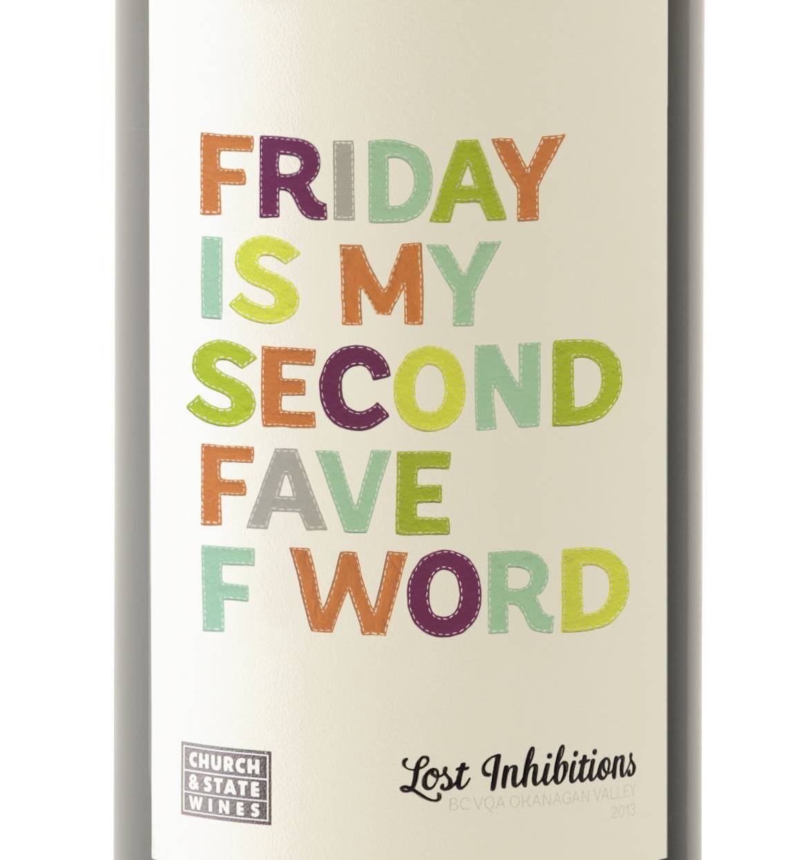
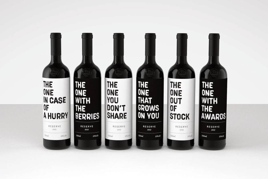
Brandever’s mandate, then, is to get his clients’ wines noticed, something he certainly accomplished with Church and State’s Lost Inhibitions label, which was released with 100 different, colourful, highly Instagram-able sayings: Chill The F*ck Out, Surrounded By Idiots and I Promise I Won’t Text My Ex, to name a few. The Easy Choice out of Paarl, South Africa, is another winery that’s opted for typographic labels, using strong fonts to name (and therefore declare) wines The One With The Awards, The One You Don’t Share and The One Out Of Stock.
The use of bold words seems to be working. Sales for Church and State have increased 200 per cent, something Brandever only takes a sliver of the credit for. Hadley– Beauregard points out that a Lost Inhibitions red recently scooped a gold medal at the 2015 Wine Align National Wine Awards. “They’re actually very proud, honourable wines,” he says. “They just happen to be wearing a very daring dress.”
If you could sum up this new direction in wine labeling with one quick phrase, it might well be “Serious wine that doesn’t take itself too seriously,” a line that seems to resonate with consumers. But while it’s one thing for winemakers, sellers and consumers to change their minds about how wine should position itself, it’s entirely another for the regulatory bodies, with a mandate for social responsibility, to do so. Wine, beer and spirit advertising should be fun, but not too much fun, which is actually the fundamental paradox that underlines all alcohol marketing – at least since Prohibition.
The Alcohol and Gaming Commission of Ontario, for example, was initially concerned about Break-In, a pinot noir from Beamsville’s Organized Crime, since it might be seen to be capitalizing on criminal activity. “I don’t get it. I don’t think anybody’s going to buy a $21 bottle of wine and go break into somebody’s house,” says Organized Crime owner Krystyna Tarasewicz. “Plus, you can see the guy on the label. He looks like a Mennonite.”
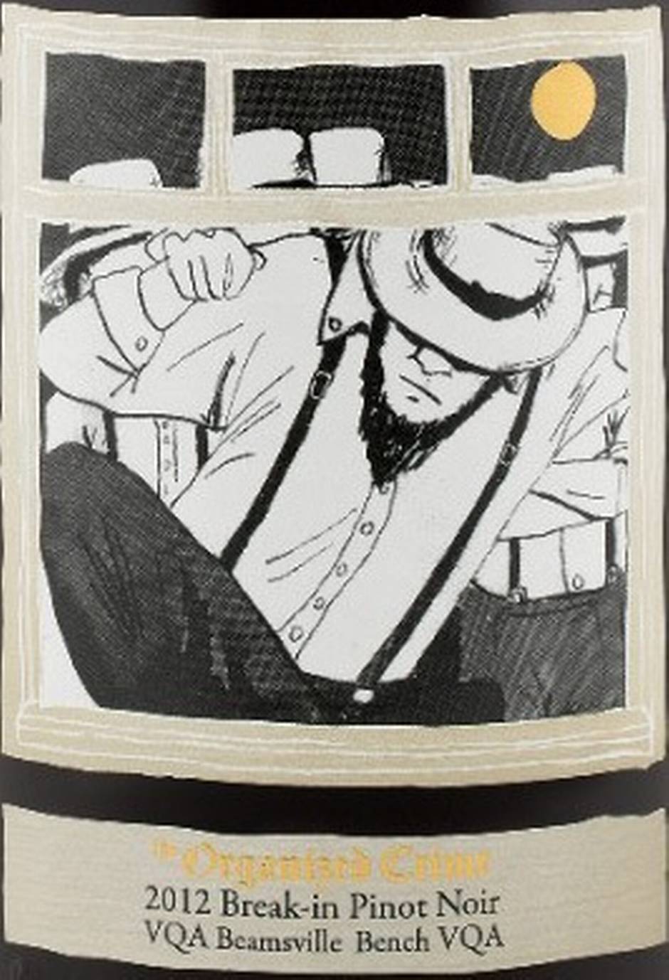
With the help of Hadley– Beauregard, Tarasewicz defended her wine and her vineyard’s name to the AGCO by explaining the backstory: “Organized Crime” is a play on words referring to a funny incident involving religious rivalry and the theft of a church organ some 100 years back in the town in which her vineyard is situated. The team also made a successful counter-argument that there were ample precedents approved for sale in Ontario – Ménage à Trois (threesome); Vigne de L’Enfant Jésus” (baby Jesus wine) and Three Thieves from California.
Tarasewicz was unwilling to consider a name change, even though she has heard that a provincial minister is scandalized by the highway marker on the QEW that reads “Organized Crime.” “You have absolutely no idea how many people come here because they love the name,” she says. “I think Bernie [Hadley-Beauregard] is brilliant. We’re even considering moving into merchandise, since we get so many requests for T-shirts.”
Where will it go from here? Between our increasing tolerance for clothing that reads “FCUK” and consumers who are responding to a lack of pretension in marketing, it’s probably only going to get more risqué. Case in point: In the United Kingdom, a British wine importer invited consumers to tweet #TasteTheBush for a chance to win a case of Australian wines. Although some responded to the humour, others used the hashtag to express their disapproval of the crass and sexist campaign that was accompanied by an image of a woman in a white dress with a glass of wine strategically placed in front of her private parts. In addition, there’s Well Hung, Bitch, Old Fart, White Trash and a small label in Illinois called Grafton Harbor’s Liquid Panty Remover. This may well have people regretting opening the door to Substitute for Love and Pardon My Body.
It’s a slippery slope, after all. And one that may even find some wine lovers longing for the return of the faux-chateau label.