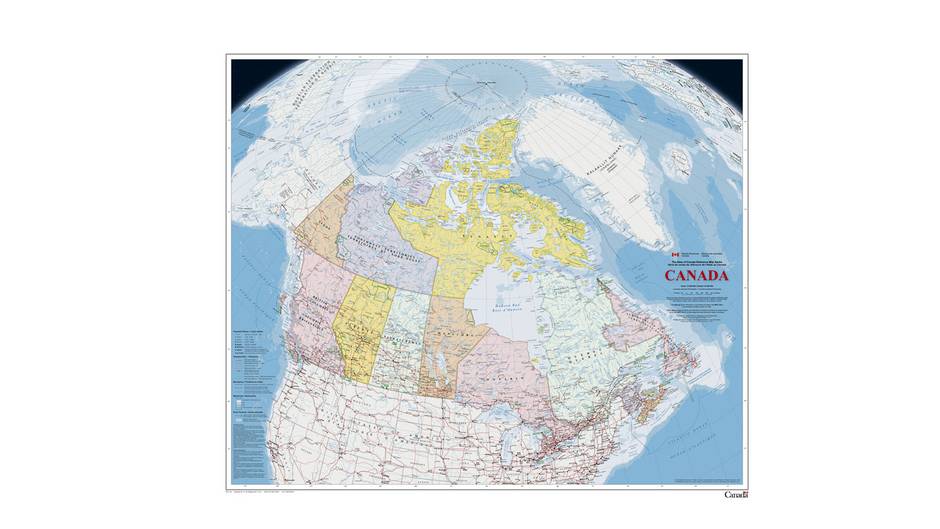
In at least one way, the federal government’s new map of Canada pales by comparison to its predecessor, thanks to a generous splash of white across the top.
The change has to do with the way Arctic sea ice is represented relative to the previous version of the map. At a glance, the update – unveiled on Wednesday – makes it seem as though there is more ice now than there was in 2006, when the previous edition was published.
In reality, climate change has been gnawing away at the planet’s permanent polar ice cap and it is projected to continue doing so.
“It’s a subtle way, on a map, to change the perspective on the way something is viewed,” said Christopher Storie, an assistant professor of geography at the University of Winnipeg and president of the Canadian Cartographic Association.
Whereas the older version of the map showed only that part of the sea ice that permanently covered Arctic waters year round at that time, the new edition uses a 30-year median of September sea-ice extent from 1981 through 2010. September sea ice hit a record low in 2012 and is projected to decline further. The change means there is far more ice shown on the 2015 version of the map than on its predecessor.
“Both are correct,” Dr. Storie said. “They’ve provided the right notation for the representation, but not many people will read that or understand what it means.”
Yvan Désy, a director with Natural Resources Canada, oversaw the map’s production. He said the updated representation brings the map into line with the way Environment Canada computes sea-ice extent.
Other changes include the use of aboriginal names for geographic features. For example, the former Queen Charlotte Islands of British Columbia are now identified with their official name, Haida Gwaii. Similarly, what used to be Clyde Inlet off the east coast of Baffin Island is now designated with its Inuit name, Kangiqtugaapik.
For the first time, the map also shows the location of seasonal ice roads across the Canadian North and stakes out the exclusive economic zones off Canada’s three coasts. It also depicts Hans Island, a small island that is disputed territory as sitting on the border between Canada and Greenland, but with the name of the island firmly in Canadian waters.
In cartographer’s lingo, the map employs a Lambert conformal conic projection, which is deemed best for depicting Canada’s northern regions at something like their correct size and shape relative to the rest of the country.
Canada’s first official national map was produced in 1906. It was improved each generation, first by surveyors armed with theodolites, then aerial photography and more recently by satellite imagery.
“A map tells a lot about the people living in those areas,“ said Geneviève Marquis, a manager of geoanalytics who worked on the map. “It depicts the reality of a society.”
Asked what reality the new map conveyed about Canadian society, Ms. Marquis noted how dispersed communities are across the vastness of the country.
“That tells me we have to communicate or network with each other … and networking is really key for the next generation.”
For comparison, the older, less icy, version can be found here.