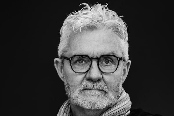
C.S. Richardson.JEFF CHEONG/Handout
When C.S. Richardson took the leap from his day job of designing books to writing them, he instantly found success with his 2007 debut The End of the Alphabet. The spare, elegant novel was an international bestseller and won the Commonwealth Writers Prize. His cinematic 2012 follow-up, The Emperor of Paris, was also a hit and longlisted for the Scotiabank Giller Prize.
Richardson’s third novel, All the Colour in the World, is – finally – out this month. The book is a short but dense story about Henry, an art history professor whose life is marked by tragedy and the restorative power of art.
Richardson, who was still working as the creative director at Random House Canada until 2017, took the decade-long break between books to fully develop the wide scope of All the Colour in the World, which spans the 1920s to the 1960s – and delves into the historical and artistic happenings during that pivotal time in the 20th century.
For readers wondering why Richardson didn’t capitalize on his early literary achievements by churning out more novels in quick succession, he has a simple answer: Not only is writing a laborious process for him, but life also got in the way.
“I had a growing family and I moved house and left the corporate world – trying to juggle all of that while trying to write something that wasn’t the usual thing wasn’t easy,” Richardson explains. “I really didn’t want to repeat myself.”
Written in poetic chapters of only a page each, All the Colour in the World recounts Henry’s eventful journey – from his childhood in 1920s Toronto to serving in the Second World War to returning to Italy in the 1960s – referencing the works of art that inspire him along the way.
To weave Henry’s memories throughout the narrative, Richardson drew on the idea of the Victorian “commonplace book,” a depository for observations, musings and mementos. In the novel, Henry often returns to keepsakes he saves in an old art textbook over the years, which mark key moments in his life.
“I love when a writer can mix fiction and nonfiction – I wanted to really integrate both as best I could. So that’s where the idea of Henry collecting bits and pieces of stuff came from – those things are telling his story.”
From his younger days onward, Henry’s story is one marked by loss – and his passion for art helps sustain him through a lifetime of wrestling with that pain.
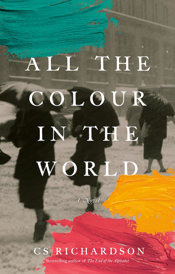
All the Colour in the WorldHandout
“It’s those moments of hardship that shape people – how they react to it, how they learn to love again, or to carry on after unspeakable loss,” Richardson says. “I’ve been very lucky that I’ve never had any incidence of unspeakable grief. I’ve never woken up the next morning and wondered whether I could go on. But I wanted to get into that head and find out how one deals with that – or in Henry’s case, his ability to bounce back, even though it takes him an awful long time to get there. To recover from his loss defines him – and his way through the story.”
Richardson, whose research was extensive enough that the novel’s acknowledgments note that a list of his sources would be longer than the book itself, wanted to accurately capture the artistic movements and masterpieces that an art history professor like Henry would teach – and appreciate.
“When [Henry] realizes he doesn’t have the gift to actually make art himself, his love of art drives his creativity in a slightly different way. He can’t paint like Picasso or Van Gogh, but he can look at their work and have that inspiration,” Richardson notes. “And I think it gives him an escape – suddenly you’re transported from the present.”
Asked about his own favourite works of art, Richardson pauses to ponder, drawing a distinction between art one could hang at home (something softer like Van Gogh’s olive grove paintings comes to mind, he says) and masterworks that have to be seen in a gallery (the darkly epic works of Caravaggio).
And Henry? Richardson doesn’t hesitate: “I think it would be the Caravaggios and Géricaults of the world, where their paintings are telling stories.”
Richardson is something of an artist in his own right. During his four-decade career in publishing, Richardson designed roughly 2,000 book covers and received the Alcuin Society Award for book design multiple times.
“I loved the challenge of interpreting somebody’s words and a story visually,” Richardson says. “Because books are so individual, every design challenge is absolutely different and unique, and that’s what I loved most about that work.”
Richardson discussed some of his favourite covers with The Globe:
The Bedside Book of Birds, Graeme Gibson

The Bedside Book of Birds, by Graeme GibsonHandout
“Graeme, without a word of a lie, is my favourite author. The cover design process is at the best of times a collaborative one – and in the case of this book, it was really Graeme’s opus where he had collected all this ephemera about birds, which were his passion. We went back and forth, and I think we both found the parrot image around the same time – to me it certainly reflects what’s going on inside the book, which is one of the keys to good book design. For me, The Bedside Book of Birds represents the best in how books are put together.”
The Remains of the Day, Kazuo Ishiguro

The Remains of the Day, by Kazuo IshiguroHandout
“The ultimate challenge here was, how the hell do you design a book that has already been designed four ways from Sunday, and that is a classic and so beloved? I looked at a lot of the approaches to previous covers of the book – everything from the original editions to movie tie-ins to foreign-language editions. I eventually decided on a graphic illustration approach because it was a little bit different. And I picked a specific typeface that was designed for the London Underground system, because I was looking to highlight the Britishness which is so much a part of the book. It was a bit like redesigning the Bible. But it was lovely – [Ishiguro] was very gracious and sent a note to the publisher saying how much he liked it.”
The Last Schmaltz, Anthony Rose and Chris Johns
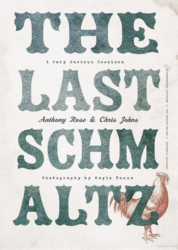
The Last Schmaltz, by Anthony Rose and Chris JohnsHandout
“There are many ways to approach designing a book cover, and the obvious first choice is that you try and reflect the concept – in this case, what kind of food is being cooked here, that kind of thing. But in the case of this book, I had to reflect Anthony – he’s a character with a great sense of nostalgia; he’s over-the-top and wonderful – leaving aside that his food is, of course, amazing. I’ve designed a lot of cookbooks in my time, but what drives me nuts is that most of them look the same. So the first thing I thought is that I wasn’t going to put food on the cover, just because Anthony is different and the way he approaches his restaurants is different – so why not be different?”
Ru, Kim Thuy
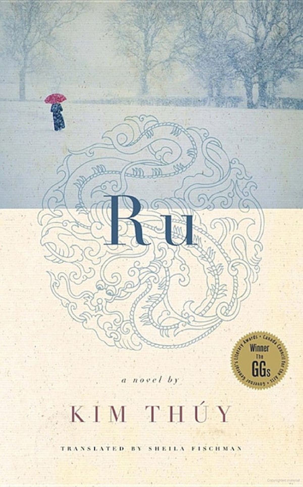
Ru, by Kim ThúyHandout
“Ru was Kim’s first book in English. It’s so Zen. I wanted to reflect that tone somehow on the cover, so you have the lighter colours and ornate symbol but then I also ended up including the red umbrella as a hat tip to Kim – she’s the most effervescent person, so bubbly and fun and enthusiastic about everything. I tried to reflect how she writes so beautifully but also who she is outside of her craft.”
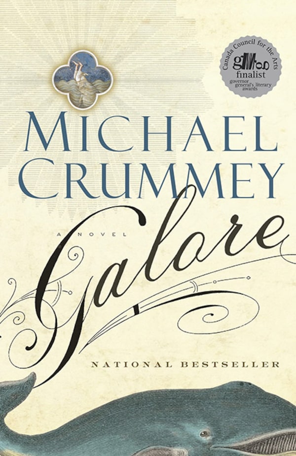
Galore, Michael Crummey
Galore, by Michael CrummeyHandout
“Michael Crummey is part of a large cast of great Newfoundland writers, and I have the very good fortune of sharing an editor with him. I’ve designed a few of Michael’s books over the years, and Galore is this wonderful fish tale in true Newfoundland style. It’s like his interpretation of [the Biblical story] Jonah and the Whale, so I knew I had to have the whale on there, and then came up with the little vignette of the guy being swallowed. But what I loved the most about the book was the title – the word ‘galore’ is so perfect. So that’s why you get this flamboyant italic swirl for the title – just trying to grab the reader’s attention. I couldn’t resist going to town on that word.”
Expand your mind and build your reading list with the Books newsletter. Sign up today.