2019 marks the 175th anniversary of The Globe and Mail. Here, we take a look back at the history of the newspaper’s nameplate.
In March, 1844, a Scottish immigrant – and future Father of Confederation – named George Brown launched The Globe, a weekly Toronto newspaper with a mandate to champion the drive toward a system of representation by population, rouse public opinion and attack political opponents.
Brown’s insistence on the most detailed news reports and his use of the latest printing presses helped The Globe become the most widely read and influential daily paper in British North America by the mid-1800s. He died in 1880, after he was shot by a dismissed employee in his office.
In 1936, the paper acquired a smaller rival, The Mail and Empire. The merger resulted in this newspaper’s current name (although most loyal readers still refer to it simply as The Globe).

The Globe A1 November 19, 1936
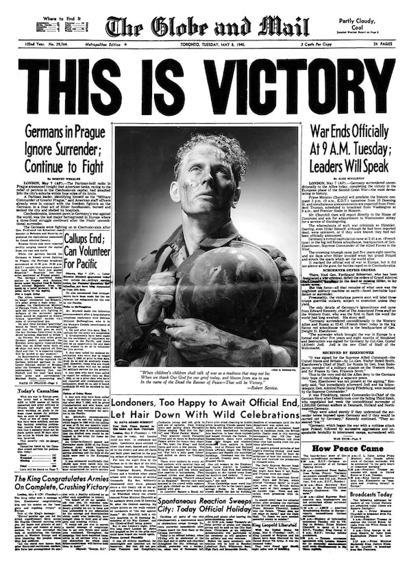
Globe and Mail front page (A1), published May 8, 1945 -- World War II: This is Victory [VE-Day or Victory in Europe]The Globe and Mail

Globe and Mail A1 December 31, 1999

Globe anniversary

Globe anniversary
From Day 1, the design and typeface of the nameplate have been of paramount importance. It’s the first thing you see when you look at the front page (or click on the home page), and its presentation is a powerful visual tool to cement the brand’s identity as a long-time champion of free speech.
For nearly 150 years, The Globe’s nameplate was set in old-English lettering called Blackletter or Gothic, a traditional typeface that can be traced to the late 700s, long before German inventor Johannes Gutenberg introduced Europe to the printing press.
In a 1990 redesign, The Globe introduced its first modern nameplate. And by the late 2000s – with the Internet eroding traditional advertising revenue and eyeballs wandering away from print – The Globe decided it needed a new look. One that was clean, simple but classic.
Named after the paper’s editorial art director at the time, David Pratt, the text that would form the basis of the new Globe nameplate was called simply “Pratt Pro,” and over the past decade, it’s been the type face used to help steer The Globe and Mail through the ever-changing and volatile news landscape.
As part of a late-2017 redesign, The Globe adopted a square nameplate, which drew a tight connection between the paper and its recently revamped website and apps. But with its historic identity firmly intact.
 Gayle MacDonald