From empty nesters to first-time homeowners, more and more Canadians are inhabiting tighter quarters. How to live stylishly in a compact space? Here are three seductively scaled-down residences making the most of every square foot.

Radically open in Ottawa
The average size of a home in Canada is about 1,600 square feet, but that’s far too much for some people. In the case of Paul Kariouk, even his 1,100-square-foot apartment in Ottawa was simply “too big and empty.” When he moved in with partner Frederic Carrier (and Carrier’s “very large and very slobbery” dog, Charlemagne), they settled into 850 square feet in a new condo tower in the capital’s downtown. Then they essentially blew it up.
In particular, Kariouk and Carrier demolished the entire two-bedroom interior and turned it into an open rectangle, with a floor of white porcelain tile and three oval-shaped pods to contain a closet, a shower stall and a toilet and sink right in the middle of the space. When the couple desires some privacy, they draw curtains to close off a bedroom in one corner and to surround the shower, which is a fully glassed-in, floor-to-ceiling enclosure that sits right next to the kitchen island.
But that’s not often. “In residential design, there’s this sense that you have to compartmentalize all your activities,” says Kariouk, who runs his own architectural practice and teaches at Carleton University. “But that’s a Victorian idea, and nobody really lives like that; I certainly don’t. Even when I work, it’s on my laptop, and I can be anywhere within the place.”
His apartment’s radical openness is made possible through carefully designed built-in cabinets, which run the entire length of a 40-foot-long wall. The builder’s original wall “moved in and out; we camouflaged that with millwork that looks level all along the wall and holds everything we need from day to day.” This includes a workstation, a musical keyboard that Carrier plays as a hobby, separate storage space for media and kitchen items and, in a recess at one end, a spotlessly clean urinal, which serves as Charlemagne’s drinking fountain and water bowl. The urinal is an an odd touch, Kariouk admits, but it serves the dog’s needs perfectly. “In a place like this, the storage and infrastructure you require becomes a huge percentage of the space,” Kariouk says. “The question is, how do you make it more efficient?”
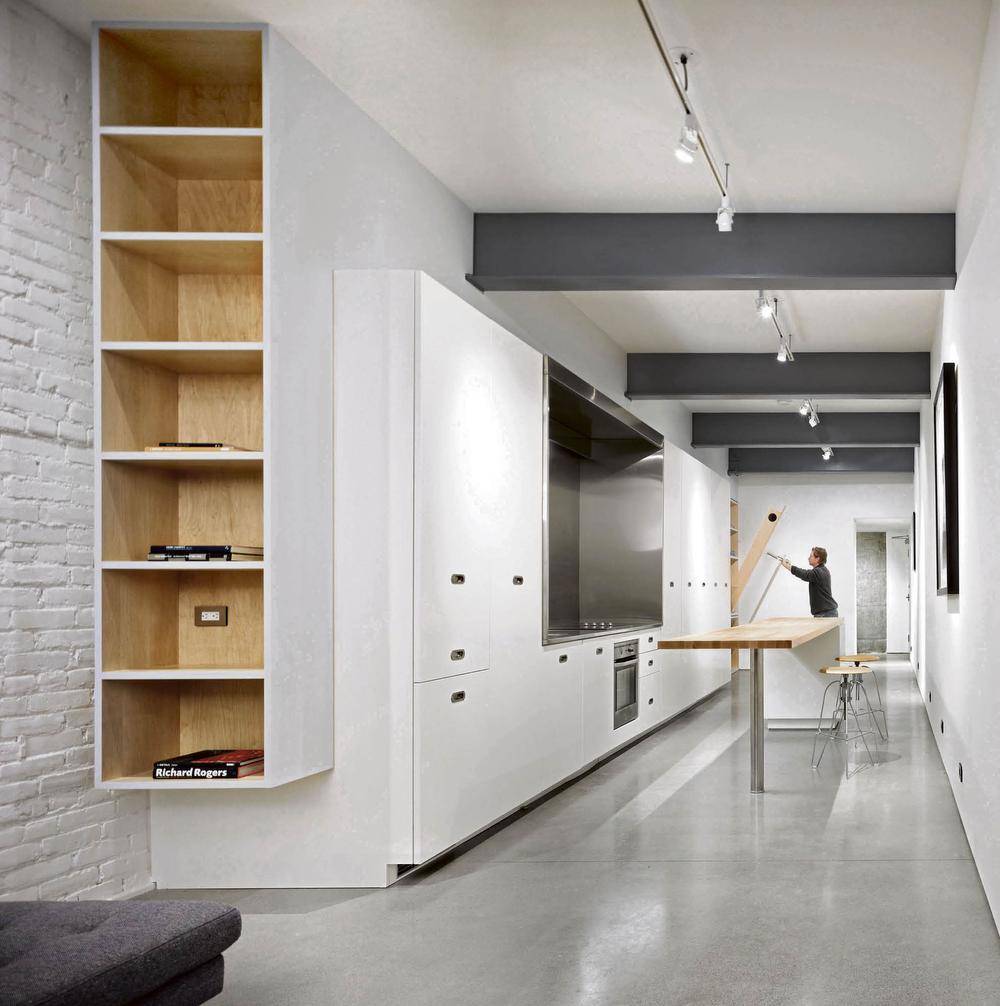
Disciplined digs in Gastown
A home that’s 10-and-a-half-feet wide – that was the challenge for Vancouver architect Gair Williamson when he designed a unit for himself in a redeveloped building in Gastown. “It’s not much wider than a parking spot,” he says wryly. “How spacious can you make it feel?”
In fact, the 685-square-foot space proved to be quite accommodating, thanks to some moves that draw more from industrial design than architecture. As Williamson puts it, “everything you need is in the wall.” That long element is lined with cabinets that contain a galley kitchen (with a stainless-steel counter and a pullout pantry), wardrobes and storage space, a library (with a retractable desk) and a fold-down bed. Each of the storage units and the bed can effectively disappear, leaving one sofa and the 12-foot-long, butcher-block kitchen island as the lone furnishings.
All this suited Williamson’s purpose when he moved in a few years ago: His aim was to pare down his lifestyle while keeping some of his art and a few other possessions close at hand. “I wanted a place that could be a gallery, a place where I could entertain. But the most important thing I wanted in the space was storage,” says the architect, now 58. “So it has three times the storage of a typical unit this size.”
Each of the wall cabinets is faced with white doors, which establish a consistent look along the 60-foot space. That repetition of lines and forms – plus the white paint – creates a clean, seamless facade. The 10-foot-high ceiling helps as well. “With a high ceiling and the control of clutter, you add a sense of importance to objects. If there’s one piece on a wall, you appreciate its quality more than if you have 20 pieces up. It’s a very focused way of living.”
Williamson, who has since sold the apartment, admits that this focus did require some diligence. “There’s one piece of furniture [a Bombast sofa custom-made to fit the historic sill], a single Attila Richard Lukacs print and 11 books.” But that kind of discipline serves the apartment well. “I think it’s just as important how it’s furnished as how the space is designed. It’s all part of an approach to living.”

Tricking the eye in Toronto
To make a small home feel more capacious, sometimes it helps to both add and subtract. In renovating a skinny house in downtown Toronto, the architects at Denegri Bessai Studio did just that, removing old walls to gain a bit of space, but also adding new storage and a dramatic new ceiling light to create a feeling of roominess.
The homeowners, Toronto couple Indira Stewart and Greg Beach, had already renovated the ground floor of their Victorian, opening the space up by eliminating rooms. Their next challenge was the upstairs, which housed three bedrooms and one bathroom – a tight layout that had to work more efficiently for them and their son, Milo, now 18 months.
Their architects, Maria Denegri and Tom Bessai, offered two solutions. First, they demolished the house’s thick plaster-and-lath walls and replaced them with skinnier partitions made of drywall. Then they built new storage units – mostly IKEA’s popular Pax wardrobes – into the walls and wrapped them with “liners” of maple plywood. These new elements reach up to the ceiling and “really stretch the space visually,” explains Denegri. “We expanded the doors upward, too,” by installing new seven-foot-tall models that “really adds a sense of spaciousness.”
The most surprising move, however, is back down in the kitchen, which had previously been renovated by Toronto’s A2L Architects. The galley space, just 12 feet wide, adjoins a small back room that is even narrower and lower. A bit of visual trickery bridges that gap: A light fixture, fashioned out of translucent acrylic, flows over the step in the ceiling. Its pattern, determined with an algorithm and cut using computer-controlled milling machines, suggests lace or drops of water. “By taking your eye away from that step-down, it makes the transition more seamless,” Denegri says. “You’re reading one long space, as opposed to a kitchen plus add-on.”
And this, Stewart says, is “the one thing in the house that people always want to talk about, without fail.” The effect is both novel and beautiful – and beauty trumps size every time.