Every room in the house is the sum of many parts – furniture, decor and accessories, of differing colours, textures and vintages. It takes a deft hand to assemble all the components and still compose a space that feels harmonious, thoughtful and well balanced. The Globe talks to experts about their approaches to commonly off-kilter issues

High and low tech
Even as TVs have become sleeker, slimmer and more discreet, their presence is still one of the single most defining features of a living room. It invariably goes on the most prominent wall, then dictates where the sofa goes (the opposite wall), and by extension, the placement of just about everything else (coffee table, side tables, etc.). And that can lead to lopsided spaces. In the Toronto living room of a recently separated bachelor, designers Samer Shaath and Kevin Chan, co-founders of Nivek Remas, used large-scale art, perched on a plate rail behind the sectional, to counteract the effect. “The room has a very tall ceiling and large white walls,” says Chan. “So we didn’t want small pieces of art. We found four-foot-by-three-foot pieces” – vintage advertising posters from Montreal-based furniture manufacturer Montauk – “but they are not overbearing because there is a lot of negative space around them.” Shaath agrees, noting that “although the TV often captures all the attention, we wanted to do something on the opposite wall that, even though it’s not something that gets looked at all the time, has a very strong presence.”

Warm and cool
Industrial loft conversions usually fall firmly into one of two camps: icy steel and concrete, or rustic brick and wood beam. For a bachelor’s kitchen in Vancouver’s Yaletown district, designer Chad Falkenberg, co-founder of Falken Reynolds Interiors, merged the two for a space that is neither too cozy nor too cold. “[The client] wanted a super-masculine space,” says Falkenberg. “But he also wanted to bring a girl over and not have her feel like she’s in a foreign land.” The balancing act is particularly apparent in two places. The walnut strip set into the concrete breakfast bar (“It’s tactile,” says Falkenberg. “Wood has such a warm sensation to it. It’s softer. Concrete is hard and colder to touch.”). And the wood beam that runs over top of the black, high-gloss cabinetry around the fridge. “The nice thing is that the cove lighting reflects off the beam,” says Falkenberg, “making the whole wall feel lighter and taller. The black wall isn’t at all oppressive. Sometimes dark walls can feel heavy enough to fall over.”
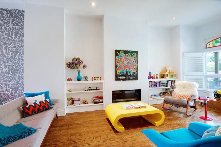
Colour
Four years ago, after Andrea Van Leeuwen moved into her 130-year-old Victorian, she noticed a smell of gas in the living room. Replacing the defective fireplace sparked a renovation. She didn’t have the option to go entirely neutral, though. “I wanted to tie in the colours of the original stained glass above the front window, as well as a piece of art that a friend of mine, Justin Broadbent, gave my husband and me as a wedding present.” The four-panel graffiti work – scrawled all over with the word Love – provided a particularly strong palette. Its yellows, blues and reds add pop, much like the mid-century-modern coffee table Van Leeuwen found at a vintage store in Ottawa (“It’s a pretty bold piece,” she says. “But every single kid that comes here gets so excited about it. They climb all over and under it.”). Although the colours are strong, they are never out of control. The gallery-white walls accentuate the vibrancy; the neutral, grey wallpaper in the nearby dining room provides a settling counterpoint.

Positive and negative space
Several years ago, when Paris-based interior designer Stéphane Chamard fell in love with a Canadian and decided to move to Toronto (“My boyfriend is a doctor, it was easier for me to relocate than him,” says Chamard), he quickly discovered that he was not in love with a prevalent design trend. Namely, the tendency of Torontonians to decorate their homes in inoffensively neutral but perfectly boring beige and greige. Instead, when he was decorating his own Victorian, he decided to do something much higher contrast. “It was almost like a game,” he says of assembling the achromatic house. “The white helps showcase whatever you put in front of it,” says Chamard. “And fortunately, white accessories are the easiest to find.” On the other hand, “The black is very strong. It helps pick up the historic, Victorian details,” like the mouldings and mantels. Together, the black-and-white elements are used in almost equal measure, creating a yin-yang effect that is powerful but not overpowering.

Old and new
Toronto-based designer Shirley Meisels, founder of MHouse Inc., is reverently irreverent when it comes to the century-old homes she renovates. To her, “the mix of original architectural detailing with modern furnishings makes a home feel both classic and timeless,” she says. In a recently finished Edwardian, for example, she made the spaces feel entirely updated, but did so while highlighting, not obliterating, the history. In the dining room, she preserved the ornate wall panelling and woodwork, but painted them out in white “to lighten the space and make the room feel fresh. I love how this creates a textured backdrop ready to balance pops of colour and the clean silhouettes of modern furnishings” – furnishings like the Random Light by Moooi, modern chairs by Jens Risom and a custom red sofa that would have looked wildly out of place to an Edwardian, but that somehow looks perfectly at home here.