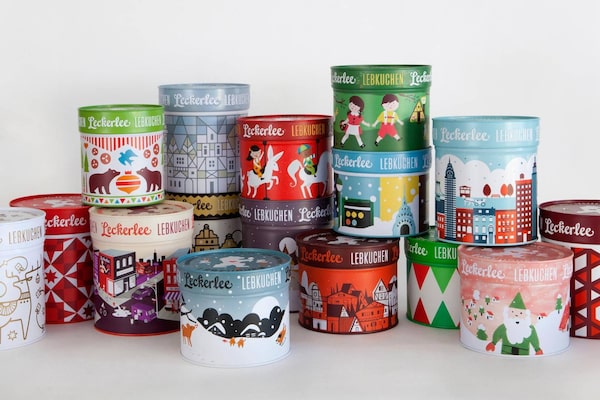
The redesign for German cookie brand Leckerlee's seasonal lebkuchen required a look that had both modern and traditional notes.Courtesy of Strohl
"What's the Instagrammable moment?" That's a question Peter Wunsch finds himself asking often, as partner and creative director of Halifax design firm Breakhouse.
For brands looking to market a product, successful design presence on the social-media network, which boasts 800 million active monthly users, with 500 million active daily, can be transformational. But traditional shelf appeal doesn't always translate to Instagram.
The social-media network, and others like it, is significantly affecting packaging design, from choice of materials in cosmetics cartons to typography selections to the glass chosen for food jars and liquor bottles. Those looking to catch consumers' eyes as they scroll through endless photo feeds must consider: What packaging design is most conducive to a consumer's own posts, where they share photographs of items in the context of their own lives and use. What shapes give the most flattering flatlay (neatly arranged items photographed from above)? Is there anything that can guarantee packaging that's photogenic? Add to that filter conditions and endless manipulations.
"Once, we did tests on how will it look in newsprint and black and white," Wunsch says. "Now, the litmus tests are how will it look in a Polaroid-style Instagram filter. You absolutely think about it – those richer textures and higher bolder textures. Though it's more subliminal and not as intentional as you might think."
Metallic cartons that strobe under a phone flash are out, as are typefaces too fine or that don't remain legible when a product is styled and photographed by amateurs. Differentiation in a crowded marketplace gets even more complicated when each hashtag is a field of data and the vagaries of Instagram real-time mean that what's side by side in any given search result – a virtual shelf of nine images – is also endless.
Creatives have different approaches to this shift, but they all agree that Instagram comes up in the very first design meeting with clients.
Last year, when Toronto agency Concrete created Capo Capo, a new Canadian brand of Italian-made aperitivo, the ruby red elixir became part of the packaging impact thanks to a transparent and inexpensive bottle that features matte white type – design cues based on Italian signage and sports typography. "This is an Instagram look called: No money with Big Graphics," the agency's chief creative officer, Diti Katona says. Chalky white on a colour field is more naturally photogenic than its opposite, which also explains why matte white type is the go-to single process for packaging by countless digital-native entrepreneurs on a budget, such as cosmetic companies Glossier and Birchbox.
There's also no "foot" on the Capo Capo bottle, for reasons beyond minimizing the budget and conveying modernity to a historic beverage category. "It's very important that it wasn't heavy because it's used by bartenders for cocktails – no bartender will want to lift it every day, so we used a wine bottle. It's a working bottle."
In contrast, to package a displayed bottle product such as perfume the opposite is true, and heft is important not just in the hand but to the eye. French glass bottles, the most expensive for fragrance, all have a noticeably thick bottom that's a visual cue of luxury. Similarly, the in-store experience of cosmetics includes a hidden weight in lipstick so that it feels good in the hand or a cap making a soft, satisfying click as it closes. But how do you register enticing tactility when the interaction is virtual?
In a word? Paper. "When we all started in this business everybody knew about paper," Katona says. "Weights, finishes, deckle edges, coated and uncoated or satin. That knowledge of the older generation has come back." The many functional and visual properties of materials such as paper and glass become important given the many possible contexts of a product's Instagram life.
Take the craft gin of a new Ayr, Ont., farm distillery called Willibald. It has a striking yellow label (think Veuve Clicquot meets Wolfblass) chosen by Concrete for its starkness, in combination with a custom typeface based on old Germanic type reminiscent of blackletter. The over all effect on Instagram is that you have you look twice: Is it a Dutch beer? An Oktoberfest bottle? And the minimal design makes the quality of the materials even more important.
"There's a mix of high and low – the lack of copy, because a lack of insignia will stand out on the shelf and online," Katona says. By anticipating how bottles of spirits that aren't full might look in photographs, Concrete opted for a more expensive paper dyed rather than printed that shade of warm yellow, "because you would see the ugly white reverse side of a printed label through the glass; now you see yellow."
"What shows up nicely on a photograph and what works on a shelf is a totally different thing," says Eric Strohl, co-founder of California branding agency Strohl, which is behind the packaging design of Williams-Sonoma jams and the familiar Mobius strip-inspired icon for Google Drive. A minor consideration of traditional grocery store-setting packaging design that's been amplified by Instagram is something he says the hit beverage brand LaCroix's array of 21 (and counting) distinctive and quickly recognizable can variations demonstrates well: visual flavour delineation is crucial.
"It's almost more important than the core product line packaging itself," Strohl says. "What's new over the last five or six years are systems in packaging design evolutions: flavour systems." The studio took that into account and chose black tins for spice blend Just Cooks, because they provided a good canvas for strong spot colours that would denote flavours.
Adapting brand packaging to be Instagram-friendly would be easy if it were simply about paring it down and making it plain. But it's not: There still has to be dimension, meaning and storytelling cues in both worlds.
The brief for Strohl's redesign of German cookie brand Leckerlee's seasonal lebkuchen, for example, required a look that had both modern and traditional notes, appealing to users of Instagram while also satisfying the needs of buyers from brick-and-mortar retailers Dean & Deluca and Whole Foods. The original tins were red patterned, Strohl explains, very bold and simple geometric high contrast with a white logo on the lid, good elements people would notice online. "But as it moved on, we were doing more historical themes with details because that's what sells more in person," he says, In the end, they split the difference, he says: "There are still quaint things you can't see unless you pick up the tin and look at it in person."
Strohl adds, "People don't look at the branding touch point on a phone screen as the only place something could exist." He suggests there are, however, growing pains as we come to a place where there is more digital overlap with the real world. "If you think of people used to consuming media on Instagram, on this little small box, things don't get much better than a retina-screen rendered in however-many pixels resolution with a high, high saturation level and RGB on bright white," he adds. "It's making things look almost better on screen than they do, better than they possibly could, in real life."
 Nathalie Atkinson