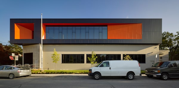
The Proper TV building is a revamp of a postal sorting station on Dovercourt Road in Toronto.Courtesy, superkul.
On multiple occasions during the construction of OCAD U’s Sharp Centre for Design in the early 2000s, then-vice-president Peter Caldwell compared the university’s 1957 building – the one Will Alsop’s black-and-white tabletop would “fly” over – to a “postal sorting station.”
There’s nothing wrong with postal sorting stations; their function dictates that they are long, low, utilitarian affairs with little to ignite the hearts of architecture aficionados. However, it was built at a time when “utilitarian” didn’t necessarily mean “cheap” – the builders showed impressive workmanship and used quality materials.
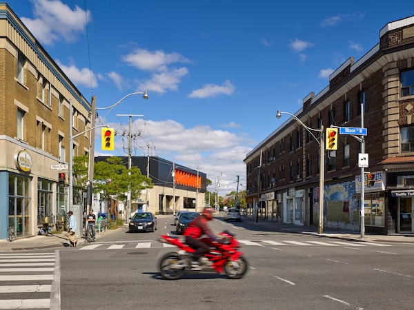
Such was the case with Postal Station E at 772 Dovercourt Rd., just north of Bloor Street West.
The 1953 Marani & Morris building was likely drawn by Robert Schofield Morris (1898-1964) since, according to the Biographical Dictionary of Architects in Canada, he was the partner who “excelled in producing safe, non-controversial and, at times, dull” buildings for his clients. But, due to its odd, trapezoidal shape caused by a jog in the road, its handsome fossiliferous limestone cladding (one can see actual fossils in the stone), red granite kick-plate along the sidewalk and big, carved coat of arms, it stood out amongst the building-jumble above Bloor.
Just as it did before the redesign, the building stands out among the jumble north of Bloor Street.Courtesy, superkul.
It certainly caught the eye of many when it was put up for auction a few years ago, architect Andre D’Elia of superkül said. “Everybody who bid just wanted to knock it down,” he remembered. Mr. D’Elia knows this because before Proper Television Inc. got its hands on it, he’d done a feasibility study for someone else … a someone else with a bid that came in second, as a matter of fact.
Ironically, Proper Television called superkül after its bid succeeded and, to Mr. D’Elia’s delight, they “wanted to pay respect to the original building,” which was not heritage protected.
While eight storeys had been approved for the site, Proper, producer of shows such as Masterchef Canada and Canada’s Worst Driver, just wanted one, 11,000-square-foot storey added to the top, and a to-the-studs renovation of the existing basement so they could place editing suites there.
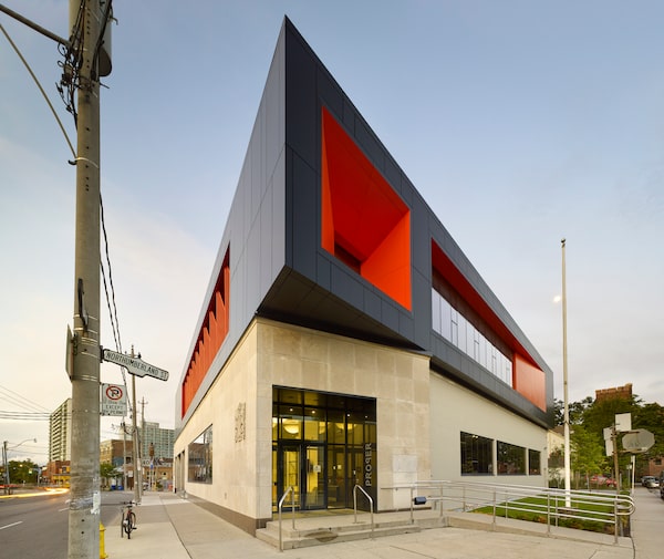
The second floor tapers to a point like the prow of a ship.Courtesy, superkul.
On the existing first floor, there was so much ceiling height – 18 feet to be exact – that the ceiling could be lowered and the floor raised to allow for HVAC, computer cables and all sorts of assorted high-tech conduits, while still allowing enough height for interior designer Anthony Meyrick-Eastick’s whimsical light fixtures, most of which are fashioned from assorted, circular skylights (some quite large). “We wanted it to look like an industrial loft,” said Mr. Meyrick-Eastick, who designed pubs in Britain back in the 1970s.
In the reception area, a large portion of original, emerald-green terrazzo flooring was left intact for heritage wow-factor, and toward the back of the large building, a bank of original, warehouse-style windows with thin metal sashes was left untouched as well (while original window openings weren’t changed on the other façades, old windows were replaced with energy-efficient, tinted ones).

Interior designer Anthony Meyrick-Eastick, whose sketch is shown here, says the building is meant to resemble an industrial loft.Anthony Meyrick-Eastick
One heritage item that could not be saved was the spy-catwalk that wrapped around the sorting floor, construction manager Dimitri Evdoxiadis said: “They could look over the people doing the sorting and make sure that nobody was stealing anything,” he said, thinking of Christmas seasons full of granny-stuffed envelopes addressed to grandchildren. “We were going to try and keep that but it got lost in the design.”
A few supervisor peepholes were retained, however: “You’re always being watched,” Mr. D’Elia said jokingly, “which is kind of ironic since this is [now] a factual television production company.”

Some of the supervisor peepholes from the building's life as a postal sorting station were retained.Dave LeBlanc/The Globe and Mail
And, just like the striking contrast between OCAD University’s old brick pile and Alsop’s pixellated box, when it came to Proper’s new second storey, superkül designed a glossy, black affair that sits “lightly” on top of the rough, taupe-coloured limestone building; it also pokes out, rather politely, over the entrance, where it tapers to a point like the prow of a ship. “We wanted to not mimic the base, we wanted to give this a dynamic top but pay respect to the building,” Mr. D’Elia explained. “Also, these are their corporate colours, black and orange, so we love that combination – it’s Halloween!”
There’s nothing scary about how, with bold accents of orange and a soldierly row of enormous, perforated “fins” along the bank of second floor, east-facing windows, the result is an instant landmark for the Dovercourt Village neighbourhood. “It felt like it needed something,” Mr. D’Elia said of the 12-foot-tall fins, which are lit from below at night. “It’s like a handkerchief, a pocket square.”

The perforated orange 'fins' on the east-facing side of the building make it an instant landmark in the neighbourhood.Courtesy, superkul.
On closer inspection, one notices how each fin is angled slightly from its brother and how the “oculus” window over the main entrance sports a “forced perspective frame,” which brings, to my mind anyway, the kitschy “Carlos of Hollywood” picture frames from the 1950s (a hot item with collectors).
However, kitsch isn’t the word that will come to the minds of those lucky enough to visit old Postal Station E. No, as with the Sharp Centre for Design, words such as “playful,” “transformational” and “wonderful” will fill the air around here … and, hopefully, inspire others to save all sorts of utilitarian buildings everywhere.
 Dave LeBlanc