The Toronto home of Alison and Gareth Gibbins.Tom Arban/Tom Arban
The irony of spending a lot of time and money perfecting a home’s curb appeal is that after the porch is elegantly furnished, the garden is rid of weeds and the lawn is tennis court flat, few homeowners actually use their front yards. According to one University of California study, porches are among the least used spaces in typical homes (along with formal living and dining rooms). Many families don’t even use their front doors, preferring to enter through rear and side doors – whichever is closest to the driveway.
It’s possible, then, that many homes might actually be built backward, with too much energy trying to impress passersby, not enough thought put to how people tend to live. The back, after all, tends to be where the barbecue is, and isn’t that the most important appliance in the home, especially in peak summer?
Flipping the focus of their home was something that occurred to Alison and Gareth Gibbins when they decided to renovate their west end Toronto semi a few years ago.
The place was originally built in the 1920s and, unfortunately, was very much of its time. “A narrow, 100-year-old house is not well suited to a modern family of four,” Mr. Gibbins says. It was too dark, for one thing. It also had a formal front foyer to delight hat-and-glove wearing guests before they were led by into the proper living or dining rooms (both cloistered behind separate walls, each with its own doorway). Conversely, the spaces that the Gibbinses (who have two kids) relied on most were the once solely utilitarian zones at the rear – the practical but pokey kitchen and the equally miniscule mud room.
“The garage is on a laneway behind the house,” Mr. Gibbins says. “So the majority of the traffic is in and out the backdoor door. Space for jackets, boots, snow-pants for the entire family was a must.”
Also essential: a comelier back backdrop. In the warmer months, the Gibbinses enjoyed gathering on the rear lawn. But the space was overshadowed by a vinyl-clad, 1950s addition – a scraggly, awkward contrast to the home’s traditional brick exterior.
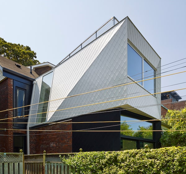
The rear addition is clad in diamond-shaped steel tiles.Tom Arban/Tom Arban
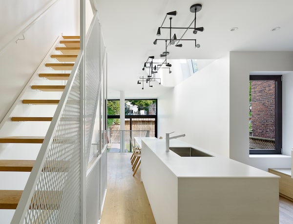
For the remodel, they were referred to Toronto architects Stephen and Merike Bauer whose studio, Reigo & Bauer, is expert at blending functionality with unique, contemporary forms. Fittingly, the renovation thoughtfully reoriented the plan of the house to suit the family’s lifestyle, with a massive rear entryway and mud room, and an expansive kitchen that spreads out over half the ground floor.
At the same time, the studio created a crystalline, impeccably tailored rear addition – all whimsically clad in diamond-shaped steel tiles, scaled to compliment the masonry, but rendered in black and white to stand out just the same. It’s the kind of architecture that elevates even the most basic weekend wiener roast into a seemingly special event.

The rear mud room is the home's main point of egress, so it's been redesigned to be larger and flooded with natural light.Tom Arban/Tom Arban
To be clear, there is a still a street-facing front porch, door and entry vestibule for visiting friends and family. But the once-tight mud room in the back is now larger and more grand, sitting next to wall-to-wall glass in a near-double-height space so that it floods with light, infusing it with a sense of importance more befitting of a primary means of egress. After all, it’s used constantly, it might as well be nice.

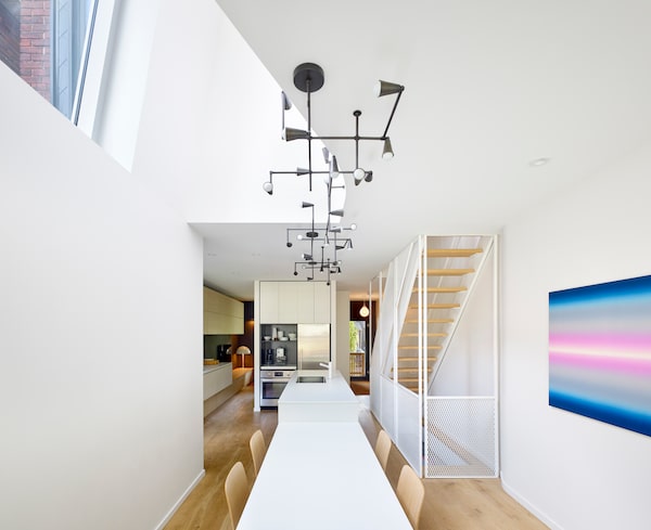
The kitchen's long table is used for games and homework as much as it is for dining.Tom Arban/Tom Arban
The kitchen is similarly improved. Rather than a postage stamp, it now sprawls, subsuming the former, never-used living room and incorporating a built-in island-cum-dining-table to break down any barriers between formal entertaining and everyday use. It might be where the Gibbinses have a celebratory dinner, but it’s equally likely to be where they do homework or play games. “The whole family is big into Lego – mom, dad, everyone” Ms. Bauer says. “So the table is oversized to allow them to make things.”
A small sitting space is tucked in the front of the house, behind the fridge and stove, on the left side of this photo.Tom Arban/Tom Arban
Although there is no longer a formal living area, there is a still a small, semi-private sitting space, at the front of the house. It’s tucked behind the kitchen’s fridge, stove and coffee nook – a custom piece of millwork that aligns with the dining room table. But it still feels like a continuation of the cooking zone, rather than a secluded, walled-off area. That’s because the kitchen cabinets extend between the two spaces. “It helps join the ground floor together,” Ms. Bauer says, “without the need for distinctions between formal and informal spaces – it’s all one.”
Another big problem that Reigo & Bauer solved was the light – a particular challenge in long, narrow semi whose primary windows were at the front and back. Although the cants of the crystalline addition might seem purely aesthetic, they were calibrated to draw in as much sun as possible. For example, a side window on the addition’s upper storey tilts inward toward the house. Since the addition faces north, the slant helps catch more overhead rays that would otherwise simply hit the roof. And as the glass sits over a double-storey shaft that cuts between the upper level, where the bedrooms are, and the kitchen below, “the light pours in to both the first and second floors,” Mr. Gibbins says.
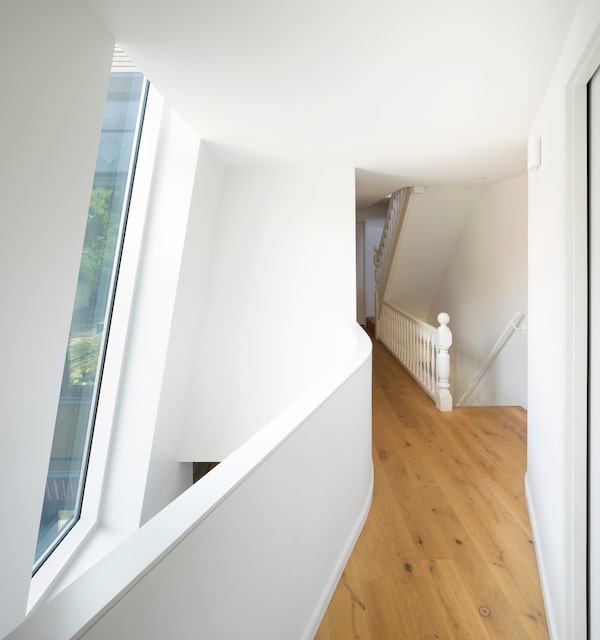
A tilted window brings light to both the first and second floor.Tom Arban/Tom Arban
The slant in the window also improves the views. If the glass were straight up and down, the Gibbinses would look directly at their neighbour’s hose. Because of the angle, “the sight lines are expanded out, capturing more of the sky and the trees beyond,” Mr. Bauer says. “A 10-degree tilt can make an incredible difference.”

A curved guard rail diffuses light in such a way that it reduces sharp shadows.Tom Arban/Tom Arban
To further maximize the light, Reigo & Bauer played with the interior wall shapes, employing, for example, a gracefully curving guard rail to edge the opening of the two-storey shaft. “When light hits the curve, it bounces in a totally different way that it would a flat wall,” Mr. Bauer says. “The cool thing is that it eliminates dark shadow lines, which are common in these old houses with lots of corners. It makes the spaces feel larger.” In other words, it’s another subversion of expectations, one that further makes the house unique, and a more enjoyable place to be.
Your house is your most valuable asset. We have a weekly Real Estate newsletter to help you stay on top of news on the housing market, mortgages, the latest closings and more. Sign up today.