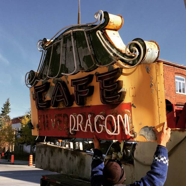
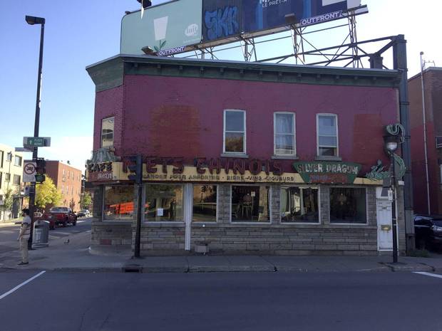
I've often ridden my bike past the Silver Dragon Café in southwestern Montreal, and stopped once or twice to marvel at the magnificent derelict neon signage wrapped around three sides of the wedge-shaped diner. The sign is gone now, but not destroyed like many others of its vintage. After 60 Montreal winters, the Silver Dragon sign has moved indoors, to the Loyola campus of Concordia University. There, it will be cleaned up, researched and exhibited as the latest acquisition of the Montreal Signs Project.
Twelve orphaned signs are already on permanent display at Concordia's Communications Studies and Journalism Building, including several items of high local repute. Some of the giant red letters that spelled out Bens Restaurant are here, salvaged from a favourite hangout for generations of Montrealers, including Leonard Cohen. Another set of robust capitals came from the Warshaw Supermarket, a well-known grocer that fed residents of the Plateau for half a century.
There's also an ultracool 1940s sign from the old Monkland Tavern. Its empty neon channels spell out the name in the kind of free-hand cursive script known to signage pros as "bastard lettering," because it didn't correspond to an existing font. To put that in less disparaging terms, it was original calligraphy made to glow in the night. Unfortunately, it glowed only in English, which is why it had to be replaced after the language law Bill 101 was passed in 1977.
The Montreal Signs Project was founded and is run by Matt Soar, a graphic designer, filmmaker and associate professor of communications at Concordia. He began rescuing signs in 2009 – about 40 years late, if you consider the history of independent signage and neon in particular. Downtown sections of St. Catherine Street were a glowing, seething riot of neon till the late 1960s and early 1970s, when much of that custom-made splendour was discarded.
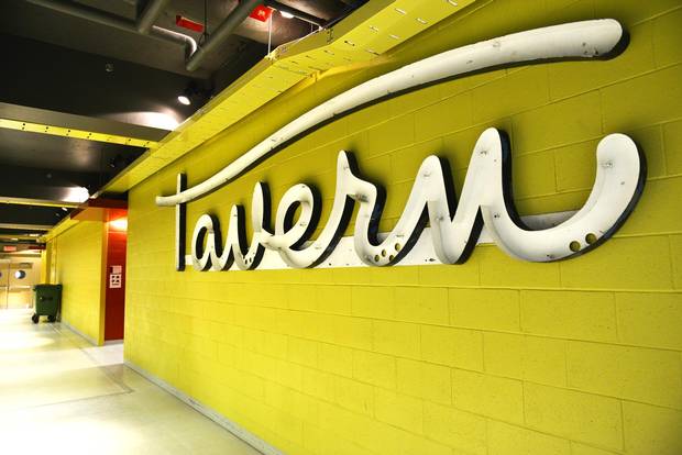
Monkland Tavern’s signage is known as ‘bastard lettering,’ because the font didn’t exist before being created.
Raphaelle Garcia
"We've lost most of the neon, especially the grand gestures of the 1940s and 50s," Soar said in a phone interview. Those that survive are often in need of drastic repair. The Silver Dragon sign was in "appalling shape," filled with dead birds, abandoned nests, flaking paint and scraps of broken tubing.
Even or especially during the heyday of neon, there was a faction that regarded the signs as a crass display of laissez-faire commercialism. But what brought the signs down was a confluence of changes: technological, stylistic and commercial.
The old signs were glass tubes shaped by hand into letters, filled with rare gases and powered by special transformers and timers. The advent of fluorescent bulbs made lettered illumination boxes a much cheaper alternative. The cleaner look of those backlit signs was also more in keeping with the cool aesthetic that took over North American architecture and design after the Second World War.
Another potent factor in the decline of distinctive local signage was increasing commercial concentration and chain-store branding. In place of dozens of shops sporting signs as individual as the welded steel letters that fronted Sheinart's women's wear store (a landmark on Montreal's Atwater Avenue, now represented at the Montreal Signs Project), we now have countless interchangeable shops fronted by uniform signs for American Apparel or The Gap.
Graphic designer Matt Soar, who founded The Montreal Signs Project, began rescuing signs in 2010.
Raphaelle Garcia
"As the manufacture of storefront signage becomes increasingly standardized," says a circular from Berlin's Buchstabenmuseum, "the tradition of idiosyncratic signs created by skilled craftspeople, reflecting regional differences and a firm's unique character, is dying out."
The Buchstabenmuseum ("letter museum") collects three-dimensional letter forms used in commercial signage. Other significant collections include the American Sign Museum in Cincinnati and the Neon Museum in Las Vegas, which maintains an outdoor "boneyard" of more than 200 signs from the Las Vegas strip.
The Museum of Vancouver has a collection of neon signs, and highlights an old debate on the subject with a show called Neon Vancouver / Ugly Vancouver. Two years ago, Edmonton's Neon Sign Museum opened in the city's former warehouse district, where a dozen vintage signs have been restored and mounted on a wall grid that sets them all ablaze in the night. They include marquees from the Pantages and Princess Theatres, a superb maple-leaf marker for CNR freight and telegrams, and the Mike's News sign that lit up Jasper Avenue for 45 years. That's the most evocative of any sign for me: I grew up looking at the Homburg-wearing man sitting cross-legged behind his open copy of the Toronto Star Weekly, one neon foot wagging.
"These signs aren't just pieces of technology, they're cultural artifacts," Soar said. "People often come in, glance at a sign [in our collection] and tell me the most amazing story about it."
Soar says the Silver Dragon sign was in ‘appalling shape’ when got to it.
Soar relies mainly on word of mouth for his finds, and on co-operation from owners, sign companies and collectors, including the one who had been negotiating with the owner of the Silver Dragon signage and came away with a large vertical dragon component – Soar got the rest.
He has no real budget, which is part of the reason he focuses only on signs that have potent local associations.
One recently came to light on Montreal's St. Catherine Street East, with the exposure of a formerly hidden mosaic sign for Northeastern Lunch, a diner immortalized in a 1954 poem by Leonard Cohen: "Northeastern Lunch / with rotting noses and tweed caps, / huddling in thick coats / and mumbling confidential songs / to ancient friends – / the public men of Montreal … " The building, rotting and damaged by fire, awaits demolition and replacement by condos. The building owner and city officials have agreed to preserve the sign, but that kind of happy ending can be elusive.
"There is no co-ordinated effort to save these things," Soar said. Even much better-known signs can vanish in a blaze of publicity. In 2014, Toronto city council voted to restore the huge spinning-discs neon sign of Sam the Record Man's flagship store, and to reinstall it over Yonge-Dundas Square. The sign is still out of sight, and the new owners of Honest Ed's still don't know what they'll do with that store's colossal electric signage. These and other signs are celebrated in Toronto photographer Tanja-Tiziana's recent book, Buzzing Lights: The Fading Neon Landscape of North America.
Increasing commercial concentration and chain-store branding contributed to the decline of distinctive local signage.
Raphaelle Garcia
Meanwhile, new neon signs have become high-end artisanal items, and dozens of fonts mimic the look of neon lettering. No one could have foreseen this evolution of sentiment in the early 1970s, when old buildings and their signs were torn down with hardly a second thought. What forms in the current built environment will we discard as easily, to our later regret? We embrace change so quickly, and realize so slowly what we give up for its sake.
Tel Quel / As Is, a display of recent and past acquisitions by the Montreal Signs Project, runs Jan. 16-27 at the Media Gallery of Concordia University's Communication Studies and Journalism Building.