‘I often use pejorative words to describe things I like, but to me they’re positive,” says Seth, the cartoonist known for Palookaville and Clyde Fans. “Things that could be described as drab, boring or frozen – these are all what I’m looking for.”
We are in the Renann Isaacs Contemporary Art Gallery in Guelph, Ont., where Seth, who also draws covers for The New Yorker, is showing his paintings for the first time, in the town where he lives. He’s dressed in a vintage grey-scale style that could be called drab, but that would definitely be noticed on the street.
“There’s a lot of mid-century imagery that has that official, boring quality that I find really appealing,” he says. “It seems to speak of a world that couldn’t possibly have existed, and yet it’s real.”
Imagine a world too dull to exist, but that does anyway, while churning out endless images of itself. It’s a fantastical concept, and Seth’s obsession with it is an important part of what distinguishes him as a cartoonist.
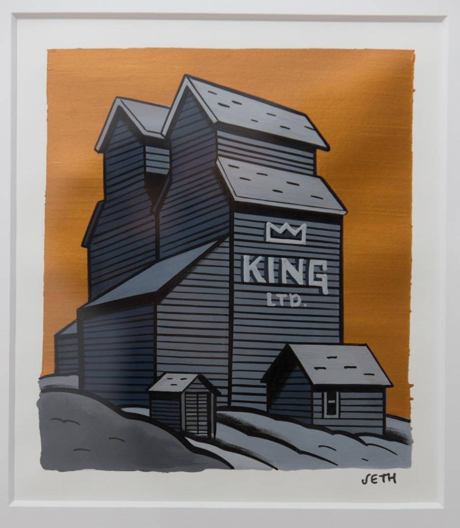
“Drab” originally meant something specific and neutral – undyed cloth, or its yellow-brown colour – before it soured into a term of abuse. Drabness, in that abstract pejorative form, came into the language during the 1880s, when Ontarians were filling their towns with the kinds of bland warehouses and civic buildings that Seth likes to paint.

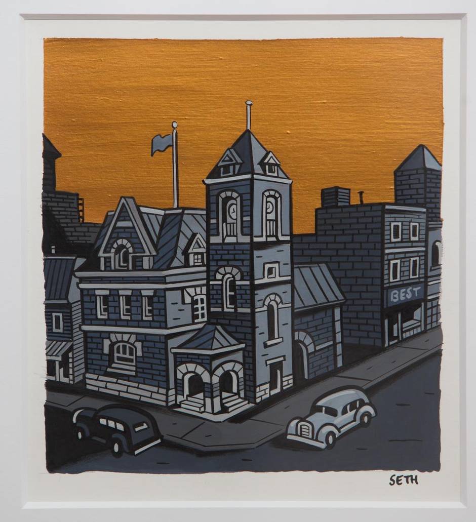
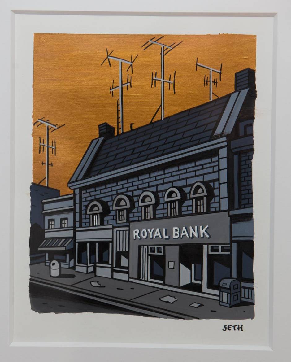
You can recognize his pictured buildings at a glance, not because they’re famous but because they’re so ordinary. The industrial blocks wear their dates and purposes on their fronts: Head Office, Storage No. 5, or 1920. The modest columns and domes of the civic buildings play out the last faint echoes of neoclassical grandeur. Everything looks static and abandoned, even when Seth paints 1950s automobiles parked out front.
“It has its roots in commercial forms,” Seth says of this imagery. “I have a beautiful little gouache painting in my house, of a warehouse, that was probably done for factory letterhead. You can see the crop marks on it, for where it was to be dropped photographically into some graphic design. It doesn’t look much different from these paintings, except it’s a little slicker. It’s got that iconic punch that mid-century postcards have, that are overprinted with flat colours. They have a drab and very otherworldly quality that’s super-appealing to me, a kind of frozen reality.”
Seth’s gouache and ink paintings on paper all look like grey-scale from a distance, except for the shiny ochre skies. Close-up, you can see subtle shades of purple, pale blue and pale green. Each painting has the firm black outlining and flat colours typical of cartooning, and every building sits smack in the middle of the paper. The images are all roughly page-sized and matted.

“In cartooning you always put the lines first, and colour things later,” Seth says. “In my sketchbooks, I tend to do the opposite, draw in a painting colour and then go in afterward with line[drawing]. It’s a way to break down the laborious, anal-retentive quality of cartooning, and it makes the drawings a little more spontaneous.”
It’s all drawing, in other words, but with different media and a reversed sequence of work. These paintings aren’t so much a new departure as another expression of a habitual process that Seth divides into three stages.
“I’m always doing three things,” he says. “I’m simplifying everything, removing the complexity of real life. I’m applying a kind of stylization that has come into my hand over 30 years of drawing, that places real things into a system of drawing. And ultimately, I’m turning them into abstractions. It’s not really a painting of a building, it’s more a symbol of a building.
“That’s the essential nature of cartooning, and it prevents most cartoonists from doing real drawing, where you’re actually looking,” he says. “I can’t return to any kind of naturalistic drawing, I know that.”
He used to resent the way adult comics were seen as a low-status form, but now says “that battle has been won.” Graphic narrators such as Art Spiegelman, Alison Bechdel, Chris Ware and Ben Katchor are feted as the imaginative storytellers they are, and their works sometimes shown in art galleries.
Seth’s touring Dominion show, of a miniature model city made from cardboard, just opened at the art gallery of the University of Lethbridge, and was curated by Andrew Hunter, now head curator of Canadian art at the Art Gallery of Ontario. Seth’s Dominion, a NFB documentary directed by animator Luc Chamberland, won the grand prize for animated features at this year’s Ottawa International Animation Festival. CO-MIX, a retrospective of Spiegelman’s comics work, opens at the AGO in December, after several months last year at the Vancouver Art Gallery.

Seth’s exhibition partner in Guelph is Ron Shuebrook, a veteran abstract painter and former president of the Ontario College of Art and Design University, where Seth studied when he was known only as Gregory Gallant. Renann Isaacs has interspersed Shuebrook’s charcoal drawings and lithographs with Seth’s paintings, and the dialogue they strike up is instructive. Both are involved with abstraction and the deliberately flattened surface. Both have to do with monumentalism, whether on the humble scale projected by Seth’s walk-ups, or in the massive spatial presence of Shuebrook’s giant black shapes and charged white spaces.
“For me, it’s the complexity of culture,” says Shuebrook, about this commingling of work from very different traditions. In the end, it’s all about expressing something on paper, whether in the “frozen reality” of Seth’s buildings or the dynamic arcs of Shuebrook’s abstracts.
Drawings in Black and White – Paintings in Gold, an exhibition of works by Seth, continues at Renann Isaacs Contemporary Art in Guelph through Dec. 24, concurrent with a show of drawings by Ron Shuebrook. Seth’s Dominion continues at the University of Lethbridge through Jan. 15. Shuebrook’s solo show of drawings at the Robert McLaughlin Gallery in Oshawa continues through Jan. 25.