I've probably written about energy 150 times in the past 200 workdays but a warning shot from ratings agency DBRS suggests that market focus is moving to domestic bank stocks, and not in a good way.
On Wednesday, DBRS downgraded its trend rating on credit issues for seven Canadian banks to "negative" from "stable" – the Big Six plus Desjardins Group – saying "anticipated changes in Canadian legislation and regulation mean that the potential for timely systemic support for these systemically important institutions is declining."
The change on its own doesn't matter much and Scotia Capital Research noted, "We don't expect any spread reaction from the move" which means they expect no market reaction to the news.
But Canadian investors are not used to seeing the word "negative" associated with domestic bank stocks and, with a broader perspective, the downgrade serves as a reminder that the business environment for the banks is deteriorating. Consumers are at least close to "tapped out" on credit, the interest rate environment makes profits on basic lending scarce and the growth of wealth management and institutional trading operations makes earnings more sensitive to market performance than ever before.
Banks are big, complicated, difficult-to-understand beasts even for the analysts paid handsomely to cover them. There's no reasonable way to summarize all of the drivers of bank profits so we'll have to go step by step to assess their investment methods relative to history.
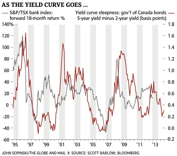
I'll start with the yield curve because it gets to the most basic bank function – borrowing funds (and paying interest) at short term interest rates and lending the funds to customers (and receiving interest payments) at higher, longer term rates. When the yield curve is steep – five-year government of Canada bond yields are much higher than two-year bond yields – banks make more profit.
The chart below compares yield curve steepness to the future performance of the S&P/TSX bank index. For example, the first data point for the red line shows that on May 31, 1995, the steepness of the yield curve – the difference in yield between two-year and five-year government bonds – was 35 basis points. The first data point for the grey line shows that the bank index generated a 65 per cent return in the 18 months following – between May 31, 1995 and Oct. 31, 1996.
The pattern for the majority of the chart is for a flattening yield curve followed by declining bank performance and a steepening curve indicating strong bank performance in the subsequent period. When the red line moves lower, for example, weaker bank stock performance is evident in the 18 months afterwards. The period from August, 2004, to October, 2006, is particularly notable. The rapidly flattening yield curve was, in hindsight, an omen for the financial crisis and weak returns.
The end of the chart highlights a sharply flattening yield curve beginning in December, of 2013, that suggests bank stocks will perform poorly in the coming months.
The yield curve is not a magic bullet with a perfect record of forecasting bank stock performance, but it is highly significant and a good first step in assessing the future for Canadian investors.