Or even 1889. The rich, tactile beauty of brocade and velvet keep coming back in fashion. After years of design austerity, Ellen Himelfarb writes, it’s a welcome jolt of luxury
One of the great paradoxes of 21st-century design – thus far, anyway – has been that the mark of a triumphant interior is the lack of anything overtly luxurious. The appreciation of Eames and Jean Prouvé has grown into an obsession with preservation, from scrapwood to quilts to teapots, and the sign of a successful business is a reclaimed wood table under a bare light bulb. All the better if the upholstery is cut from a burlap coffee sack and the palette is neutral to monochrome.
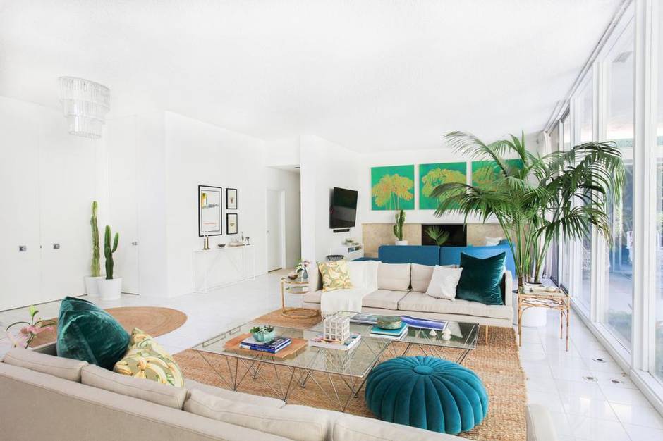
But if the slow creep of metallics, 1980s neon and velvet into our shops and our lives are any indication, people are tiring of austerity chic. And they’re rebelling against “understatement overload” with the most luxurious, tactile alternatives they can get their hands on: sofas covered in brocade, gold-threaded fabrics, braided trims. Chintz is coming back to curtains, tied with tassels the likes of which we haven’t seen since Dynasty was in its first run.
Like George Costanza on that rerun of Seinfeld, we want to drape ourselves in velvet. And while we’re at it, we’re letting some colour into the frame.

“There’s a backlash brewing against what I think of as ‘Frieze’ decor,” says Colette van den Thillart, Toronto-based creative director of NH Design, referencing the high-end art fair that just wrapped up in London.
“The public has been convinced white walls are the only way to display art. And, of course, we’ve been ‘beiged’ to death. When every chain store is sporting this look it becomes the antithesis of uplifting.” The upshot is what Orlando Soria, West Coast creative director of the by-the-hour design consultancy Homepolish, calls an ironic interest in ornate decor. “For so many years these traditional, rich fabrics were seen as stodgy, something your grandmother would have,” he says. “But these days people are more willing to accept these formerly outdated styles as something that can give their home more character, distinguish it from everyone else’s house.”
Boutiques from the top end to Pier 1 are getting into the spirit with cushions in saturated blues and clarets, embroidered tapestry textiles and wallpapers with robust peony bouquets. It’s like a tease of springtime in the doldrums of mid-autumn. And it’s not only a reaction to sepia-washed minimalism. There’s poverty-fatigue, too, a disenchantment with the “back to basics” trend. Consumer confidence is inching up and, with it, a desire to spend a little.

Hand in hand with spending power comes what van den Thillart reckons is an increased worldliness among Canadians, translated into design know-how. “We’re much savvier now, so exposed to authentic, complex and original design,” she says. “And we crave this originality and emotional investment in our homes.”
None too surprising – until you consider the decade fuelling the inspiration.
“Toronto in the 1980s was chockablock with pattern and colour,” says van den Thillart. “The backlash against this was enormous. Now it’s become apparent that any one direction quickly becomes dull. Mixing patterns and colours is much more intellectually elevating and emotionally inspiring.” To wit: Last year Jonathan Adler rolled out a canary-yellow brocade wallpaper with the emotional impact of a Zoloft cocktail.
“I call it ‘Palm Springs redux,’” says Soria of today’s tendency to bring eighties deco to what is trending elsewhere in design. “People have gotten tired of style being so rigid. We like to find beauty and quirk in the decades that preceded us.”

In perhaps his highest-profile project to date, the Los Angeles home of Canadian humorist Kelly Oxford, Soria added a rosette-shaped pouf in eighties teal and matching cushions to the mid-century-modern furnishings. In others he’s brought back pillow fringe and tassels.
However irrational it might sound, the new ornate fabrics placate our yearning for that bigger, bolder era in recent memory. But the motifs were by no means eighties-born – rather, to the manor born. The upmarket fabric and wallpaper purveyor Zoffany may have printed its first collections in 1983, answering the call for pastoral florals and toiles, yet the aesthetic was lifted from the stately homes of 18th-century England.
“Ever since the grand tours, paisleys and chintzes have been a staple in English design,” says Peter Gomez, Zoffany’s head of design. “The Victorians, the Arts and Crafts movement … they all adopted it into their interiors. The look lingered in heirlooms and hand-me-downs and in the 1980s it mixed together into an ‘English eclectic’ look.”

Today’s eighties luxe is no rehash of Chuck and Di mania for the Cambridge generation. Though Gomez is charged with reproducing chintzes and paisleys from the archives, he says contemporary digital printers are able to print with limitless colours, and have the ability to reproduce large-scale archival designs with no size restrictions. “Through modern technology we’ve managed to get closer to the original document,” he says. “In the eighties, everything came down in scale in order to be printed. Today we’re able to do much bigger, bolder prints.”
He’s seen them on fabrics as presumed-dead as chenille, which is poised for a major comeback, he warns.
For now, though, it’s velvet dominating trade shows, like the recent Decorex fair in London. With new digital printers able to go deeper into the pile, the colours are more saturated than their ancestors. “The amount of print I’ve seen on velvet is astounding – a real statement piece,” says Gomez.
“These designs tend to be quite grand in scale and fashion-led.”

Yes, fashion. If you haven’t noticed the grand suiting fabrics and ornamental formal wear coming out of the shops, you probably haven’t made it beyond your local Gap. The look seems to be staying put for the time being. Mary Katrantzou embroidered jewel-toned silks and tulles to within an inch of their lives at her Spring/Summer 2015 show, in innovative shapes that cut a modern swath through the most regal textiles. With her 2015 resort collection, she brought back chinoiserie, chintz and brocade to sporty silhouettes that we may yet see picked up in quilts and cushions.
Dolce & Gabbana introduced trimmed silk boleros and elaborate gemstone appliqués reminiscent of Christian Lacroix’s prime.
And lest we forget Kim Jones’s Autumn/Winter 2013 men’s wear for Louis Vuitton, cut from jacquards and a rather grotesque chintz designed by artists Jake and Dinos Chapman. It led a run of collections designed to out-Laura Ashley Laura Ashley – a U-turn from the shrunken suits and shapeless dresses of the post-recession years.
It’s about time, says everyone who’s been crouched over a light-therapy lamp since 2008. “The colour, the joy, the wit, the bravado. This is going to remind people how wonderful they look and feel in colour, but also make us smile,” says van den Thillart. “And when was the last time your interior made you smile?”