There’s no polite way to put this, but it’s true: Typography nerds – those lovers of all things lettering – tend to be huge snobs. They turn up their noses at poorly spaced or ill-conceived letters the way a wine aficionado might grimace at an off bouquet.
That’s not necessarily a bad thing – and it’s not just because they are fussier than the rest of us. It’s because they’ve obsessively studied the subject and appreciate the look of a perfectly proportioned typeface that is well balanced, properly set and evenly tracked. Beautiful type is like a symphony for the eyes, whereas fugly fonts (we’re looking at you, Staccato) are like daggers to the retina.
This discernment seems to be spreading beyond the world of graphic design. Despite the long-lamented death of the printed word, people seem more curious than ever about the physical form of our language, especially when it comes to accessorizing their living spaces. Words and letters have been elevated to an art form, gracing the interiors of our homes and offices, living rooms and lives like a fine painting or photograph. The writing, it seems, is now literally on the walls, but not always as intelligible text – sometimes it’s just a giant A or Z reclaimed from a vintage sign and recontextualized as a stylish objet. If incorporated with care, they look sharp and unexpected, even sexy.
It’s possible that our collective fascination with fonts is a direct result of computer programs like Microsoft Word. Seriously. When we were all trying to change the default from the ubiquitous Times New Roman, we pulled down the font tab and realized how many other options are out there, from Arial to Verdana.
More likely, though, it’s because type touches something that makes us uniquely human – the deep-seated need to communicate. After all, the roots of typography go way, way back – beyond the invention of the printing press in 1450 to cave drawings and quills and letters hammered into stone. Its history is codified in type itself.
The first mechanized typeface, for example, was Johannes Gutenberg’s Blackletter. It was based on the calligraphy that monks used when they had to hand-copy the Bible. But because the ornate, Gothic letters were hard to read when passed through the presses, it was soon supplanted by something even older – so-called Roman type. It was developed by a French designer named Nicolas Jenson in the 15th century but was inspired by the chiselled letters common on ancient Roman buildings (it still forms the basis of many popular fonts today, including Garamond and Cambria).
That’s not to say that typography hasn’t evolved. Roderick Grant, the chair of graphic design at OCAD University in Toronto, suggests that one of the reasons typography is an interesting field of study is that it is constantly changing. “It’s like architecture,” he says. “I can’t imagine anyone saying we don’t need any new building designs. Because of evolving needs and technologies and cultures, there will always be a need for new expressions.”
For example, the rise of advertising in the 19th century had a huge influence on typography. Before then, serifs – letters with little line strokes at the tops, bottoms and sides – were standard and everywhere. The dashes were practical, helping with legibility by guiding the eye. But advertisers wanted to pack as much text as possible into a playbill or poster, meaning those space-consuming dashes had to go. So a second major family of fonts, sans serif, was invented (including frill-free Helvetica, which was fi rst crafted in 1957 and is still used for wide array of corporate logos, including American Airlines, Crate and Barrel, American Apparel and The North Face).
Not that serif versus sans serif fonts is the ultimate deciding factor for some people’s typeface preferences, especially when it comes to incorporating text elements in interiors. According to Christine Flynn, the choice can be a lot more intimate. Flynn runs Love the Design, an art gallery and vintage store in Toronto’s Rosedale neighbourhood. Oversized letters and numbers from disused industrial neon signs are among her most popular items. She has a notebook full of requests that she carries around on her buying trips, listing all the errant Ms and Rs and Qs people want to decorate their walls with.
“People don’t necessarily care if they get a serif,” she explains. Instead, they are looking for something “quite personal. It could be the initial of someone’s name or a lucky number.” Something that, through type, expresses their identity.
That expressivity is something that Ian Brignell has spent a lot of time considering. He’s a top Canadian graphic designer and true type artist. He has worked for major brands like Bell Canada and Harvard University. He often has to distill the complex, abstract ideals of his clients – things like trustworthiness and dependability – into a few letters.
“I do it through a number of a ways,” he points out. “Curves and flourishes tend to connote lightness and femininity. Dense and dark has a sense of urgency. Rounded forms tend to be friendly.”
Good points to consider the next time you’re on the hunt for a character with character to add to your own wall.
Punctuation Marks
Aiming for a room with boldface drama? Offset graphic black-and-white elements with a hit of primary red or blue.
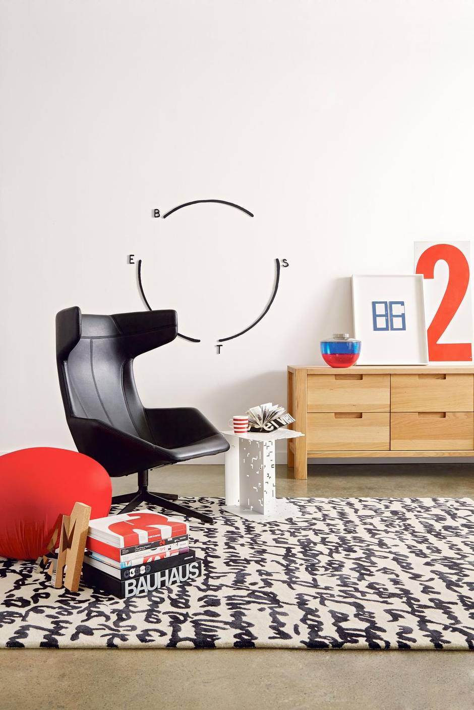
Take a Line for a Walk chair by Moroso, $4,799 at Klaus (www.klausn.com). Shibuya vase by Kartell (on credenza), $216, Hollywood ottoman by Bonaldo, $900 at Suite 22 (www.suite22.ca). Manuscript carpet by Nani Marquina, $3,682, Digitable by B&B Italia, $1,700 at Kiosk (www.kioskdesign.ca). Cork letter A (next to books on floor), $49 at BoConcept (www.boconcept.ca). Harvest double dresser, $1,199, Tasaraita mug by Marimekko, $20 at EQ3 (www.eq3.com). Number 2, $85 at Love the Design (www.lovethedesign.com). Micah Lexier’s Diagram Sculpture (BEST) (2013) and Things Exist 23 (2011), price on request at Birch Contemporary (www.birchcontemporary.com). All books throughout provided by Swipe (www.swipe.com).
Five alive
They’ve got your number: These days, sign manufacturers that usually create pieces for retailers and restaurants will often supply custom letters and numbers on request.
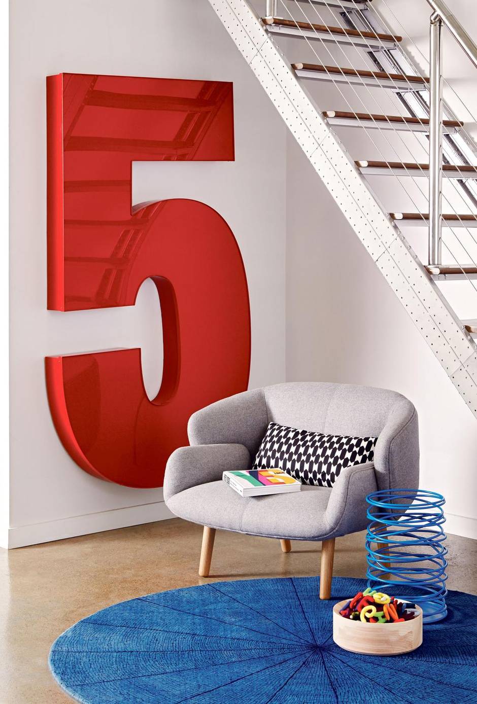
Nendo chair, $3,650 at BoConcept (www.boconcept.ca). Number 5, price varies depending on size and material at Channel Letter Depot (www.channelletterdepot.com). Hay Felt Letters (in bowl on floor), $5 each at Klaus (www.klausn.com). Loony basket by Herve Van der Straeten, $410, Coupe bowl by Michael Verheyden, $420 at Avenue Road (www.avenue-road.com). Blue hand-woven rug, $2,450 at Julien Armand (www.julienarmand.com).
Winging it
Salvaged elements such as the silver model-airplane part perched behind the desk above often incorporate retro typefaces. Scour vintage-furniture shops for similarly graphic accents.
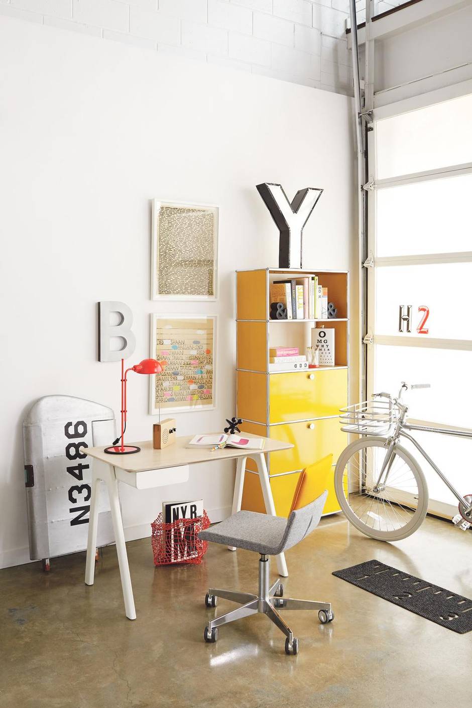
Desk lamp by Marset Funiculi, $388 at Lightform (www.lightform.ca). Stash desk, $479, rug, $65 at Urban Mode (www.urbanmode.com). Model-airplane wing, $395, letter Y, $115, plastic H and 2, $2 each at Queen West Antique Centre (www.qwac.ca). Eye-chart flask by Wild Eye Design, $34, cardboard radio by Suck UK, $48 at Bergo (www.bergo.ca). Letter B, $89 at Absolutely Inc. (www.absolutelyinc.com). Flexket basket, $67.95 at Swipe (www.swipe.com). Custom configuration unit by USM, $2,571, Regard men’s bicycle by Martone, $1,460 at Avenue Road (www.avenue-road.com). Office chair by Gispen, starting at $650 at Julien Armand (www.julienarmand.com). Framed Untitled gouache-on-paper works (2012) by Shaan Syed, $1,800 each at Birch Contemporary (www.birchcontemporary.com).
Feeling font
A feature wall papered with a typeface print is an easy way to mix serif and sans serif styles.
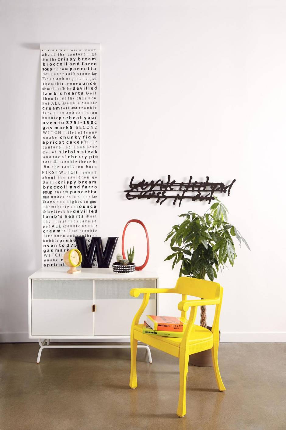
RAW lounge chair by Muuto, $1,579 at RADform (www.radform.com). Tracy Kendall wallpaper, price on request at Hollace Cluny (www.hollacecluny.ca). Anisha lamp by Foscarini, $833 at Kiosk (www.kioskdesign.ca). Smartville clock, $119 at BoConcept (www.boconcept.ca). Siirtolapuutarha bowl by Marimekko, $59 at EQ3 (www.EQ3.com). Dang media console, $1,079 at Urban Mode (www.urbanmode.com). Letter W, $40 at Love the Design (www.lovethedesign.com). Two actions #7 (2002) by Micah Lexier, price on request at Birch Contemporary (www.birchcontemporary.com).
This story originally appeared in the September 2014 issue of Globe Style Advisor. To download the magazine's free iPad app, visit tgam.ca/styleadvisor.