As she prepares to move out of the apartment she has lived in for 31 years, Louise Fili says she has been sifting through visual and historic reference materials that date back over four decades of her varied career. The respected art director and graphic designer (Print magazine dubbed her one of “the women who saved New York”) has been a laureate of the Art Directors Club Hall of Fame since 2004, alongside Saul Bass, Massimo Vignelli and Norman Rockwell.”
“We moved in before the home computer,” Fili says from her studio in New York. “Now you don’t need dictionaries, atlases, albums of photographs, so many things. Everything just gets put on a drive.”
To upgrade the grainy snapshots and 35mm slides that document years of inspiration-seeking trips, and share one of her major sources of inspiration, Fili recently returned to Italy and systematically rephotographed the historic signage for posterity – this time with better equipment. The inspiring collection is now assembled as Grafica Della Strada, equal parts coffee table book and reference tome.
Fili has shared her personal inspiration in book projects before, including several on historic design and typography with husband Steven Heller, a former art director at The New York Times. Fili, now 63, has also been the art director of Pantheon Books, where over the course of 11 years she created more than 2,000 indelible covers, such as Camille Paglia’s Sexual Personae and the ethereal, elegant American edition of The Lover by Marguerite Duras. As one critic put it, Fili’s style may be retro-centric but it is no mere pastiche: The inspiration from vintage elements instead builds on design history to create work that’s fresh and resonant.

The Italian-American from New Jersey has been an admitted Italophile since a family trip to the old country, when she first spotted a blue art nouveau-style billboard for Baci Perugina chocolates. “They’re so creative,” Fili explains of the eclectic, curvaceous letter forms of Italian vernacular signage. “They make up these fonts and type treatments you would never see again!” In Europe, trends in graphic design cycle more slowly and exterior signage in Italy in particular is proudly preserved as cultural heritage (Fili did a count of how many signs from her past inspiration photos in Italy remain and it came in at about 85 per cent). “Here [in America] we just have so much, and everybody is trying to out-shout each other.”

“The designs needed to have a mnemonic allure and instant recognition, as though they were logos,” Fili writes of book design in Elegantissima, the 2012 book that collects her career highlights. Its contents were all-too-briefly mounted as an immersive exhibition at the Art Directors Club of New York earlier this fall.
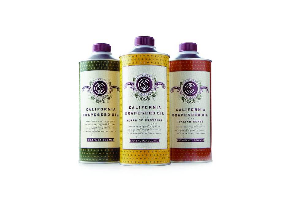
The exhibition of four elaborate rooms underlines how product design is a door into a fully-formed universe, whether she is conjuring it by way of a book jacket or through a food product. One memorable project is the Jean-Georges Vongerichten’s Californian grape seed oil tins; designed for distributor Williams-Sonoma, the printed metal unites French and Californian sensibilities by using a West Coast colour palette on a traditional Provençal motif.

“For me it’s all very personal, and I just try to humanize it as much as possible,” she admits, “I am creating a backstory.” A simple object such as a Tate’s cookie carton contains narrative context – real or imagined. It’s like Wes Anderson’s cinematic universe, where the distinctive pink and blue of the fictional Mendl’s bakery box in The Grand Budapest Hotel suggests and the world it comes from. “His [graphic design] is a major part of his films, of his world.”
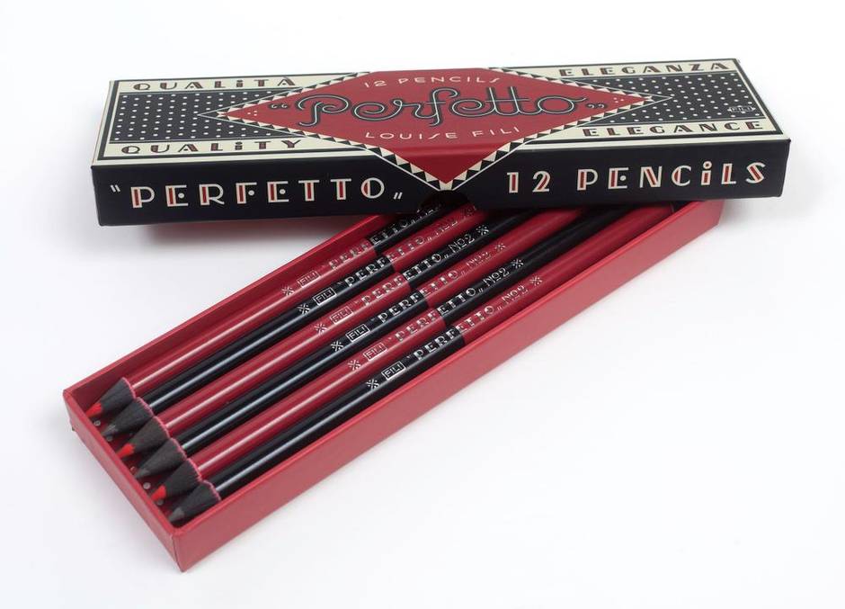
Now after nearly 40 years as a designer of packaging, Fili is creating what’s inside. Her foray is a capsule collection of – what else – Italian-themed greeting cards and other items for Princeton Architectural Press’s new gift line. “I showed them all the Italian pencil boxes that I’ve been collecting over the years,” says the designer, who still prefers to sketch ideas by hand. “I do love a nice No. 2 pencil.”
That enthusiasm became Perfetto, a set of double-ended pencils with red and black lead, and Tutti Frutti which are double-edged colouring pencils, each dozen housed in decorative boxes whose design could be mistaken for a heritage brand. “My work and inspiration are interspersed,” Fili says. “I like it when people can’t really tell the difference between what I’ve done, and what was done in 1930.”
The pencils are an especially apt expression of Fili’s aesthetic, because of the gracious packaging and the philosophy they embody. With apologies to Forrest Gump, life is a box of pencils.
“I think everybody is craving that analog, just like everyone craves letterpress because there’s nothing tactile any more.”
Not that digital direction of visual culture and information doesn’t has its advantages but, like the pencils, “it’s double-edged.”
“In many ways Instagram is wonderful, because everybody has access to everything,” Fili says. “But everybody is just appropriating everything, finding things on Pinterest they don’t know where they came from or thinking it’s old and they can copy it, and it’s not.” For a graphic designer to find his or her own voice, “they must step away from their computer. Precisely because everybody has access to all the same stuff.”

“That’s why I recommend going to Italy to photograph signs, or finding your own inspiration that isn’t necessarily coming from a computer monitor. The three-dimensional world. It’s also much more exciting to make the discoveries on your own rather than just take everybody else’s discoveries and say here it all is, in one single hashtag.”
For its centenary, Fili updated Good Housekeeping’s iconic oval Seal of Approval. Its iterations throughout the century reflect decades of graphic design fads, but her goal was to return it to its roots and make it look authentic and timeless. “They unveiled the new logo alongside the original 1909 one on The Today Show,” Fili recalls, “and by mistake they reversed them. I took that as a compliment.”