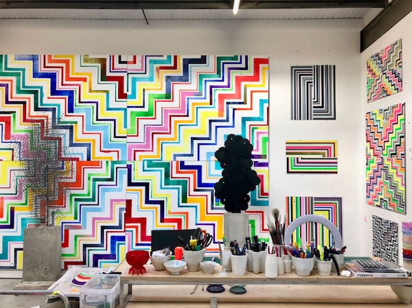
The London studio of writer and artist David Batchelor is exuberantly colourful and challenges the notion that contemporary art has to be grey, white or black to be taken seriously.Handout
In early January, my husband and I were sitting in our living room when he said, “This room is really boring.” I looked around – beige sofa, ivory carpet, tan chairs, grey sofa – and I realized he was right. The overall effect of the “quiet luxury” interior design trend I had tried to emulate was soothing but it was also decidedly dull.
We set out to find a carpet that would bring a little life into the room. A salesclerk pointed to a 10- by 12-foot carpet hanging on the wall. Geometric in design, it had swirls of colour ranging from dusty blue to burnt umber, smoky grey and topaz.
We were told we could trial it for 24 hours, so we lugged it home and laid it out. It was bold. It was busy. I liked it, but was still afraid to spend so much money on something that was, well, so different. I polled friends, sending before and after pics. Every person – except one – advised us to play it safe and stick with the neutrals.
Regardless, we bought the wild and wonderful carpet and have no regrets. It brings us joy, and even the naysayers who poohed-poohed it agree our living room – once so demure (a.k.a. bland) – has way more personality.
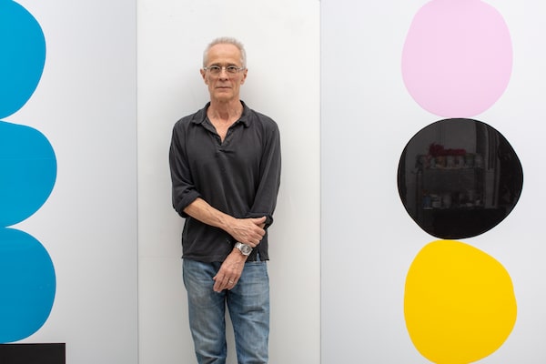
Batchelor in his studio, in May 2019. Batchelor makes the argument in his book Chromophobia that our fear of colour can be traced back to the early 1800s when Goethe’s Theory of Colours maintained that bright colours were suited to children and animals, not adults.Lucy Dawkins/Handout
My fear of colour made me wonder what that said about me and the legion of others who have spent the past few decades embracing all things Greige, so that, in the end, all our homes look more or less the same. David Batchelor, an artist and writer who lives in London, thinks he knows why so many of us lean this way. “We are a society of chromophobes,” he says.
In his book, aptly titled Chromophobia, Batchelor makes the argument that our fear of colour can be traced back to the early 1800s when Goethe’s Theory of Colours maintained that bright colours were suited to children and animals, not sophisticated adults. This view, he adds, has been shared by great artists and thinkers throughout history “from Aristotle and Plato to Le Corbusier, who called for all surfaces to be painted white in his 1925 manifesto, The Decorative Art of Today.”
Needless to say, Batchelor’s own artwork – sculpture, drawing, large-scale installations that have been exhibited throughout the U.K., Asia and elsewhere – is exuberantly colourful, challenging the notion that contemporary art has to be grey, white or black to be taken seriously.
American author and designer Ingrid Fetell Lee is another champion of colour, which she, too, feels has been unfairly maligned. “If you look at joyful things the world over, colour is always at the heart of it,” says the author of Joyful: The Surprising Power of Ordinary Things to Create Extraordinary Happiness. “You never see celebrations or festivals in muted shades of grey or browns. They are vivid reds, oranges and yellows. Children use bright colours when they are representing happy or joyous scenes. And the most colourful foods – the ones bursting with antioxidants – are healthiest for us.”
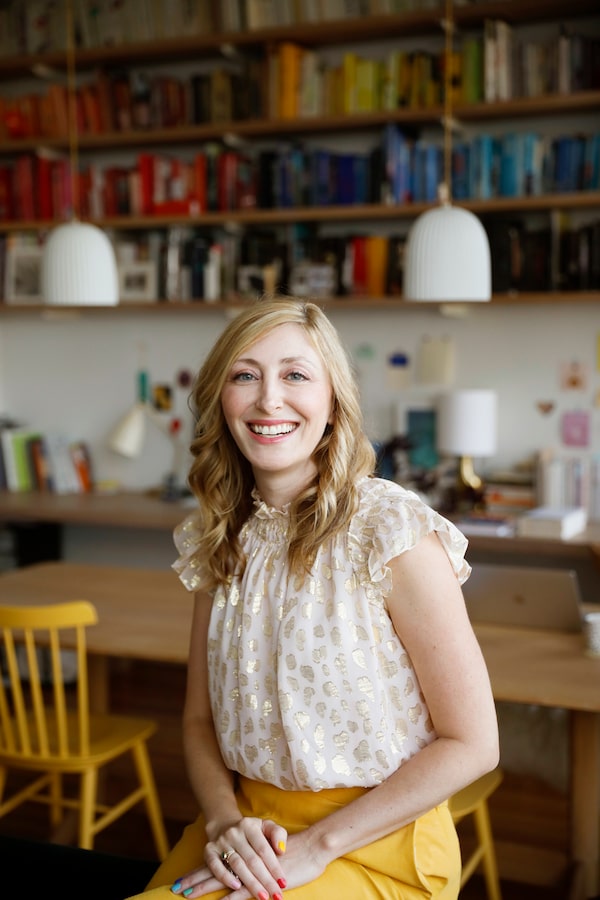
Author and designer Ingrid Fetell Lee champions the use of colour in her work.Handout
A world without colour would be sterile, devoid of individuality or any self-expression, says Fetell Lee. And yet, many of us are afraid to experiment with it. “I never really thought about where our fear of colour comes from until I saw a 2015 study in the U.K. by Dulux, the paint company, that found more than half of Britons would like to use more colour in their lives but were worried about the opinions of friends and family.”
Colour can be intimidating, explains Fetell Lee, who lives in East Hampton, N.Y. “Many people are afraid of getting colour ‘wrong,’ ” she says. “It’s safer to stick with greys and neutrals rather than risk ‘making a mistake’ with a bright hue.”
The mid-2010s is when we started drifting toward all things Greige. “We may have started to reach for safe, mid-range colours as a reaction to the overstimulation from all of our devices,” says Fetell Lee. “Our worlds seemed too busy and overcluttered so we sought to soothe ourselves with calm interiors. We didn’t want our homes to energize us.”
The rise of Instagram and other social media also played a role. Seeing images of the homes of the rich and famous – mostly decorated in neutrals – we aspired to mimic that. “There definitely were moral overtones to the ‘Greige’ movement,” Fetell Lee adds. “If you were able to keep a minimalist aesthetic, you were better than the rest of us.”
However, this anodyne aesthetic finally lost some of its power over us when the pandemic hit. With most of us stuck in our subdued and understated homes, we realized we desperately needed some colour to boost our spirits, says Sharon Grech, Toronto-based spokesperson for the paint company Benjamin Moore & Co. Unable to venture far, we reached for green and blue paint, “anything to remind us of the outdoors and happy times.”
Instagram and other social media played a role in bringing colour back to the fore in design,Handout
The blanket of grey and beige started to lift. And in 2022, Benjamin Moore highlighted the trend, choosing October Mist (a green) as its colour of the year. In 2023, it picked Raspberry Blush, and in 2024, its colour of the year is Blue Nova, a cross between violet and blue. “People are choosing to celebrate colour again, not always in dramatic, over-the-top ways, but it’s definitely coming back,” says Grech. Her own home reflects the shift. She recently painted her kitchen cabinets Ashwood Moss and her home office is a blue/green called Tranquility.
Xanthe Wells, vice-president of global creative for the image-sharing app Pinterest, says her company also started noticing an explosion of colour on social media in fashion, beauty and home decor in the past two to three years. This year, the Pinterest Palette was released for the first time featuring five retro and fun hues, which it identified as trending based on searches, called gummy pink, moss green, mocha brown, desert orange and aqua blue. “People are getting braver,” says Wells. “They want to surround themselves with colours that inspire levity. We’ve all been greyed out.”
She believes Gen Zs deserve the credit for bringing colour back. “A generational unlock has happened and this demographic considers themselves creative to the core,” Wells says. “They’re less concerned with judgment. They’re plucking inspiration from many different sources to create their identity. And they do not want everything to be homogenous. They aren’t afraid to stand out and be noticed.”
Xanthe Wells, vice-president of global creative for Pinterest, says Gen Z deserves the credit for helping to bring colour back.Handout
Red Barrinuevo, a property stylist and owner of Redesign4More in Toronto, says almost every space he worked on before the pandemic was variations on white, beige and grey – “and looked like nobody lived there.” Now, his clients are asking for “pops of colour” – specifically dark greens, fuchsias, pinks and jewel tones. “Wallpaper in vintage patterns and vibrant shades are huge. And I’m also seeing colour in kitchen and bathroom tiles.”
In the era of house-flipping, Barrinuevo says it made sense for owners to stick with non-offensive neutrals, which he adds “are not going anywhere. They’re still extremely popular.”
“But now people are staying put in their homes much longer, and they’re opting to make their spaces more personalized and far more eclectic.” His dining room, for example, is wallpapered blue and gold, with chairs upholstered in a rich chartreuse. “It definitely makes an impact,” he chuckles.
Fetell Lee says one good thing to come out of the pandemic is that many of us have learned to appreciate the importance of finding joy in the here and now. Colour, she believes, is a simple way to do that. “When you look at climate change, at the political instability in the world … it’s no wonder that people – especially young people – are shifting their attention to a happy mindset,” she explains. “Now people are saying, I don’t know what the future holds, so I need to find joy in the moment. If that means an orange sofa, a purple rug or a bright yellow fridge, I’m not holding back any more.”
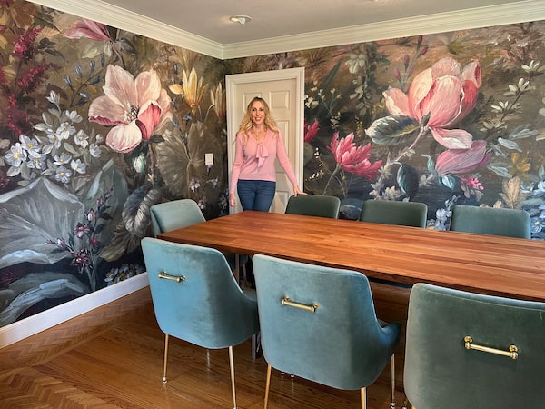
Pinterest’s Wells, who recently went through a divorce, has embraced the same philosophy. “My dining room used to be white and grey, stark and boring. My kids never wanted to go in there. I decided to create a room that I would love personally so I wallpapered it in giant, bright, beautiful flowers. Now my kids and I eat in there all the time.” Her bedroom is going to be next. It will be pink.
“Adding colour to our home has made us all happier. It’s been liberating.”
 Gayle MacDonald