Architecture
Devil's Glen
It all started with the site. The owners of Devil’s Glen, so named for its proximity to a provincial park of the same name on Ontario’s Bruce Peninsula, had a condo in Toronto but dreamed of spending more time in the wilderness. When they found land with water views and close proximity to hiking and rock climbing, they contacted Toronto-based StudioAC (Studio for Architecture and Collaboration), whose principals felt an immediate connection to the clients’ vision.

StudioAC, clockwise from top left: Andrew Hill, Jennifer Kudlats, Mo Soroor, Yu Chu Su, Sarah Reid and Ryan Beecroft.HANDOUT/Handout
“They had an ethic about ecology and restraint that aligned with ours. We knew we would get to do something raw and essential,” principals Jennifer Kudlats and Andrew Hill said in a joint statement.
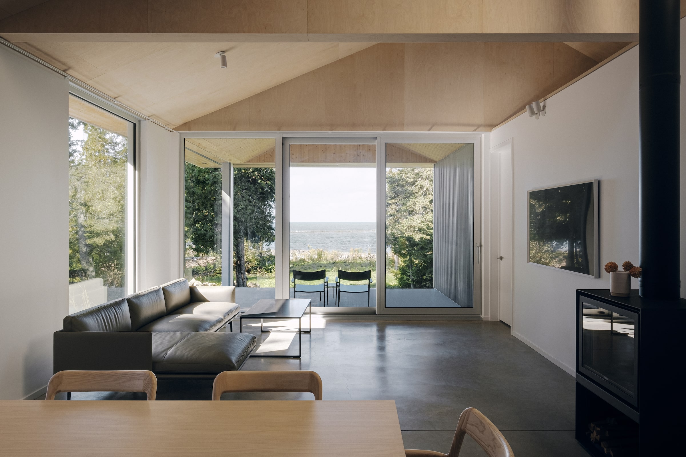
StudioAC fixated on the 1,500-square-foot home’s site; their sketches show a methodical plotting of the sun’s movement over the roof and skylights throughout the day. “It happens on every project, whether it’s a view, the organization of spaces, or the way the light comes in – those fixations shape the story and frame the answer to every question,” Kudlats and Hill said.
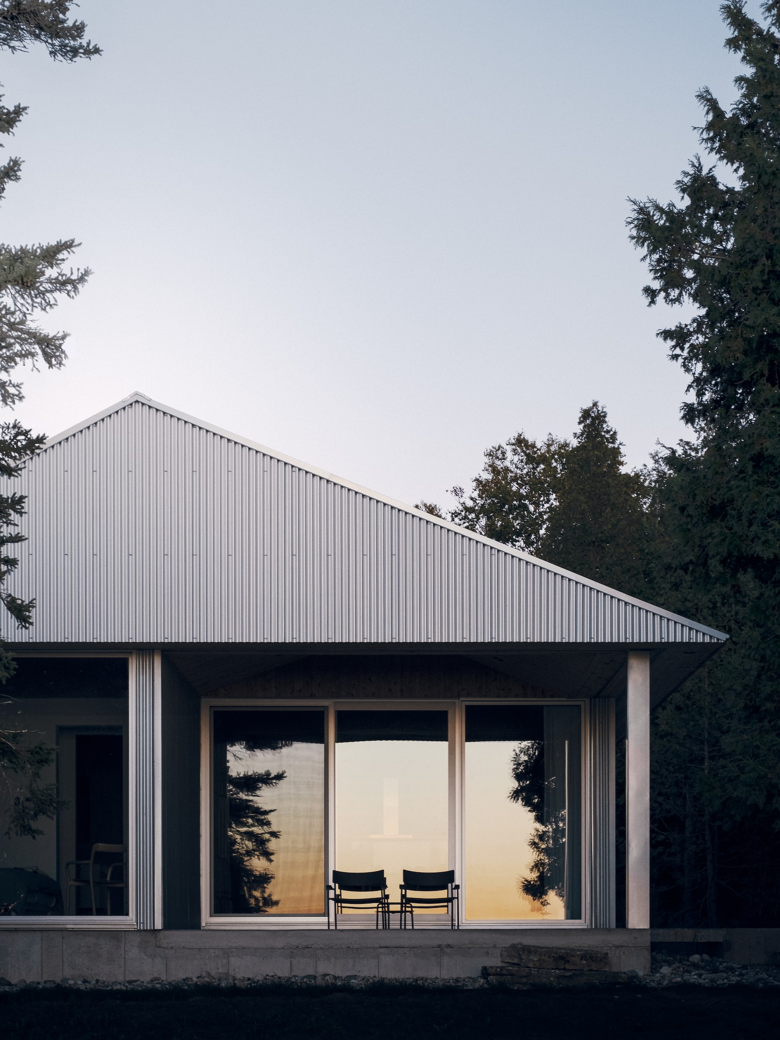
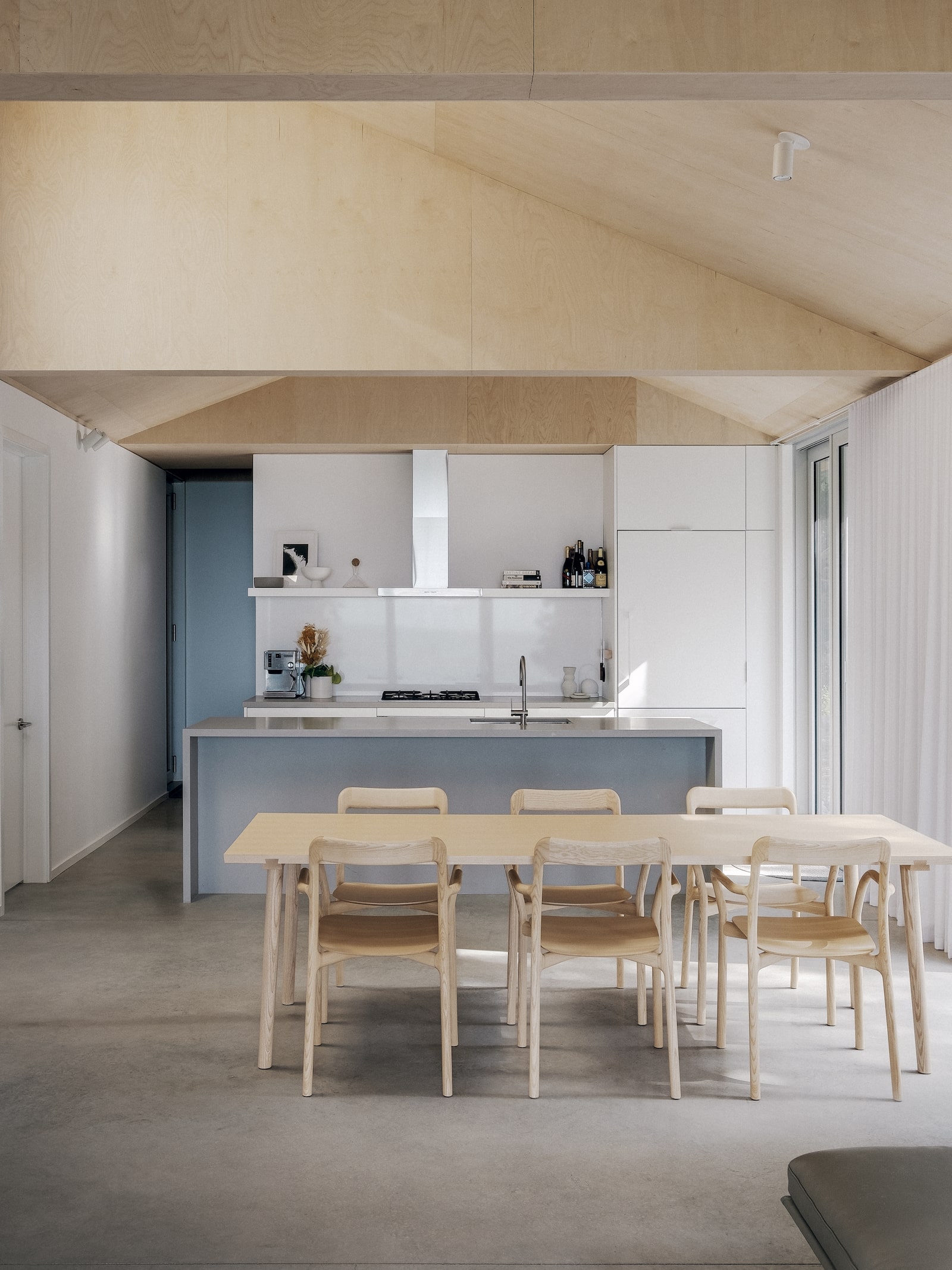
The home is organized in two offset but attached rectangular spaces: one for living and the other for sleeping. A striking exterior was fashioned from galvanized steel meant to withstand the weather. Inside, simplicity reigns in the form of plywood-clad ceilings, painted plywood walls and minimal decoration. One of the standout features is a stargazing platform made from hammock-like netting and tucked into an exposed loft area.
“This project is a strong example of creating a space with a clear architectural idea, but one that’s also utilitarian in a way,” Kudlats and Hill said. “The materials aren’t superfancy, so we were able to build something beautiful but still quite affordable.”

Broadhurst & Whitaker Block

Harley Grusko and Marianne Amodio of MA+HG Architects.Janis Nicolay/Handout
Tackling the restoration of one of the oldest commercial and residential buildings in Vancouver was a challenge that Marianne Amodio, principal of MA+HG Architects, relished. “It’s a joy to breathe new life into heritage buildings,” she says. “Especially ones that have great bones.”
Situated on Vancouver’s eclectic Commercial Street, the mixed-use building had been abandoned since 2010. Amodio says the developer, Hudson Projects, approached the firm with several ambitious goals: return the building to its original stature on the street; modernize the existing retail and living spaces within; add four new rental units above the heritage building; and create an infill building with 10 rental units on the property behind.
“We knew the infill building should be contemporary, so as not to take away from the heritage aspect of the original,” Amodio says. “So, we came up with a similar visual language and colouration to allow them to play off each other.”
Working with heritage consultant Donald Luxton & Associates, Amodio and partner Harley Grusko endeavoured to keep much of the original clapboard siding, refurbish or replicate the decorative parapet and trims, and select colours sensitive to the building’s age. Their work was recently honoured by both the city and the province of British Columbia for excellence in conservation.
“Densification in our cities is needed, but there’s so much sensitivity around it,” Amodio says. “Heritage restorations are a lovely exchange because you’re saying to the public, we all value the narrative of this building – and we can still densify in a way that’s sensitive and small.”
Blong House

Shane Laptiste and Tura Cousins Wilson of SOCA.Richard MacNeil/Handout
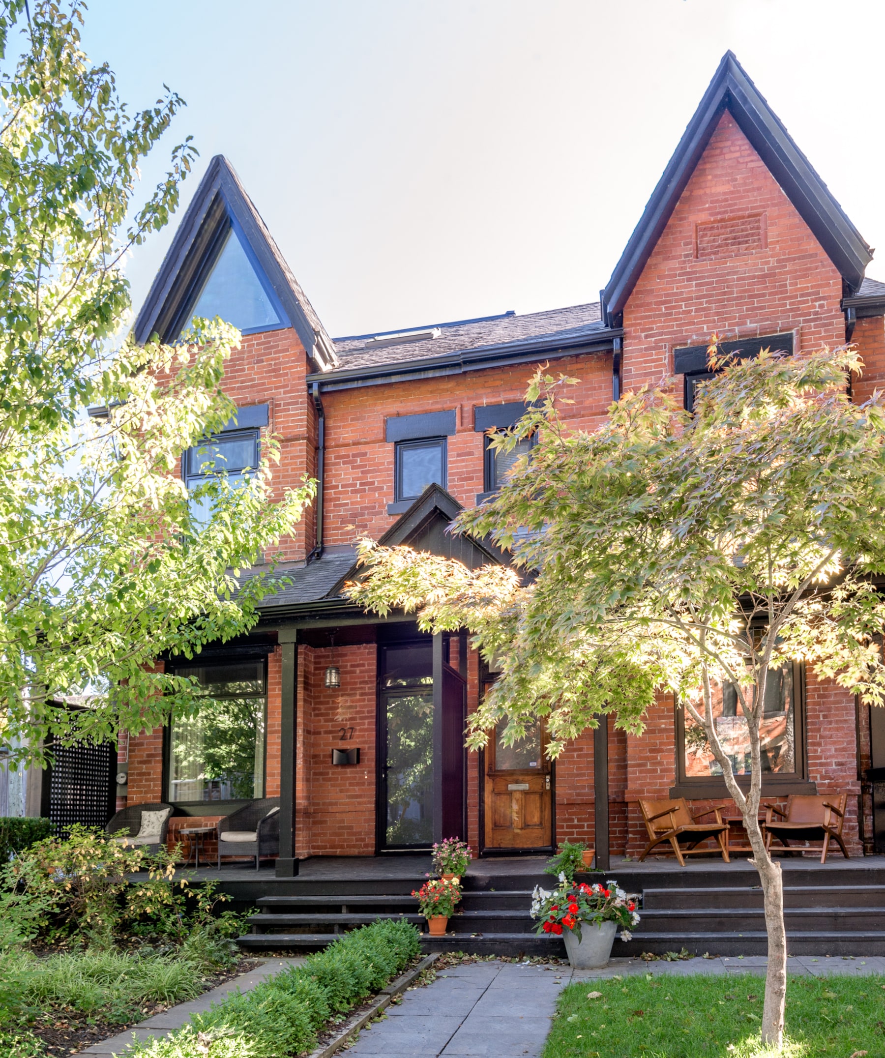
In Toronto’s east end, where the residential streets are lined with semi-detached houses, it’s common to see uncomfortable pairings that don’t maintain a unified facade.
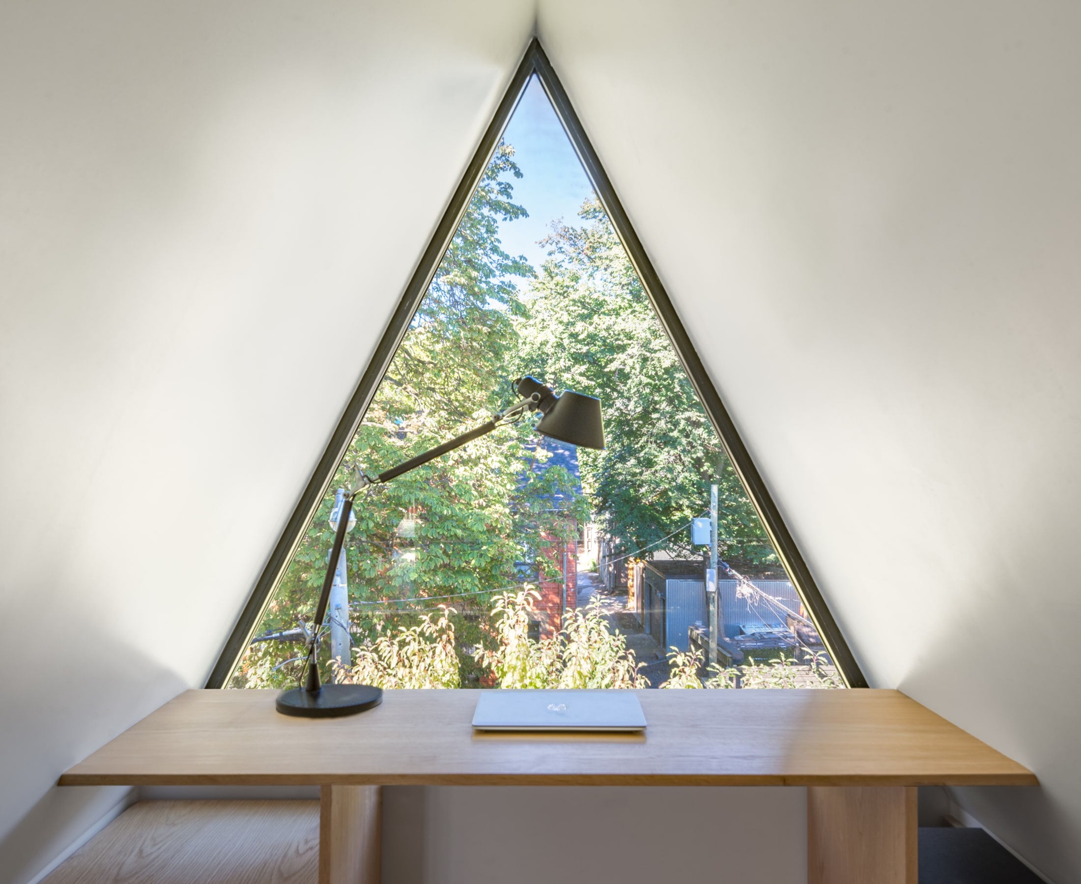
Not so with this Victorian brick home, thanks to Tura Cousins Wilson and Shane Laptiste of Toronto-based SOCA (Studio of Contemporary Architecture). Apart from a sleek, triangular window in the top gable, there’s little hint about the contemporary space within.
“I hate it when people renovate an era house with no respect to the neighbour,” says project lead Cousins Wilson. “It was important to us and our clients to maintain the porch and roof lines in keeping with the character on both sides.”
Craving more from their 15-foot-wide home, the owners approached SOCA with a singular idea – annexing a third-floor attic to create a primary suite – that soon blossomed into a full renovation. “It often doesn’t make sense to do piecemeal renovations,” Cousins Wilson says. “While you’re opening things up to insulate, soundproof and level, you may as well reconfigure and maximize your space.”
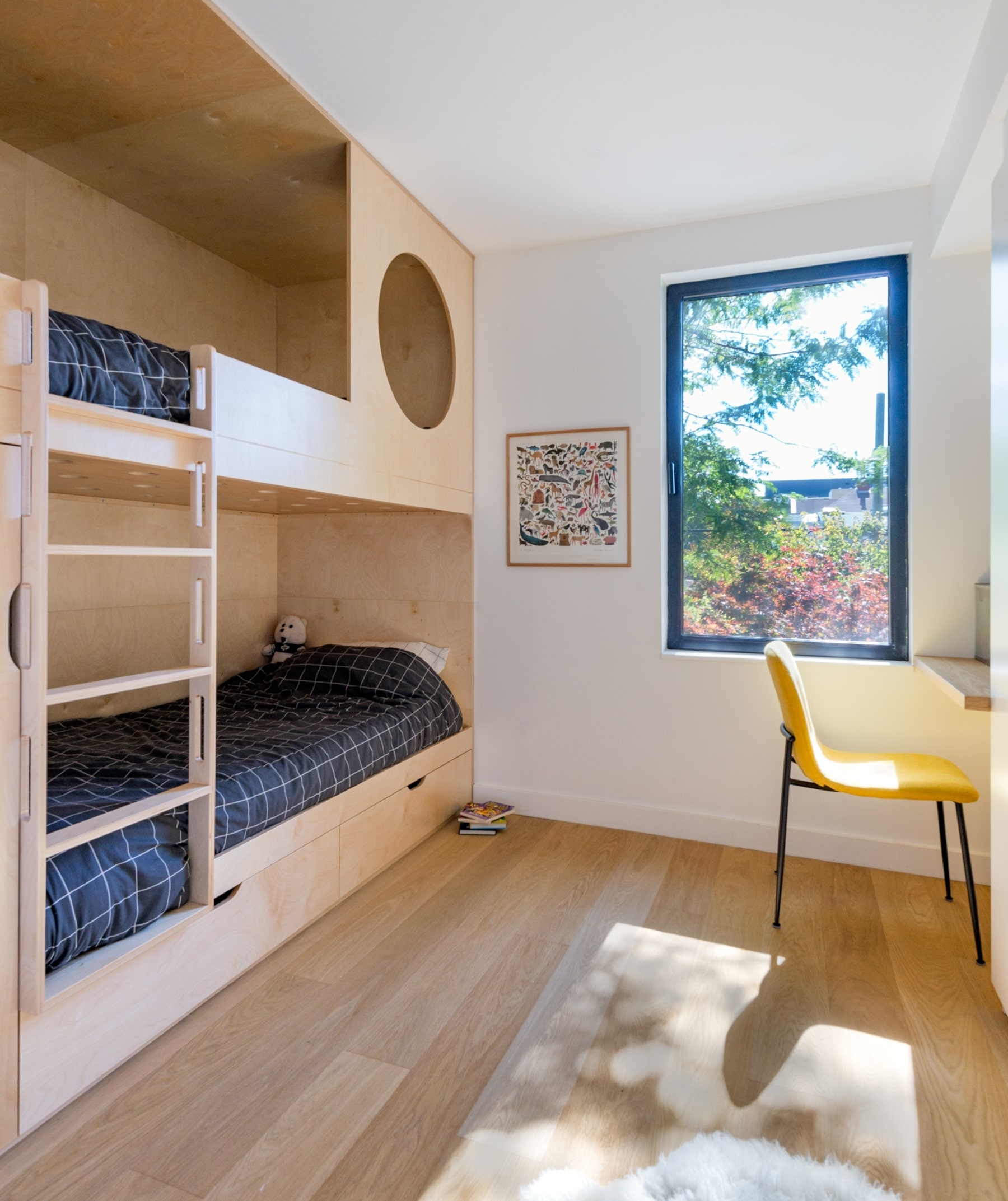
He proposed raising the roof at the back of the home and adding a walkout patio, placing both children’s bedrooms on the second floor with a family/guest room in-between, and opening up the main floor with a staircase clad in white oak as a visual punctuation mark.
The use of the oak throughout the home – from the slats on the kitchen island to the built-in bunk beds, and the desk under the third-floor gable window – creates a cohesive journey across all storeys.
“The owners expressed a desire for a contemporary house with clean lines and minimal details, but to have it feel warm,” Cousins Wilson says of the choice.
Interiors

City Condo
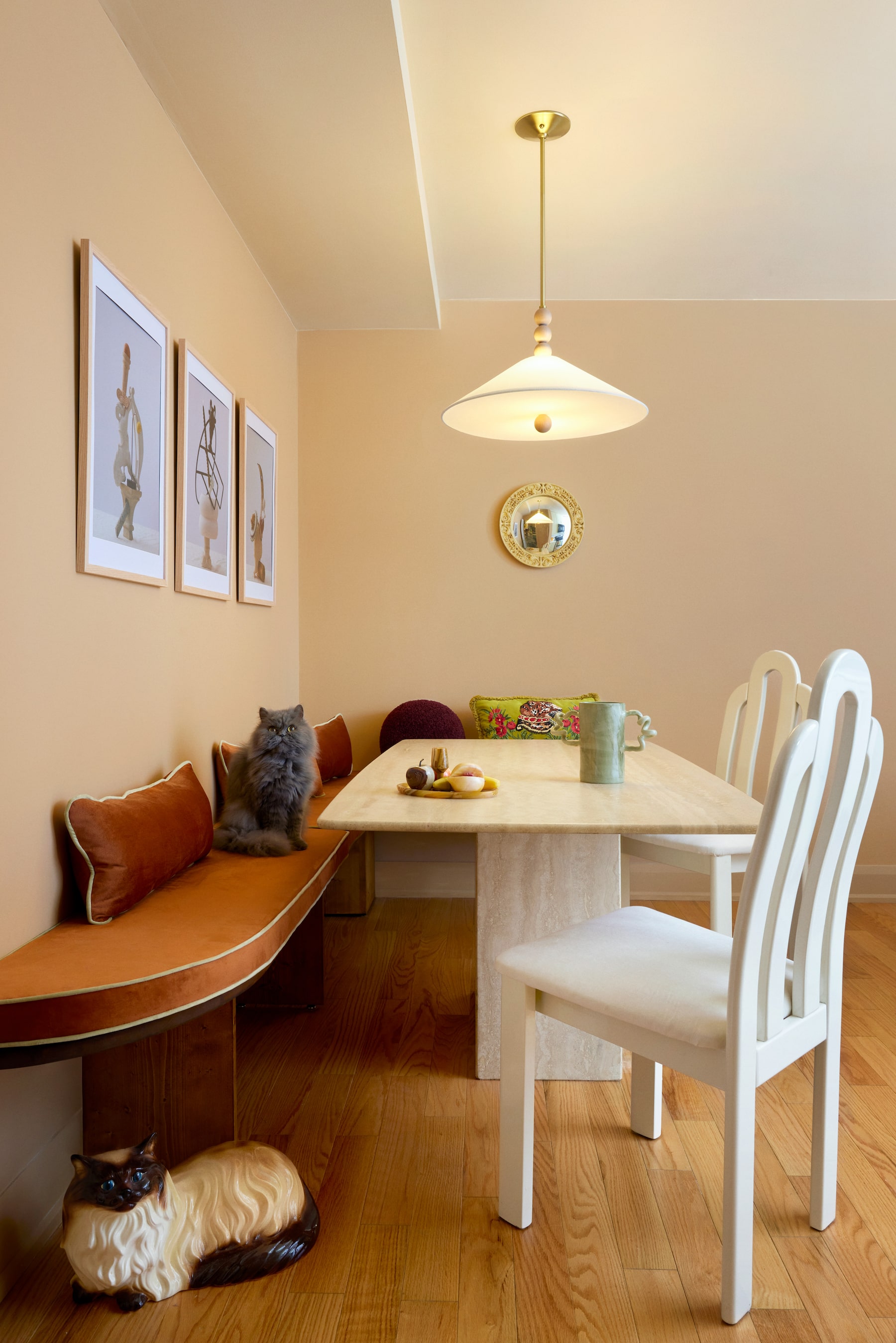
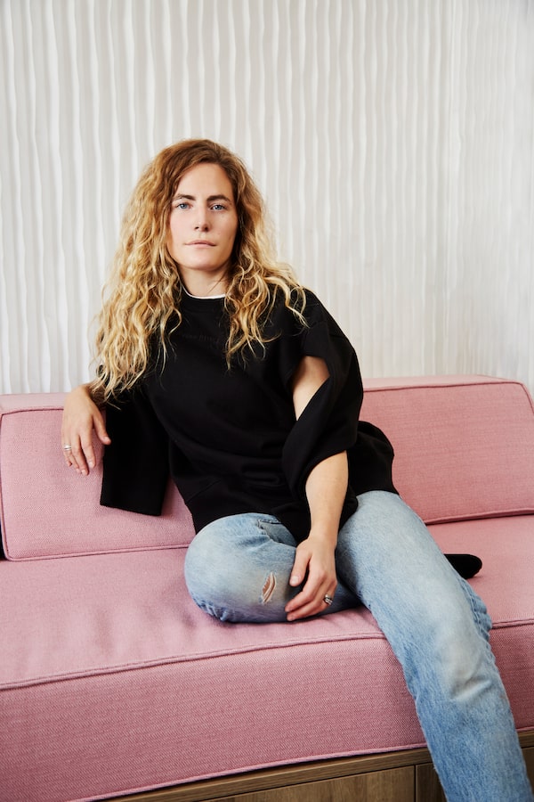
On Instagram, Chad Burton calls himself a “curated hoarder.” But when it comes to describing the 900-square-foot Toronto condo he shares with his husband, Burger Kim, and their Persian cat, Terrence, Burton has another term at the ready: “restrained maximalism.”
A fashion and still-life stylist whose clients include Holt Renfrew and Shoppers Drug Mart, Burton has been dabbling in interiors since the start of the pandemic, when he renovated the couple’s first condo. He even took some online interior design classes, hoping to incorporate decor styling into his professional “bag of tricks.” Inspired by British more-is-more illustrator and designer Luke Edward Hall and uber-minimalist stylist Colin King, Burton sees his approach as somewhere between the two.
Chad Burton.Brandon Titaro/The Globe and Mail
When Burton and Kim bought the condo in the city’s Little Portugal area, it felt cold and industrial. Burton decided to add personality with arched doorways reminiscent of the brick detailing in neighbouring homes and dentil crown moulding to accentuate the nine-foot ceilings. He chose paint in warm shades, such as Coral Bells by Benjamin Moore and Nutmeg Powder by Pure & Original. “Whoever started the rumour that darker colours make rooms feel smaller must have had a great PR team, because I find the opposite to be true,” he says.
For Burton, the magic is in the eclectic mix. Some of his most treasured additions include a marble fireplace facade – a Facebook Marketplace score for $50 – a travertine table that was the inspiration for the kitchen’s earthy palette and two sparkly doll chairs from Prince Edward Island.
“We have so many random tchotchkes found on our travels or at local thrift stores, but we wouldn’t have it any other way.”
Bird’s Wing Passivhaus + Duplex

Allison Holden-Pope of One Seed Architecture + Interiors.Lillie Louise/The Globe and Mail
Designing a 4,000-square-foot multiunit home isn’t simple; in fact, it’s like a video game. “This one was a bit of a Tetris puzzle,” says Allison Holden-Pope, principal of Vancouver architecture and interiors firm One Seed. “It was one of our biggest challenges, but one of the outcomes I’m most proud of.”
The four-unit structure, located in Vancouver’s Kitsilano neighbourhood, contains two two-bedroom principal suites for its owners, a brother and sister, with one separate studio unit assigned to each. “One of the terms we threw around a lot was ‘generational flexibility,’ ” Holden-Pope says. “The separate units could be used for a family member, caregiver or tenant – and the owners could even live in the studios and rent out the larger, two-bedroom units for more income if they wish.”
The dwelling, named Bird’s Wing for its folded front roof line, was designed to be both fully accessible – to accommodate the owners as they age – and a passive house, which means it requires minimal energy for heat and cooling.
Holden-Pope’s architectural eye also came into play when outfitting the interiors with maximum storage to reduce visual clutter. The interior palette is muted, to create a cohesive story from outside in, and slatted, white-oak partitions throughout define spaces without blocking the south-facing light in both primary suites.
For the owners, the most personal element is the the material used at the home’s entryway. “The siblings grew up in Manitoba, so they wanted to incorporate Tyndall stone, which has fossils embedded in it,” Holden-Pope says. It’s the perfect new-meets-nostalgia material to tell the story of this forever house.
Charlotte-Denys Residence
Mélanie Cherrier and Laurence Pons Lavigne of Blanc Marine Intérieurs.The Globe and Mail
The renovation and decoration of this totally eighties Montreal home was a family affair for designers Mélanie Cherrier and Laurence Pons-Lavigne. The owner is Cherrier’s sister and “chief treasure hunter” for Blanc Marine Intérieurs’ online boutique, Blanc Marine Living. “Julie was a big help to find all the vintage pieces in the house,” Cherrier says of her sibling. “She looked all over Quebec.”
Sprinkling vintage pieces throughout a home (from moody oil paintings to architectural salvage) is a Blanc Marine signature. Under the discerning eyes of Cherrier and Pons-Lavigne, even a simple bathroom becomes a soulful space with antique doors, free-standing furniture and the addition of a table lamp.
The challenge was greater than usual with this 2,000-square-foot ranch-style layout. “It’s hard to get the eighties out of a house,” Cherrier says. “We needed to remove that split-level feel.” And strip away the dated layers, they did; the only remnant of the original house is the sloped ceilings and beams.
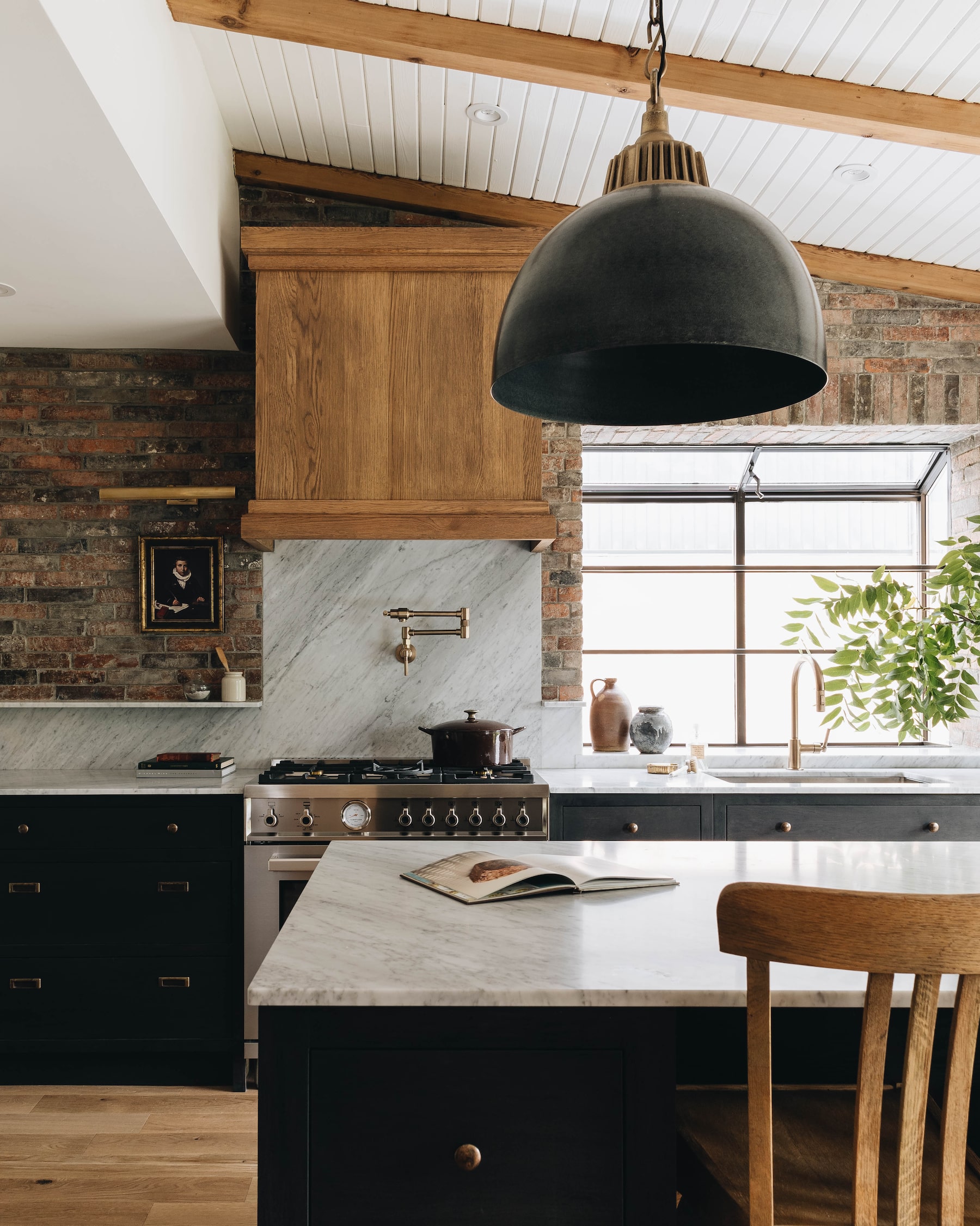
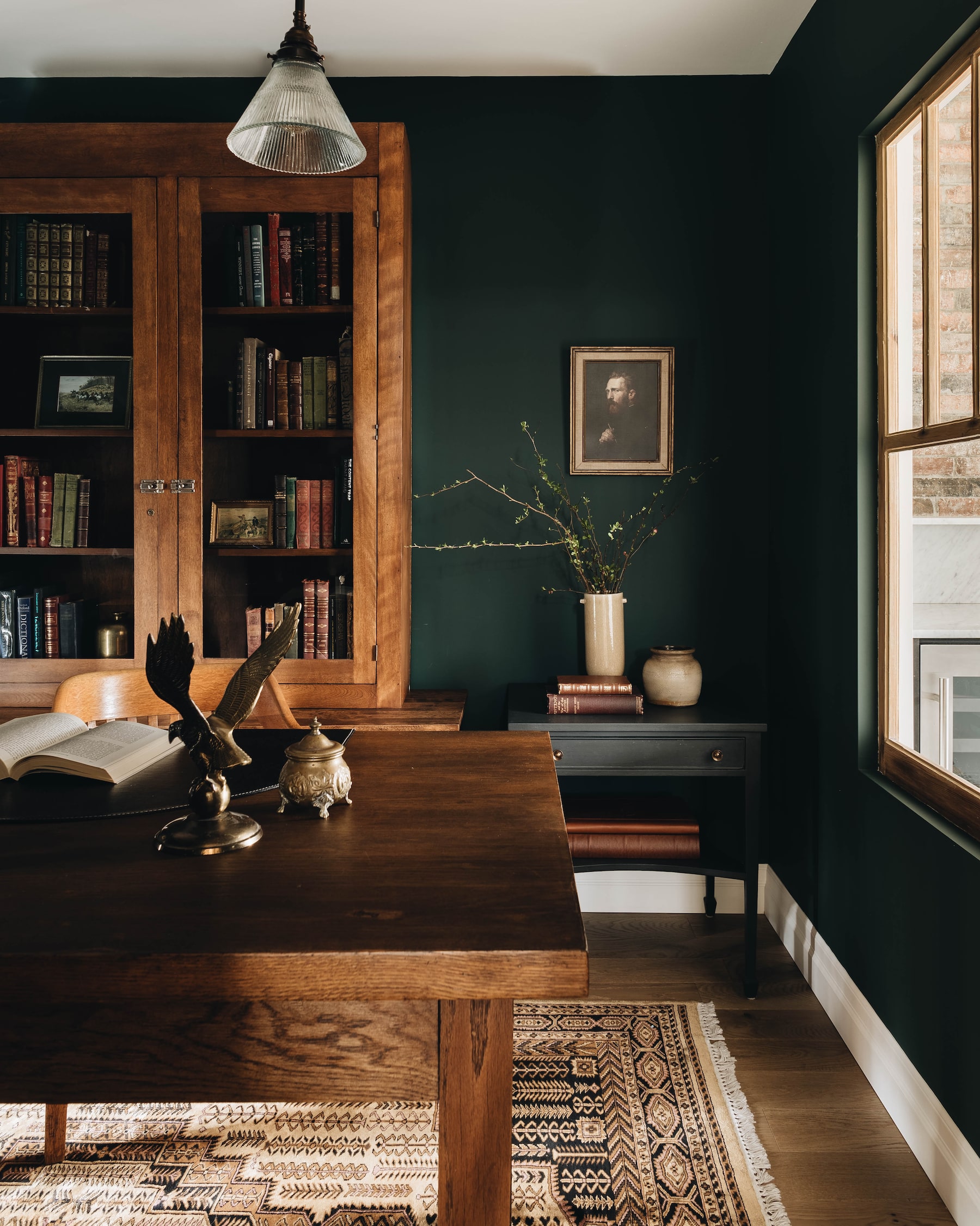
To make the main floor more functional, Cherrier and Pons-Lavigne incorporated a dining area in the large kitchen, a work-from-home office and a laundry room. Though Blanc Marine’s work tends toward the lighter side, the designers drenched the office in Benjamin Moore’s Tarrytown Green for a rich, English manor vibe. They also installed an interior window between the kitchen and office to connect the spaces and allow light to flow through.
“Old interior windows, French doors, transoms – it’s a way for us to create layers and bring old into new,” Pons-Lavigne says.
Furniture and housewares
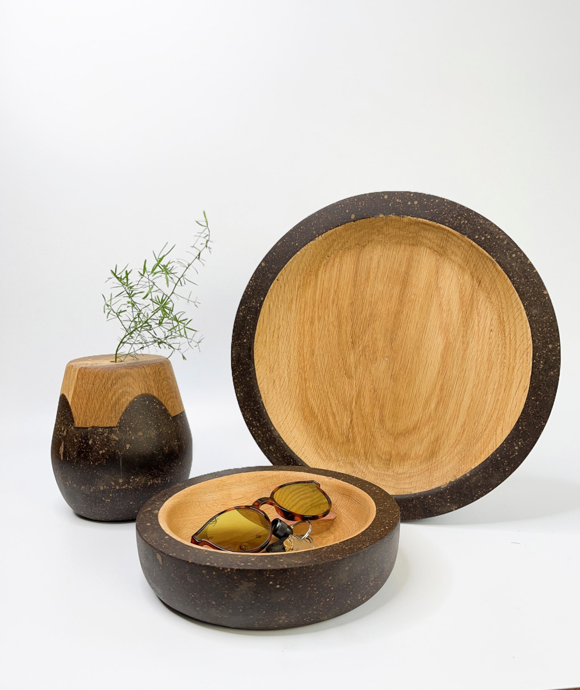
Bunn Series
As a child in the Philippines, Krisette Santamaria came to appreciate “scrappy resourcefulness” as a way of life. She fashioned toy boats from discarded flip-flops, and drums from tin cans and tossed umbrella parts. Now, propelled by a background in economics, the award-winning industrial designer – whose studies at OCAD University in Toronto focused on sustainability – has turned her attention to crafting beautiful objects from food waste.

Krisette Santamaria.Krisette Santamaria/Handout
Making her pour-over coffee one morning, she wondered what happened to the grounds when she was done with them. “I learned that coffee grounds have versatile uses, from fertilizer to steak rub, but often end up as landfill,” Toronto-based Santamaria says. “I wanted to change the form and consistency of the grounds and use them as a building material.” She soon discovered that setting the grounds in resin allowed her to experiment with a more polished texture.
The Bunn series (so named for the word “coffee” in Amharic, the official language of Ethiopia) marries the coffee grounds’ rich tones with offcuts of light oak and takes the form of furniture and accessories. Appropriately enough, Santamaria’s first Bunn creation was a coffee table, which won the Prototype Award at the 2023 Interior Design Show in Toronto.
The newest pieces in the collection are off-the-shelf vases and bowls, with a bespoke chair coming soon. Santamaria is also looking for a way to upcycle the by-products of her production process. “I’ve been thinking about different ways to use the shavings from my woodturning as I make the bowls,” she says. “The evolution seems to happen naturally.”
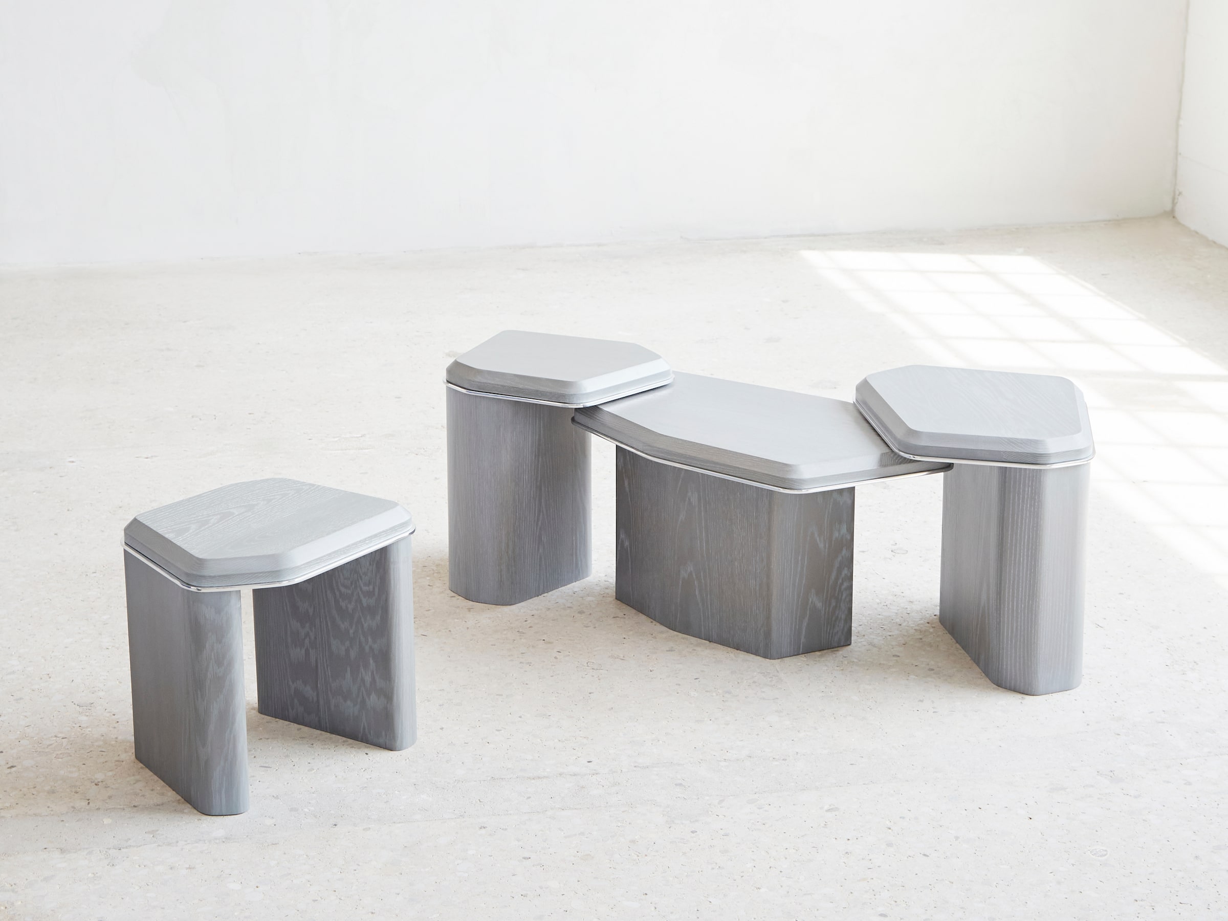
Geomorph Side Tables
Some designs happen by inspiration, others by habit. “There was no ‘aha’ moment,” says Mary Ratcliffe of her latest collection, Geomorph. “I’m just that weird person who’s been picking up rocks and shells forever. I suppose this direction for my work was inevitable.”
Mary Ratcliffe.Ryan McCoy/Handout
In 2022, Ratcliffe was experiencing a creative block. Then, during a road trip vacation with her husband to Los Angeles from Toronto, she was mesmerized by the way the landscape changed, from the ancient rocks of the Canadian Shield to the red rocks of Sedona, Ariz., and the beach pebbles of southern California. It was also a time of life transition for Ratcliffe, who was pregnant with her first child. Once back home, she started sketching rounded rock-like shapes.
“The drawings were spilling out of me,” Ratcliffe says. “I can’t describe it any other way.”
For a designer previously known for her oval oak dining tables and ceramic candlestick holders, a collection of furniture made from grey-finished wood and aluminum was a risk. “It’s the most boundary-pushing work I’ve done, and more conceptual,” she says. “But it felt personal and right.”
The Geomorph side tables, with their organic shapes and blend of hard and soft edges, are meant to be rearranged and nestled as the owner desires. “Like the rocks and pebbles they’re inspired by, nothing stays stagnant,” Ratcliffe says. “You can cluster these tables or separate them for a cocktail party. They give you the flexibility to do what suits the way you’re using the room.”

Connect Collection
At first glance, it’s a minimalist book or plant stand made of Canadian ash dowels. But add a soft pad, a tray with dish and a dangling toy – and it becomes the ultimate hangout for the most sophisticated of cats.
At Papuk, which means “soft and fluffy” in Armenian, Vazken Kara Gozian’s mantra is that it’s possible to live with pets without sacrificing design. But during the pandemic, when Gozian was spending more time than usual with his two felines, Grayson and Ella, he shopped in vain for a cat tree that would suit the aesthetics of his living space.

Vazken Kara Gozian.Anita Chen/Handout
“It’s really hard to find cat furniture that is both functional and aesthetically pleasing,” he says. So, rather than spend on an ugly, carpet-covered tower, he decided to design a structure of his own.
Gozian’s starting point was the Scandinavian design principles of simplicity, minimalism and functionality without forsaking beauty. He soon realized that when your own cats are your focus group, it’s easy to observe what works and what doesn’t. “Our cats sometimes like playing alone and sometimes we played together,” says Gozian of the eventual modular design with a removable toy.
Gozian’s instincts were sound, as evidenced by Papuk’s global buzz. The Connect Cat Tree was recently a finalist in the accessories category of Interior Design magazine’s Best of Year Awards. He is also in talks with U.S. furniture retailers, as well as fielding orders from a new cat hotel in South Korea. “It turns out many cat owners also love their homes,” Gozian says.
Shopping
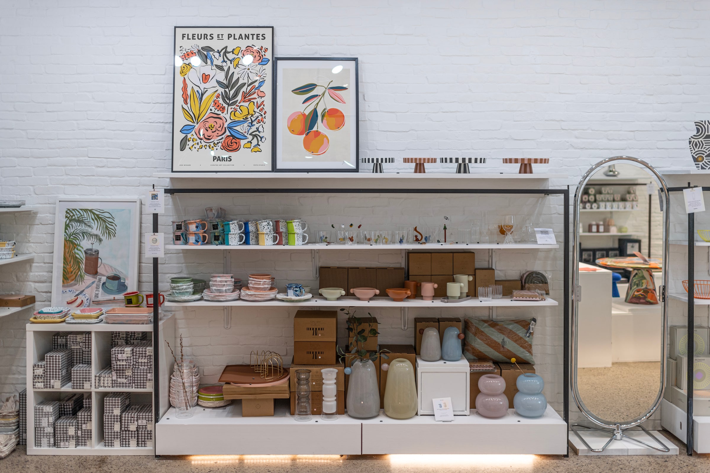
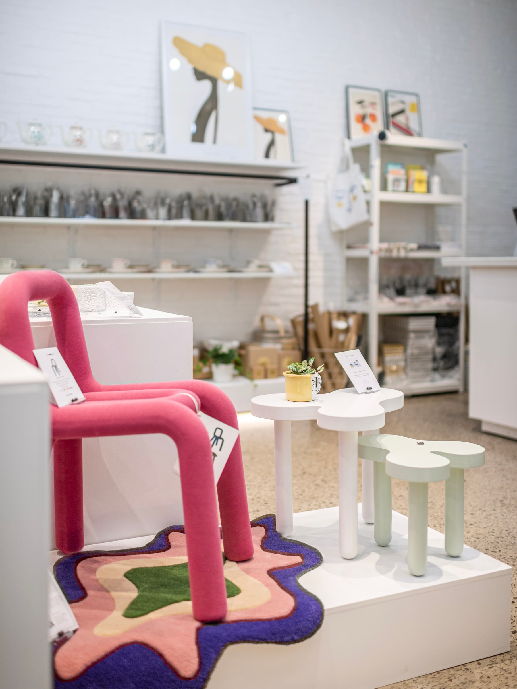
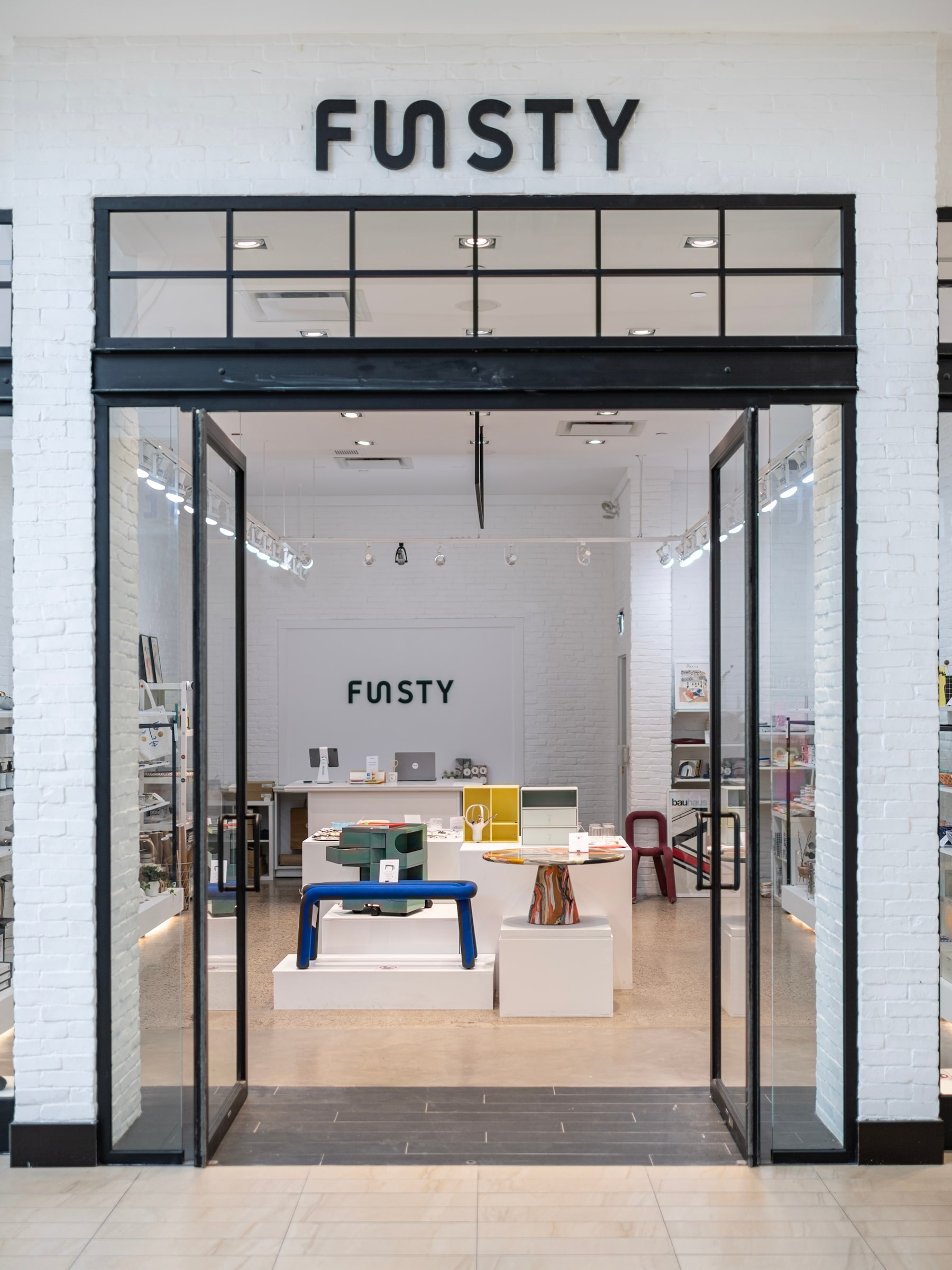
Funsty
At Richmond Hill’s Hillcrest Mall, there’s a multibrand homewares shop that’s as fun as it is stylish – hence its name. “I enjoy the beauty that arises when practicality meets creativity,” says founder Lingjin Gongye. “I believe in design that is not just what meets the eye, but also how it integrates into our lives.”
Walking through the bright, gallery-like space, it’s easy to comprehend Gongye’s form-meets-function approach. Bendy, crayon-coloured Moustache chairs by Big Game mingle with organic-shaped multicolour rugs by Tarta Gelatina and quirky geometric tableware from Canadian Xenia Taler.
After graduating from the visual communications program at Germany’s Bauhaus University, Gongye worked in the furniture industry in Berlin. “I was obsessed with the radical furniture designs that reflect the roots of pop art and Bauhaus style,” she says. “Those connections and experiences inspired me to have my own space to promote modern design.”
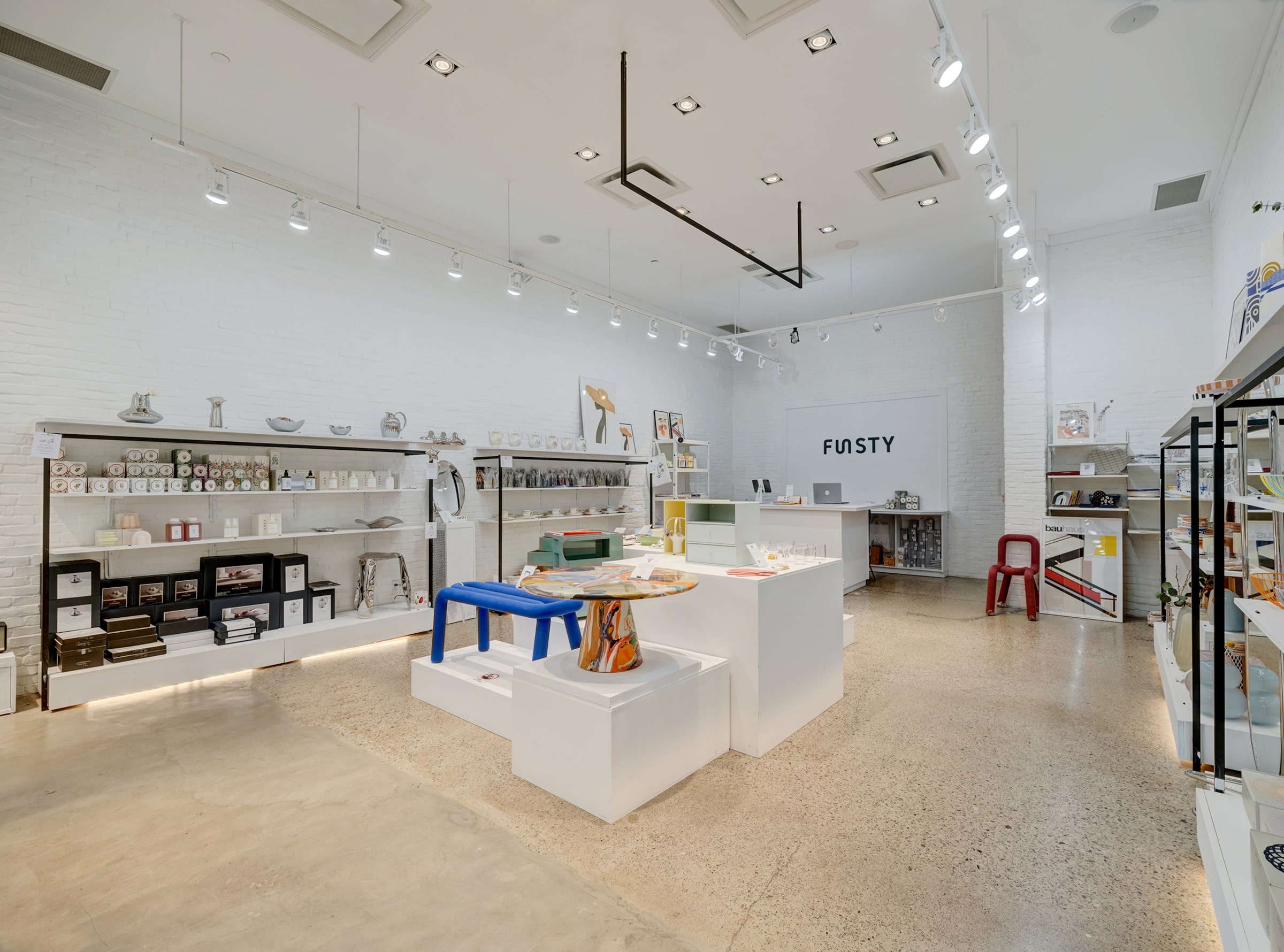
Funsty began as an e-shop with a focus on mixing mature, European brands with local designers, and grew to a brick-and-mortar store in early 2023. No longer confined by a digital retail space, Gongye was excited to interact with consumers and interior designers looking for a fresh approach.
“I believe that to make people really know and understand the products, we need a physical space for showcase and display,” she says. “Sometimes, good designs are not just to be looked at, but to be touched and felt.”
DESIGNING CANADA AT THE INTERIOR DESIGN SHOW
On Jan. 20 at 1 p.m. at the Interior Design Show in Toronto, contributing Globe style writer Odessa Paloma Parker interviews a group of Designing Canada’s standout stars. For more information and tickets, visit interiordesignshow.com.
HOW WE DID IT
To compile this list, writer Beth Hitchcock reached out to Canadian design insiders to pitch the residential architecture, interior and housewares projects that are capturing their attention right now. Projects had to be completed in 2023 by a Canadian designer or firm based in Canada or abroad. Architecture and interior submissions had to be homes located in Canada, and housewares had to be available for purchase by Canadians. A group of editors from The Globe narrowed down the projects to the 10 featured here.
Have a design-savvy suggestion of your own? Post a photo of your contender to Instagram and tag the picture @globestyle and #DesigningCanada.