Never underestimate the power of a well-designed entrance. Not only does it point a person in the right direction – generally to elevators that get them home – it sets the mood.
A good entryway is a landscaped garden that calms the frazzled urban nerves; a bad entryway is a messy, brambly forest that confuses and agitates and, over time, it can diminish a unit owner’s quality of life.
So, slapping shared spaces together without a thought given to psychological effects is a definite no-no in today’s super-competitive condominium market. But, back in 1999, when the Merchandise Lofts was nearing completion in the grand, old Simpson’s (and Sears) mega-warehouse near Dundas and Jarvis, demand was such that developer Cresford was able to let things, well, slip through the aesthetic cracks.

While the hundreds of units were nicely finished, the long, public corridors on the first floor were left underdressed in thinly-painted concrete – jagged in places after a century of abuse – lit by stark florescent fixtures. This was punctuated by exposed pipes caked in fire-retardant material, and yellow-edged steps painted for safety rather than pleasure. The fourth floor lobby (floors two and three are parking) was only a little better: After exiting elevators into an equally raw space, there was, at least, a semi-nice reception desk under a drop-ceiling; in a few areas, seating groups huddled together in a futile attempt at coziness.
While some residents had grown accustomed to the eye assault, others were still rankled. “For those of us that were here at the beginning … that bought before the building was open, we were anticipating a huge, beautiful, very upscale lobby here … and it was just never touched,” says David Callaghan, a man accustomed to looking at beautiful things in his role at retailer European Jewellery. And “architect by training” Darren Newton, a 2008 purchaser, offers that this was a shared misery, as this sprawling building (100,000 square feet on each floor with many common areas) afforded abundant opportunity to discuss the problem with neighbours. “It’s sort of an unusual problem in Toronto to have this much space in a building,” he says. “In downtown Toronto, where the price of land is so expensive, developers are going higher and higher – we’re losing that opportunity to move horizontally through buildings, and thereby losing some of the socialization that can happen.”

Eventually, these conversations morphed into a three-person design committee that interviewed three architecture firms, with Bortolotto Design Architect receiving the commission. “I think the goal was to bring value to the owners,” says Tania Bortolotto, adding that the other big consideration was maintaining “a sense of loft appearance or loft feeling in the building, and yet providing some sort of finish so that it felt like home when you walked in.”
Of course, when dealing with a massive complex built in 1910 with additions in 1916 and 1930, and further tweakings/expansions until 1949, the world was Ms. Bortolotto’s oyster: Art Nouveau, while a stretch, could have been the design inspiration, Art Deco was a strong contender, as was early Modernist,a consideration also.
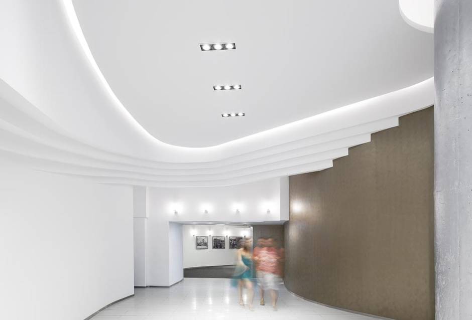
The Bortolotto team settled on a pared-down Deco design. For the high-ceilinged entrance facing Dalhousie Street, a stepped, three-dimensional “racetrack” curving around white walls, and a glowing biomorphic ceiling subtly nudge residents to the elevator area. They do much more than that, actually: They are a topographical map of calm, creamy-white landscape a world away from what was here before.


Quartz floor tiles sparkle like tips of ocean waves in the sun. They are lit both by overhead artificial lighting and natural light pouring in from an enlarged opening around the doorway. The big, bold columns now wear a glamorous coat of silver paint to echo the durable aluminum handrails and baseboards, and one wall is finished in bronze-tinted Venetian plaster.
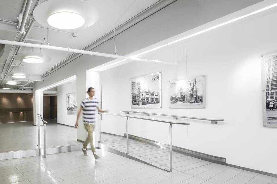
For the lower-ceilinged entrance at Mutual Street, creating a “gallery-type space” was logical, since the condo already owned a collection of vintage photographs of the building under construction and at various stages in its storied history. To achieve this, strips of light were embedded into the structural beams and columns, which are positioned a few feet away from the wall; now, the lighting informs viewers of the proper vantage point. “This is actually my favourite space on the ground floor,” Mr. Newton says. “When you see it from the street, it’s a real marker, as the street’s very dark.”

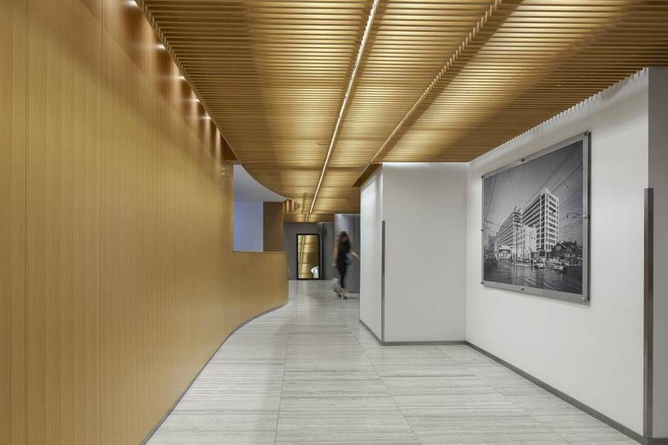
The fourth floor concierge lobby, Ms. Bortolotto says, is “trying to be a little more inviting and warm.” An undulating, rhythmic ceiling of ripped white oak and a wood-clad wall that swells outward to become the main desk (all by Geometric Design) do most of the warming work, but metallic walls and logically-placed furniture groups help as well.
Interestingly, it was the silver paint that caused the most dissent among residents, which, the architect says, is because “anything man-made, people go crazy about, because they don’t get attached to it and it’s subjective, whereas stone or wood are natural [and] no one has a problem with them … always, always, always.”
Perhaps, given a little more time, this beautiful Bortolotto forest will soothe the urban savages who can only see one tree at a time.