Unless you attend the same sort of dinner parties that I do, you may not get another invite if you start yammering on about urban planning.
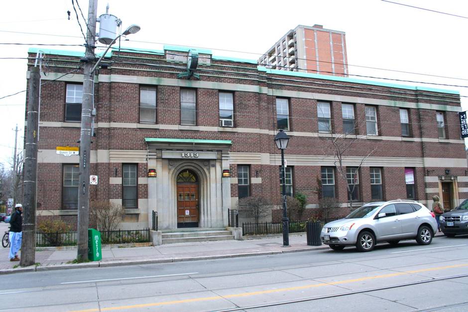
However, wax poetic about that great gallery exhibit you just saw, City of Art, located in the back of the old art-deco police station at 1313 Queen St. W. (designed by city architect J.J. Woolnough and built in 1931-32) that just happens to examine a few urban planning themes, and, well, you might just find yourself the belle of the ball.
“I was hoping that some artists would address things like urban sprawl and some more issues than just paintings of buildings,” says Phil Anderson, curator and executive director of Gallery 1313. He needn’t have worried; while the show does contain some pretty images, many also pack a punch. “People recognize things like the little slice of Markham there,” he continues, pointing to Model for Tranquility by photographer/artist John Lowndes. “People relate to that right away.”
Actually, the dozens of tiny, two-dimensional McMansions sporting faux-historic gables with oculus windows, “stone” columns and dominant multicar garages are based on the artist’s current home of Newmarket, Ont. “It’s very commercial, everything is packed together,” Mr. Lowndes explains. “Every summer, they knock down 10 acres of forest and put up the same 10 houses, 200 times … it’s strange, it’s alien almost.”
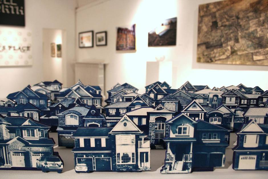
As well as representing the “cookie-cutter” nature of modern suburbia, the cyanotype colouration might also represent the home buyer’s naive wish that happiness can be purchased from blueprints. “It’s a bit of a tragic installation,” the 22-year-old finishes.
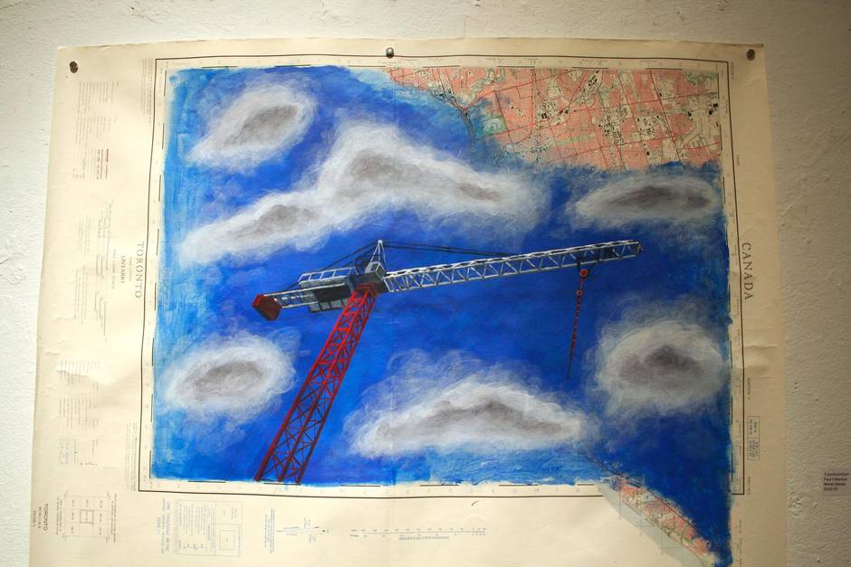
A few steps away is the jarring image of a construction crane painted over an old, pre-Internet map of the city. Torontominium by Paul Kilbertus asks gallery goers to consider the vertical sprawl of Toronto’s condominium boom. Are we erasing the old city? And, if so, is the exchange of our bricks-and-mortar heritage for a vibrant downtown with a café on every corner a good trade? Is the high-rise tower the only way to combat suburbia’s appetite for precious farmland?
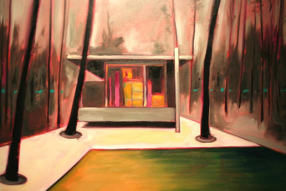
The squared off, “Dwell magazine”-type of neo-modernist home, which often pops up on inner-city infill sites, won’t be our salvation either according to painter Ian McLean. In all three paintings, Fertilizer, Pond and Prosthetic, the perfect, geometric lines of the architect are sabotaged and subordinated by skies on fire, algae-infested swimming pools and a landscape pockmarked by craters (or is it just an ugly rug?). In his artist’s statement, Mr. McLean suggests that it might be fallacy to believe that “a utopian existence” can be achieved through “purity of design.”
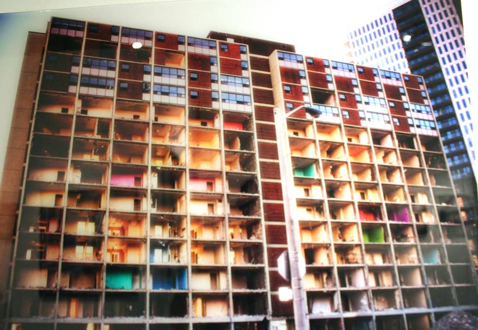
A Lorie Slater photograph of a 14-storey Regent Park apartment tower with its face ripped off – exposing the secret, colourful walls of former tenants – reminds us that nothing, not even high-rise architecture, is permanent. The last of five award-winning residential towers by English-born modernist Peter Dickinson (1925-1961), there had been talk of saving this innovative 1958 “Maisonette” building since it featured two-storey apartments with internal staircases, and because much of the architect’s body of work, including the suburban Inn on the Park hotel and the crisp, Mad Men-esque addition to the Park Hyatt Hotel at Bloor Street and Avenue Road, has been lost.
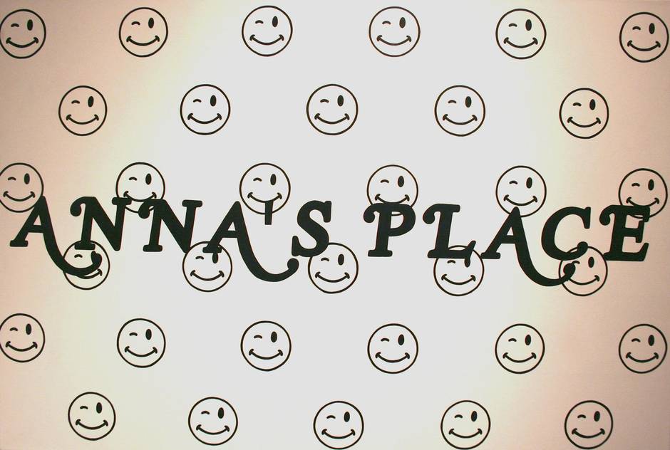
To lighten things up, Mr. Anderson points me to Yan Wen Chang’s work. While stark, her black-and-white interpretations of retail signage in Parkdale are grin inducing, since I am also a typography aficionado. Simply by putting it on a canvas, the banal “Anna’s Place” font (in all its poorly kerned glory) takes on a certain gravitas; it is further enhanced by the addition of an army of winky-faces that don’t appear on the actual piece of backlit plastic over the pub/restaurant at 1521 Queen St. W. While Ms. Chang takes liberties with the shadowing of “Full Worth,” a department store at 1371 Queen St. W., locals will still recognize the equally dull lettering.
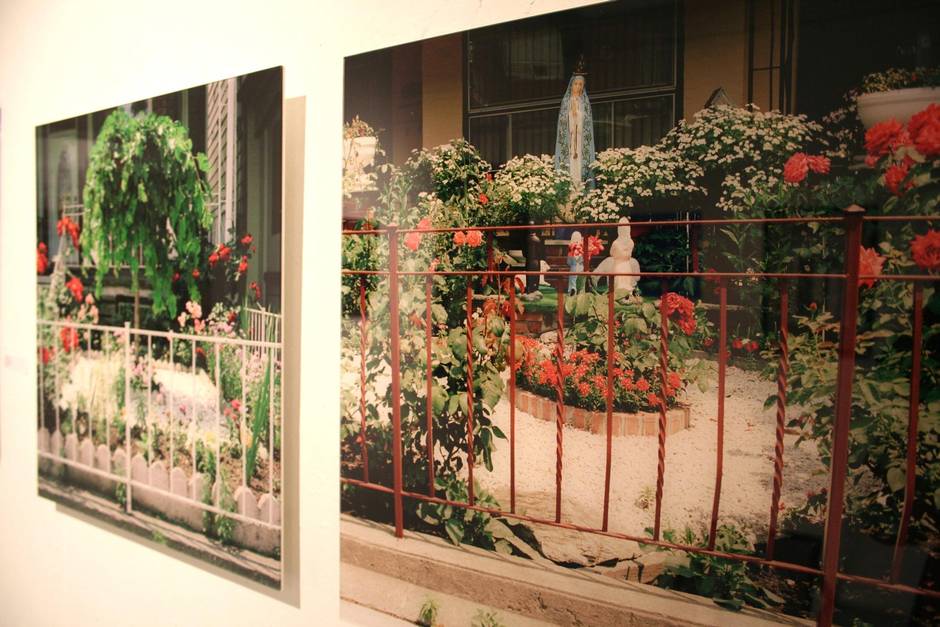
Also whimsical are Rita Godlevski’s portraits of immaculate front yards in her Hedging Desire Series. In one photo, a ceramic saint keeps watch over the peonies.
Thoughts on urban planning are never very far away, however, as a number of works have interpretations of Toronto’s street grid as seen from above, and others manage to convey the jumbled layers of urban life through full- or semi-abstraction. Emanuel Pavao’s blocky streetscapes constructed from tape – that’s electrical, painter’s and duct, to be clear – are not to be missed.
“It’s like a collection of short stories,” says Mr. Anderson of the exhibit, which features 30 artists and runs until Nov. 22. “Hopefully, [visitors] go away with something to think about, and maybe there’re other conversations or questions that come up that weren’t there before.”
City of Art, then, is a handy excuse to place urban planning, the condo craze and suburban sprawl right next to the butter dish on your next dinner party table. Ask each guest, in turn, to share his or her perceptions of the city. Which neighbourhoods feel good? Which don’t? Why? And what can we do about it?
The artist, after all, is but an oracle. It’s up to us, the foot soldiers, to fight for the city we want.