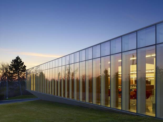
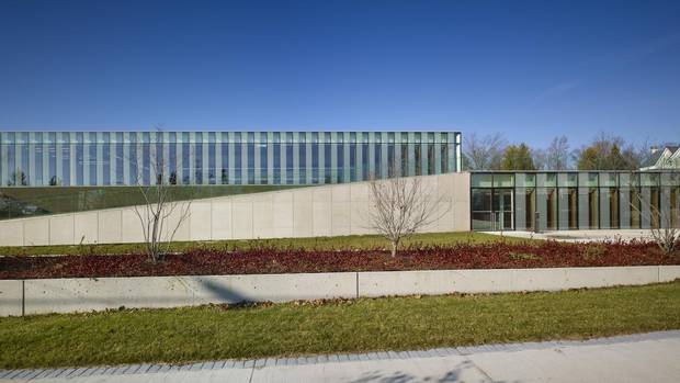
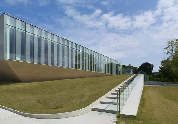
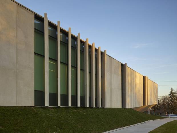
Imagine a slab: a low box clad in limestone and glass. Then place it on the crest of a hill and split it down the middle, one piece pressed down into the earth and the other slanting up to the sky. This is the three-dimensional drama that animates the new Waterdown Library and Civic Centre in Hamilton.
Inside, more twists. Walk in the door, and you can wind your way to the top of the hill: climbing a series of ramps lined with generous windows and slats of Douglas fir, past green roofs and through six levels of a library filled with colour and dashed with sunlight on all sides. At the top, the payoff: long views from the height of the Niagara Escarpment, taking your eye beyond the suburban road to the broad topography that defines this place, the arcing shore of an ancient sea.
The latest in a string of excellent public buildings from its architects, RDHA, the building is fresh proof that libraries are the locus of creative architecture in Canada. Waterdown brings together an elegant metaphor and accessibility with a sense of place – and shows how excellent art can emerge from constraints.
Plus you can find books here, or pay your taxes. The 23,500-square-foot facility combines the library branch with a seniors' recreation centre, and smaller functions including an archive and a municipal customer-service office. These are folded neatly into those two boxes: library above, and other functions below.
The library is the latest in a string of excellent public buildings from Toronto-based architecture firm RDHA.
"It's deceptively simple," says its lead architect, RDHA partner Tyler Sharp. "It's essentially a box … but when you look carefully at what's happening, there is a lot of complexity."
And that complexity is expressed in the uphill promenade.
To understand this, you need to think three-dimensionally. "Most libraries want to be a single-storey building," Sharp explains. That makes it easy for librarians to greet patrons and keep an eye on materials, and saves money. In this case the architects at Toronto-based RDHA, who have designed about 10 libraries since 2005 including a Governor-General's Medal-winner in Toronto, wanted to resist that constraint. Instead, they imagined the building as a fragment of the escarpment, pushing up from the ground.
Librarians – at least Hamilton's – understand metaphor, and the architects won approval for the complex scheme. The key was linking the building's two entrances, and the six levels within the library itself, with a series of low ramps, at a 1:20 slope. This makes "a kind of public landscape," Sharp explains, "that you ascend to reach the different public programs at different levels."
The 23,500-square-foot facility is divided into two boxes: library above, and other functions below.
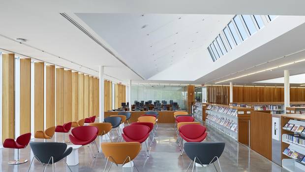
These include a lobby with the city customer-service window; an entry to the library, and a nearby children's area where the ceiling drops down for coziness and acoustic control; and then levels of bookstacks and glassed-in reading rooms. It is all highly transparent, minimal in its material choices of polished concrete, tempered glass and recycled Douglas-fir slats.
Having gotten to the top of the library, you are in an atrium studded with colourful chairs; from there, you can (in warmer months) exit through a door onto a terrace. "We imagined a full cycle of circulation," Sharp says, "a full cycle of movement in the building, all the way up and back down through a terrace.
"This is a single-storey building," he adds, "but it's a single-storey building that is on six different levels."
This is hard to capture in the two-dimensional drawings that guide construction. (The building came in on budget, and is exceptionally well-built, but was at least a year behind schedule.)
RDHA partner Tyler Sharp cites the building as an example of a ‘parameters-based architecture.’
Yet, paradoxically, the building manages to serve the library's practical needs in an era when the institution is becoming less focused on books and more on becoming a space for programming, creativity and public gathering. "For us, the key word is flexibility," says Karen Anderson, the Hamilton Public Library's director of public service, "because there is this changing dynamic about how libraries are being used and perceived – so you want to set yourself up for the future."
The design, Sharp adds, "speaks a language of accessibility." The slopes also make the entire building accessible to people with mobility issues, meeting Hamilton's barrier-free design guidelines. Policies such as that, and legislation including the 2005 Accessibility for Ontarians with Disabilities Act, increasingly require all public buildings to become genuinely accessible to everyone.
This is a moral and practical question that the library takes to heart. "Accessibility … is at the forefront of all of our projects," Anderson says. "Because we're serving the entire community: If a building is inclusive and accessible and pleasant to use, for moms with strollers to seniors – if everyone can use the building, then we've done the right thing.
"And if people see that they're able to use the building comfortably," she adds, "they are more likely to come."
The library shows how excellent art can emerge from constraints.
There's no question that the building is both comfortable and beautiful. Its outside is clad in thick slabs of locally quarried limestone, another expression of its ties to this place, and panels of glass that are printed with vertical strips of ceramic fritting. The views are epic. A clerestory window up top brings in gentle north light, helping wash the interior. And the subtle slope of the floor feels both surprising and perfectly comfortable.
There is a lesson here about design, and about creativity in general. Sharp cites the building as an example of "a parameters-based architecture," an intellectual tendency that originates with the Dutch architect Rem Koolhaas and his firm, OMA. This begins with an analysis of a building's site and components, often expressed in a diagram of boxes; and then through counterintuitive leaps of logic, the boxes torque, warp and shift into wildly unexpected configurations. At OMA's Seattle Central Library, "clusters" of different functions slide this way and that, stretching the skin of the building like a textile. The Danish architect Bjarke Ingels, who worked on that library, is a master at this sort of crazy-but-logical form-making.
"Sometimes the effect is not as rational as the initial discussion," Sharp says with a smile, "but I try to use constraints as potential opportunities."
Yes: Some architects complain, inexcusably, about accessibility requirements. Most of us wouldn't let a one-storey building climb a hill. But this is how great public space gets built, when architecture reaches for new heights.