The Toronto home of Anahita Azrahimi and Diederik van Liere, designed by Creative Union.Riley Snelling/Riley Snelling
In 2012, Anahita Azrahimi and Diederik van Liere bought a condo in Toronto’s popular Roncesvalles Village neighbourhood at well below the asking price. The unit was irregular – a trapezoidal, double-height main space with a staircase connecting to two oddly apportioned bedrooms – but it wasn’t without its charms. “I loved the location and the ceiling height,” Ms. Azrahimi says. Mr. van Liere was enticed by the floor-to-ceiling windows. “Natural light is so important to our emotional and spiritual well-being,” he says.
The couple don’t belong to the 1 per cent: Ms. Azrahimi, an artist, runs the annual Toronto Outdoor Art Fair, and Mr. van Liere is a data scientist and engineer. They knew that they might not get another chance to buy so cheaply in a sellers’ market. Still, they couldn’t entirely escape their feelings of trepidation. Could one live an ordered life in such a haphazardly designed space?
The second bedroom, where their future children would sleep, was a tight, polyhedral volume (picture a slice of cake with the point cut off), its floor space disrupted by a hefty concrete pillar. The couple wanted at least two kids, but was there space? “How the hell are we going to fit two beds inside that room?” Ms. Azrahimi wondered.
Creative Union Network, who led the renovation, specialize in making the most out of oddly appointed interiors.Riley Snelling/Riley Snelling
At her prenatal class, she met Claudia Bader, a German-born architect, who, with her husband, Timothy Mitanidis, runs the boutique studio Creative Union Network. The firm specializes in exactly the kind of problems the couple was facing. Their talent is for making the most out of tight, oddly appointed interiors, bringing unconventional solutions to what seem like fixed constraints. Their work is both fanciful and pragmatic – whimsy in the service of rationality.
As it happens, Creative Union designed one of my favourite Toronto homes – a tiny repurposed Coach House in Toronto’s Beaconsfield Village neighbourhood, which feels roomy although, in theory, it shouldn’t. The architects optimized the space by setting the bottom level a metre below grade (if you can’t raise the roof, you can lower the floors) and shrinking the back-end areas (passageways, stairwells, bathrooms) as much as possible, saving precious square footage for where it was needed most. They also created neat custom pieces that perform multiple functions: a sectional that houses LPs and a record player, a bed with reading lights and side tables that pop out from the baseboard.
The orange-laminate flooring was replaced with white oak.Riley Snelling/Riley Snelling
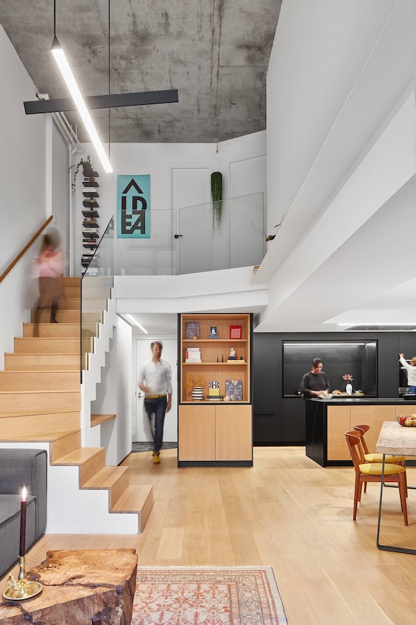
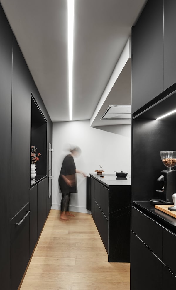
They took a similarly resourceful approach to the Azrahimi–van Liere home. First, they streamlined the interiors by getting rid of unsightly or superfluous elements. They took out the powder room on the ground floor – a small chamber, like an airplane washroom, that partially blocked kitchen access – thereby making space for an open coffee nook and pantry. They also replaced the ghastly orange laminate on the floors with white oak and the oversized kitchen appliances with compact European substitutes.
Riley Snelling/Riley Snelling
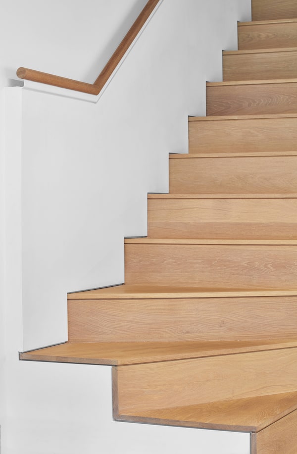
The new staircase turns toward the middle of the room to free up space.Riley Snelling/Riley Snelling
Most importantly, they redid the staircase, a chunky unit that ran along the north side of the main room, making most of the wall space unusable. Mr. van Liere – who is from the Netherlands, land of windmills and vertiginous stairways – found this feature particularly baffling. “I’m used to staircases that are practical and compact,” he says. To fix the problem, Ms. Bader and Mr. Mitanidis set a leaner staircase that turns toward the middle of the room at a 90-degree angle, freeing up wall space for furniture and art. They also pushed the stairs inwards. Why, one wonders, had the previous designer opted to leave a foot of space between the stairs and the wall? Who knows? But now that this feature is gone, nobody misses it.
These tweaks were easy and obvious – proof that designers can achieve a great deal with just a bit of thoughtfulness in an otherwise thoughtless space. But in addition to fixing previous errors, Ms. Bader and Mr. Mitanidis added innovations of their own. When you’re designing in small units, the three most important words are millwork, millwork and millwork. Expensive furniture by high-end producers can only take you so far. More important are purpose-built pieces that accommodate people’s habits, needs and spatial constraints. “When you have a small, funny-shaped space,” Ms. Bader says, “it’s all about the built-ins, because they enable you to tuck everything away.”
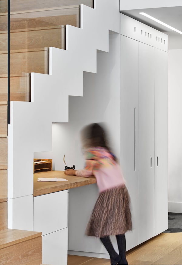
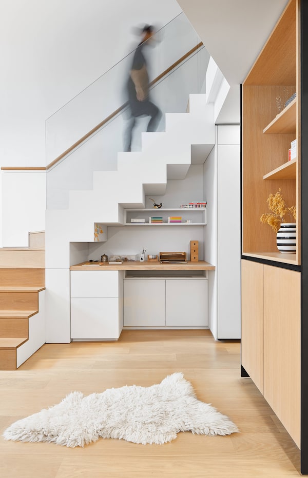
A small desk beneath the stairwell creates a cozy miniature office.Riley Snelling/Riley Snelling
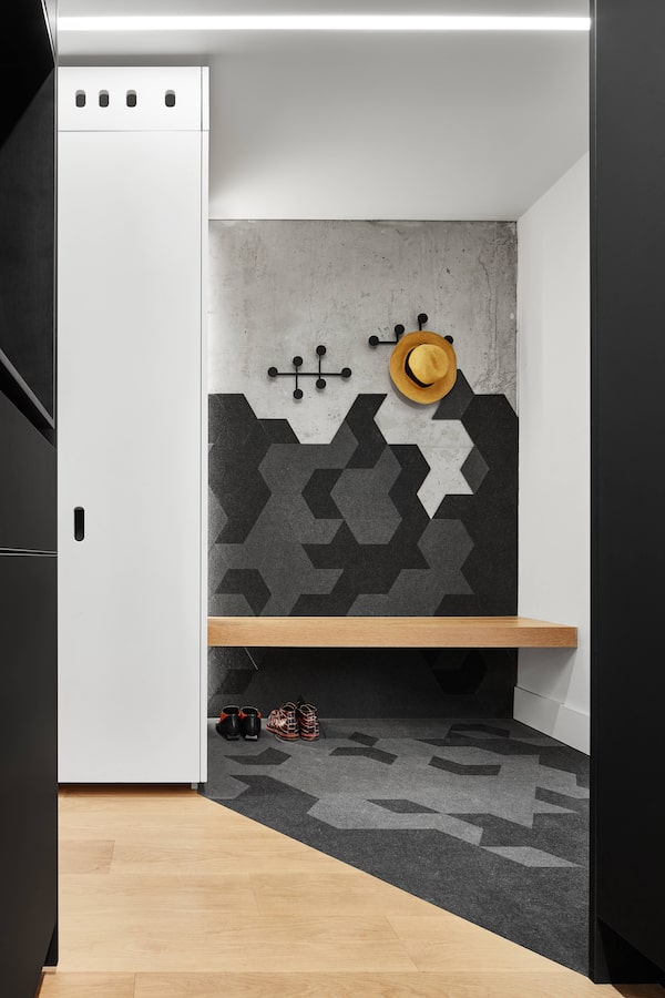
Creative Union excels at this kind of design. At the Azrahimi–van Liere home, in a tiny nook beneath the stairwell, the architects set a custom desk – which is also a bookshelf and storage unit – that transforms dead space into a cozy office. In a cabinet near the entrance, they built a removable shoe shelf occupying six inches of space between the cabinet doors and the furnace. It’s hardly luxurious, but it does the job.
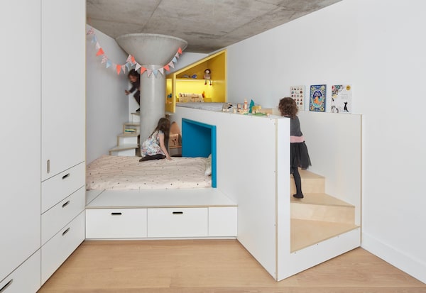
The children's bedroom is an asymmetrical space that transforms an errant concrete column into a decorative accent.Riley Snelling/Riley Snelling
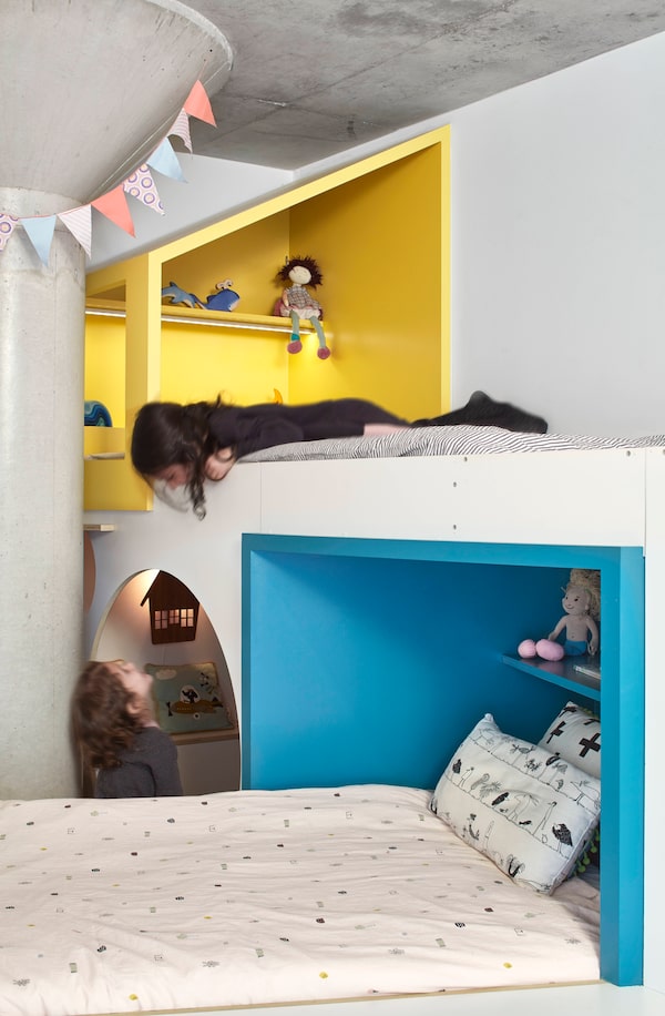
The most impressive piece of millwork, though, is in the children’s bedroom. I’m not sure how to describe it, except to say that its colourful and asymmetrical – part nest, part apiary – and that it’s made of Baltic birch with a plastic laminate finish. It includes beds, drawers, winding stairways and a tiny reading cave with a fuzzy carpet, and it wraps around that errant concrete column in the room, transforming an obstruction into a decorative accent. It is in pieces such as this that one sees the dual impulses – whimsy and rationality – at the heart Ms. Bader and Mr. Mitanidis’s practice. Looked at one way, the structure is a Seussian flight of fancy. Looked at another way, it’s a rationalistic response to inflexible constraints: the architects somehow got two beds into a room built for one.
For all its whimsy, the room functionally fits two beds into a space intended for one.Riley Snelling/Riley Snelling
Ms. Azrahimi and Mr. van Liere’s daughters were both born in the same month, so, last fall, the couple gave them the structure as a birthday present. “I was setting it up the whole day,” Ms. Azrahimi recalls. “Then we opened the door and let them run wild. It was incredibly emotional, like that scene in The Nutcracker when Clara and the Prince arrive at the Land of Sweets.” When designing the piece, Ms. Bader was similarly enchanted. “I felt like a child again,” she says.
Your house is your most valuable asset. We have a weekly Real Estate newsletter to help you stay on top of news on the housing market, mortgages, the latest closings and more. Sign up today.